15 Mar 2017

Designing Moniker

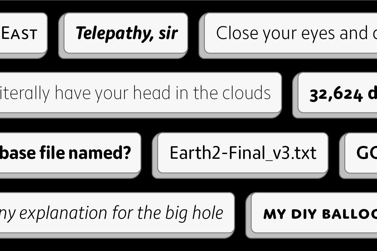
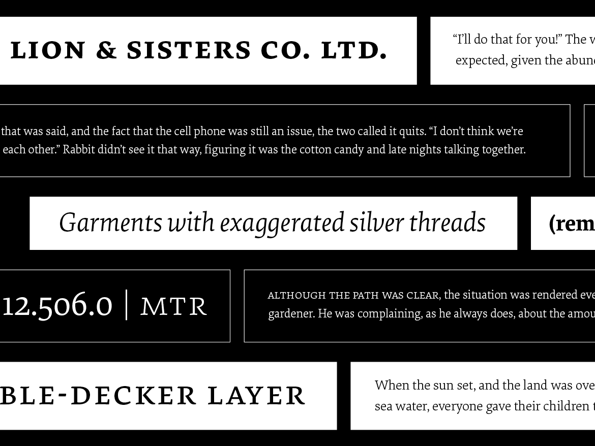
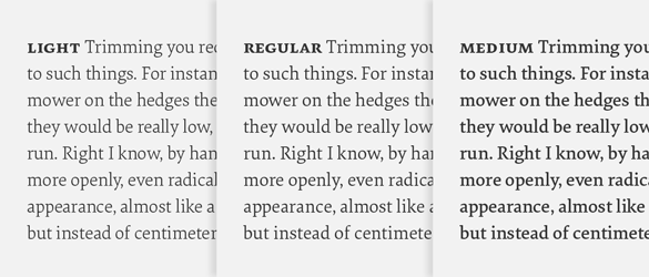
Taking inspiration from the rounded sans serifs of the last 50 years, Moniker captures the informal tone of the genre while building on the typographic possibilities left under-explored. Its open terminations, slightly condensed lowercase and almost classically proportioned uppercase bring a sensible workhorse mentality to an often display-centric genre. Continuous running text, charts, graphs and tables can join headlines and decks in communicating a friendly and approachable message. The full family consists of five weights, with lively matching italics and small caps, making it suitable for a variety of design tasks from wayfinding to identity work.

The different number styles of Moniker — lining, small cap and old style, all with tabular counterparts.

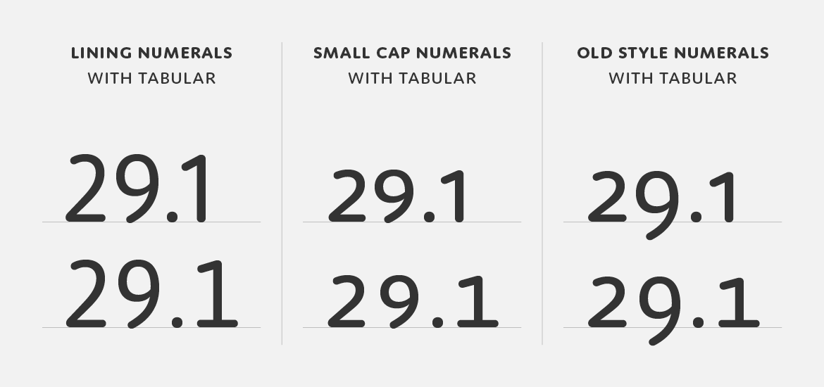
The display of numerical data is an increasingly crucial element of daily communication and Moniker features a full set of number styles to address this need. Lining numerals (default) as well as old style, small cap, tabular, tabular old style and small cap tabular numerals for each weight – italics included – are standard in the full version of the Complete Family.

Moniker italics.

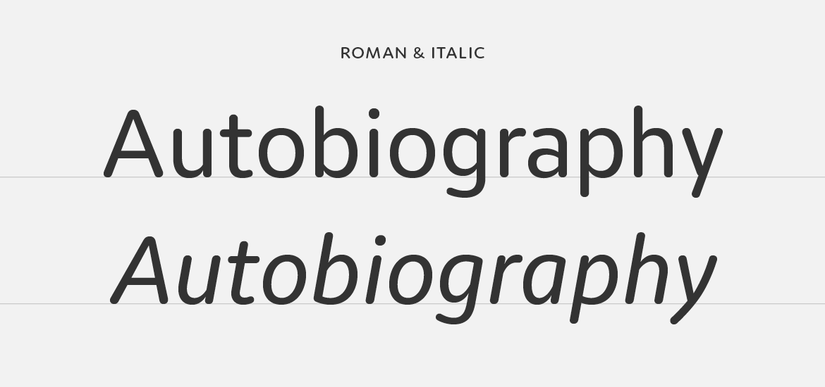
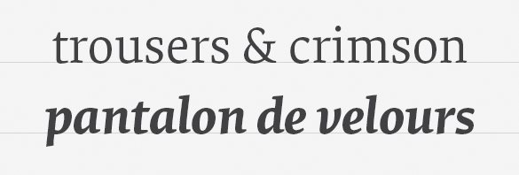
Moniker features an italic that mimics the left to right movement of italic handwriting. In contrast to an oblique roman, the strokes are slightly thinner, the joins more dramatic and the rhythm more pronounced, making it easier to distinguish when set with the roman.

Moniker lowercase to small cap comparison.

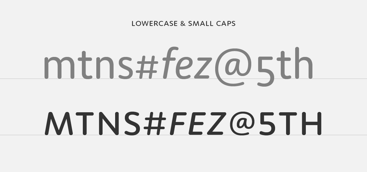
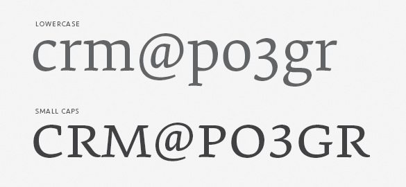
And small caps too! Just like our other fully-featured OpenType families, Moniker has a complete set of small caps, matching small cap numerals and punctuation at small cap height.

Stylistic set one has an alternate a, from double story to single.

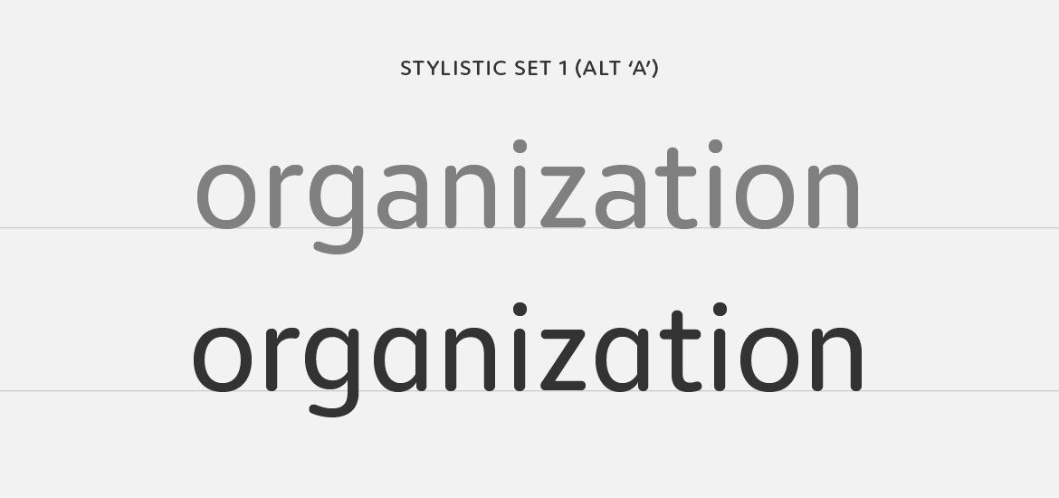
In a nod to the informality of the rounded genre we’ve included a single OpenType stylistic alternate ‘a’. It’s a small detail, but it’s one that adds a casual tone to headlines and text.

To keep Moniker accessible, we’ve also created Moniker Basic for those requiring something stripped down. Moniker Basic is the same as Moniker but does not have OpenType features like small caps or different number styles. If you buy Moniker Basic and later decided to upgrade, the purchase price is directly credited towards the Complete Family.

15 Mar 2017

New Release: Moniker

CM_Moniker

We’re excited to announce our latest typeface, Moniker by Eric Olson. Moniker is a rounded sans serif that captures the informal tone of the genre while maintaining a sensible workhorse mentality. The family is made up of five weights with lively italics, and with features like small caps and multiple numeral styles, the fonts can take on the small (tables and text) and big (headlines and logos).

Moniker is available for desktop, webfont and app licenses. And it’s offered in full and basic versions. The basic version has a smaller character set — and price so you can start there and always upgrade later.

elena-blog5

Elena, designed by Nicole Dotin, has doubled in size with two new weights. Adding to the Regular and Bold, a Light and Medium bring a twist of variability to this modern serif typeface. The new styles form a trio of text weights – rather than follow a traditional linear weight model – and serve as lighter and heavier gradations of the Regular. These new fonts are designed to offer finer control over page color, hierarchy, and type pairings.

Originally released in 2011, Elena was made for extended reading. It has since found its way into every medium, from books to blogs, and even the popular reading app Instapaper. This release expands on that mission, reaffirming its commitment to text that’s meant to be read.

As before, the fonts are offered in Full and Basic versions. The Basic has a smaller character set — and price so it’s a good way to test the family before you dive into all of its features. And if you’ve previously licensed Elena, you can upgrade without paying for what you already bought, whether that was a single style or family.

13 Dec 2016

Designing Elena

The design of a new serif typeface for extended reading is an exercise in subtlety and restraint. The type designer traveling this path is faced with a limited and abstract palette with which to build unique character – stem widths, counter shapes, proportions, terminations and so on. Elena is a manipulation of these subtleties in a direct and unaffected way, creating a modern serif typeface that quietly balances warmth with a crisp, tailored tone.

Elena regular and bold italic.

Central to this typographic balancing act is a rejection of extremes. Serif typefaces meant for continuous reading quickly turn bookish and old-fashioned when rote historicism is the singular influence. On the other hand, a designer attempting to capture a contemporary voice may strip or exaggerate details only to find that grace and ease went with them. Elena merges these two ideological opposites by heeding the lessons of the past while taking advantage of formal possibilities no matter their origin.

The result is a low contrast typeface of economical proportions, moderate x-height and spare details. The influence of the broad-nibbed pen is conspicuous but tempered by a discreet reinterpretation of its shapes. Soft, brush-like terminations in the lowercase lend an organic note while a strong horizontal movement and tense curves create a structured counterpoint.

The three text weights of Elena — light, regular and medium.

Elena debuted in two weights, Regular and Bold, and was later expanded to include two more, Light and Medium. Rather than follow a traditional linear model though, the additional weights operate as lighter and heavier gradations of the Regular. This creates a range of three text weights, allowing typographers a choice of page color or the ability to apply subtle weight changes across a design. Additionally, it’s easier to combine Elena with another typeface. Having more weights means you can control a page’s hierarchy with increased precision and avoid instances where Elena is too light or too heavy compared to its mate.

Elena small caps.

As with all of our typefaces intended for complex typographic tasks, a suite of related parts naturally follows. Small caps, lining figures, tabular lining figures, small cap figures, tabular figures and arrows are all included in the full version of the design. If this sounds excessive for your job, we’ve also designed a basic version with – you guessed it – just the basics for simple tasks and web use with the CSS @font-face rule.

tengbom_id_2016-05-03_page_27_5000

Tengbom, a Scandinavian architectural firm, has a new visual identity and it’s full of Scandia. Developed by Oscar Liedgren Studio, the branding takes full advantage of our latest typeface and also features a new style — Scandia Light Stencil.

Scandia was released with just one stencil font, but Liedgren thought a second, lighter weight would carry them even further. He came to us after creating Tengbom’s new logo, based on Scandia Regular, and worked with Eric Olson to design the custom font. Since there was always potential for more stencil weights, we’re glad they asked.

tengbom-scandia-light-sample

No doubt stencils and architecture have an affinity for each other. Liedgren was keenly aware of the relationship but after surveying the competition, he found it wasn’t as common as he imagined. In the end, their use of stencils accent Tengbom’s own design work, adding a nice level of detail across print and web.

‘I think type in the context of identity can help you either to “belong” to a world (like that of architecture) or “stand apart”,’ Liedgren explained via email. ‘Both are valid strategies and need to be seen in the light of all other graphic elements and imagery at hand. In the end, what makes it work or not, is in the detail, in the craft, and in the way it’s applied.’

tengbom_id_2016-05-03_page_31_5000


Tengbom-portfolio3b

alla-crop

Tengbom-blog2


Visit Tengbom.se to see the webfonts served up. And you can see more in-use samples at Oscar Liedgren Studio. Print images courtesy Oscar Liedgren.

webfont-guide-desktop

Getting webfonts up and running on a website can be challenging or just plain tedious. To take some of the sting out of it, we’ve written a quick start guide to help you implement the webfonts right away.

Take it Step-by-Step
The new guide, included in all our webfont packages, has step-by step instructions as well as a pre-written stylesheet for self-hosting webfonts. Just upload the included webfonts folder to your server, add a link to the stylesheet, style some text and you’re done. If it doesn’t go as smoothly as advertised, there’s a troubleshooting section too.

Jump Straight to the Code
You can also skip the steps and jump straight to pre-written CSS @font-face rules and classes. For packages with multiple weights or styles, the relationships between the fonts have already been worked out and are specific to the fonts in your order. The font-family name is shared, the font-weights use number values, and the font-styles are set to normal or italic, making it easier to manage related webfonts.

Need to deal with FOUT, want to make sure kerning is on, or prefer to serve fewer formats? Go for it! The quick start guide offers a solid beginning but isn’t prescriptive – feel free to adjust it based on the priorities of your site. Now go and enjoy the ten or twenty minutes you’ve been spared by not having to write @font-face code!


If you’ve purchased webfonts from us in the past, re-download an order from your account to get the quick start guide.