Posts tagged “FIG”

Not All Who Wander Are Lost card

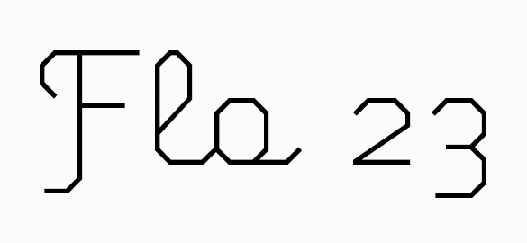
Designer Ross Moody and his 55 Hi’s imprint are one of the reasons we love running our own type foundry. It’s been said that type design is a lonely, difficult and frustrating endeavor and while that can be true, it’s also immensely gratifying when the bi-product of your work is so surprising.

FIG Script default

‘Is that our FIG Script?’ we wondered. When set in all caps, a script face doesn’t traditionally connect. So what gives? Capable hands. Ross deftly connected the caps, modified certain letters and added flourishing touches.

Not All Who Wander Are Lost card

‘Not all who wander are lost’ is a derivative of a line from a J.R.R. Tolkien poem titled, ‘All that is gold does not glitter.’ The poem appeared in the Lord of the Rings trilogy and the original line read, ‘Not all those who wander are lost.’ The poem and its place in the trilogy is documented on Wikipedia.

Ross has created limited edition, hand screen printed posters and postcards of ‘Not all who wonder are lost’ as well.

Longtime Process Type Foundry collaborator Allon Kaye of Entr’acte sent along this 12″ sleeve using eight of our capital A’s. It’s probably best to let Allon describe the project:

“it’s an over-over-overprint of process [type foundry] ‘a’s for an event-only edition (15 copies) of a new 12″ (alpha, by jo thomas).

these were originally overprinted for an event called avoid. the printers ran too many copies, so i overprinted the ‘avid’ lettering (‘o’ was the centre hole) with a blocky, abstract ‘entracte’. i’ve been using these ‘reject’ sleeves for promos etc., but every so often i get to do something a bit more special with them.”

Named for the collaboration of Frank Sheeran, Ian Chai and Glenn Chappell that produced the FIGlet program, FIG is a set of three typefaces in the spirit of early email and ASCII art explorations. Written in 1991 using the programming language C, the FIGlet program allowed users to create letters with basic ASCII characters and then paste them into a software program of choice. Alphabets of surprising ingenuity – often made using just a single element – could then be tasked for everything from email signatures to banners and posters.

FIG sans and serif

Taking inspiration from this reductionist approach, FIG Sans and Serif follow the FIGlet construction principal literally and rigidly: they are made from a single element. FIG Sans uses only the + symbol while FIG Serif uses the * symbol to construct each character. As your eyes have now gathered, these are display fonts to be sure – larger sizes are encouraged.

FIG script

In contrast to these hardline construction principles, FIG Script follows a less rigid structure to arrive at something of an upright geometric script. However, after a lot of trial and error it became obvious that a script with too few angles was illegible. The resulting surprise pairing of primitive geometry against swooping ascenders/descenders makes for a script that’s both delicate and versatile.