The design of a new serif typeface for extended reading is an exercise in subtlety and restraint. The type designer traveling this path is faced with a limited and abstract palette with which to build unique character – stem widths, counter shapes, proportions, terminations and so on. Elena is a manipulation of these subtleties in a direct and unaffected way, creating a modern serif typeface that quietly balances warmth with a crisp, tailored tone.
Central to this typographic balancing act is a rejection of extremes. Serif typefaces meant for continuous reading quickly turn bookish and old-fashioned when rote historicism is the singular influence. On the other hand, a designer attempting to capture a contemporary voice may strip or exaggerate details only to find that grace and ease went with them. Elena merges these two ideological opposites by heeding the lessons of the past while taking advantage of formal possibilities no matter their origin.
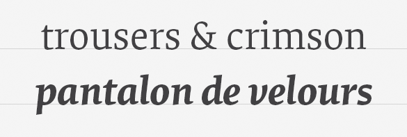
The result is a low contrast typeface of economical proportions, moderate x-height and spare details. The influence of the broad-nibbed pen is conspicuous but tempered by a discreet reinterpretation of its shapes. Soft, brush-like terminations in the lowercase lend an organic note while a strong horizontal movement and tense curves create a structured counterpoint.
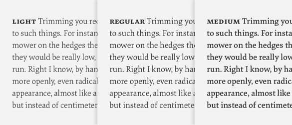
Elena debuted in two weights, Regular and Bold, and was later expanded to include two more, Light and Medium. Rather than follow a traditional linear model though, the additional weights operate as lighter and heavier gradations of the Regular. This creates a range of three text weights, allowing typographers a choice of page color or the ability to apply subtle weight changes across a design. Additionally, it’s easier to combine Elena with another typeface. Having more weights means you can control a page’s hierarchy with increased precision and avoid instances where Elena is too light or too heavy compared to its mate.
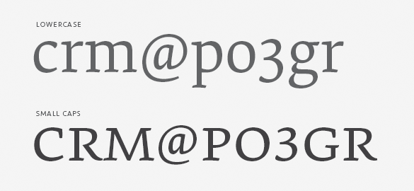
As with all of our typefaces intended for complex typographic tasks, a suite of related parts naturally follows. Small caps, lining figures, tabular lining figures, small cap figures, tabular figures and arrows are all included in the full version of the design. If this sounds excessive for your job, we’ve also designed a basic version with – you guessed it – just the basics for simple tasks and web use with the CSS @font-face rule.