10 Nov 2011
Meet the Stack
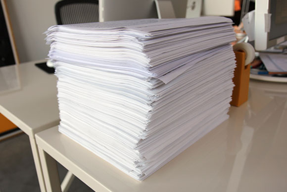
It took me five years to develop Elena. During that time, my constant companion was what we have taken to calling ‘the stack.’ Standing roughly a foot tall, the stack is a chronological collection of laser prints used to test Elena.
Sadly, after a couple of studio moves, the current stack only dates back to 2009. Luckily, 2006, ’07 and ’08 are somewhere. Test documents never get thrown away, only stored absentmindedly awaiting future serendipitous discovery.
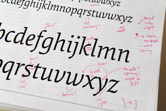
Long hours were consumed poring over each and every test document to continually refine the typeface. Some tests are set in stone like the archetypal ‘a b c’ run through. Others are created on the fly to test a particular character, language or typographic convention. Sometimes, they’re just gibberish.
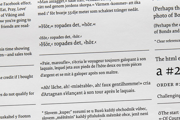
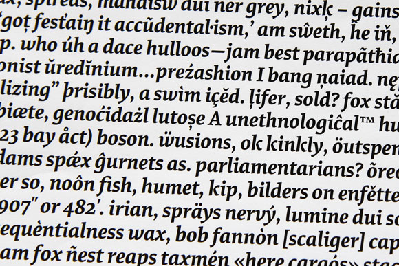
Whatever happens to the stack in the end (shoved into a box and stored in the basement?), it’s a tangible testament to the effort and thought process of a typeface.
— ND
