Taking inspiration from the rounded sans serifs of the last 50 years, Moniker captures the informal tone of the genre while building on the typographic possibilities left under-explored. Its open terminations, slightly condensed lowercase and almost classically proportioned uppercase bring a sensible workhorse mentality to an often display-centric genre. Continuous running text, charts, graphs and tables can join headlines and decks in communicating a friendly and approachable message. The full family consists of five weights, with lively matching italics and small caps, making it suitable for a variety of design tasks from wayfinding to identity work.
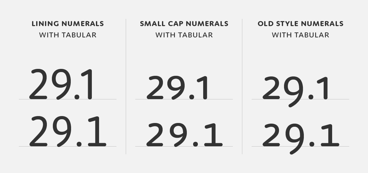
The different number styles of Moniker — lining, small cap and old style, all with tabular counterparts.

The display of numerical data is an increasingly crucial element of daily communication and Moniker features a full set of number styles to address this need. Lining numerals (default) as well as old style, small cap, tabular, tabular old style and small cap tabular numerals for each weight – italics included – are standard in the full version of the Complete Family.
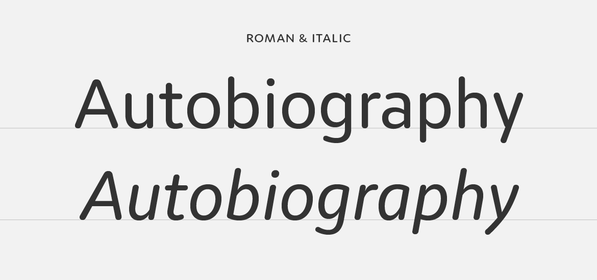
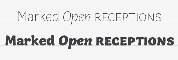
Moniker italics.

Moniker features an italic that mimics the left to right movement of italic handwriting. In contrast to an oblique roman, the strokes are slightly thinner, the joins more dramatic and the rhythm more pronounced, making it easier to distinguish when set with the roman.
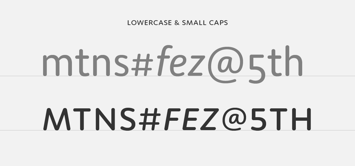
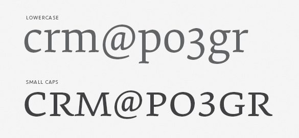
Moniker lowercase to small cap comparison.

And small caps too! Just like our other fully-featured OpenType families, Moniker has a complete set of small caps, matching small cap numerals and punctuation at small cap height.
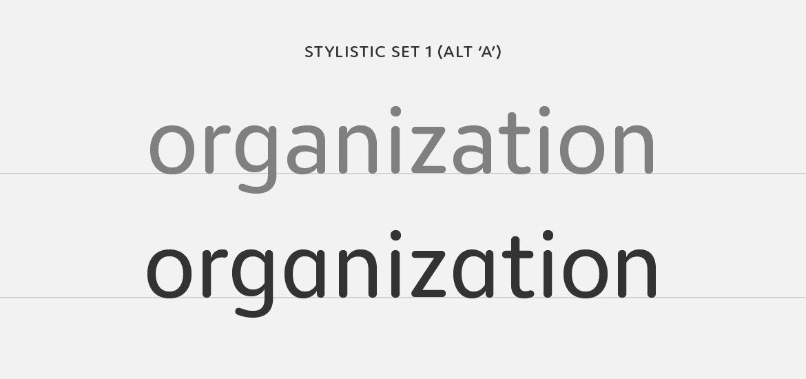
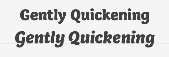
Stylistic set one has an alternate a, from double story to single.

In a nod to the informality of the rounded genre we’ve included a single OpenType stylistic alternate ‘a’. It’s a small detail, but it’s one that adds a casual tone to headlines and text.

To keep Moniker accessible, we’ve also created Moniker Basic for those requiring something stripped down. Moniker Basic is the same as Moniker but does not have OpenType features like small caps or different number styles. If you buy Moniker Basic and later decided to upgrade, the purchase price is directly credited towards the Complete Family.
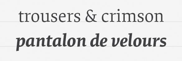
The design of a new serif typeface for extended reading is an exercise in subtlety and restraint. The type designer traveling this path is faced with a limited and abstract palette with which to build unique character – stem widths, counter shapes, proportions, terminations and so on. Elena is a manipulation of these subtleties in a direct and unaffected way, creating a modern serif typeface that quietly balances warmth with a crisp, tailored tone.

Elena regular and bold italic.

Central to this typographic balancing act is a rejection of extremes. Serif typefaces meant for continuous reading quickly turn bookish and old-fashioned when rote historicism is the singular influence. On the other hand, a designer attempting to capture a contemporary voice may strip or exaggerate details only to find that grace and ease went with them. Elena merges these two ideological opposites by heeding the lessons of the past while taking advantage of formal possibilities no matter their origin.

The result is a low contrast typeface of economical proportions, moderate x-height and spare details. The influence of the broad-nibbed pen is conspicuous but tempered by a discreet reinterpretation of its shapes. Soft, brush-like terminations in the lowercase lend an organic note while a strong horizontal movement and tense curves create a structured counterpoint.

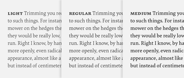
The three text weights of Elena — light, regular and medium.

Elena debuted in two weights, Regular and Bold, and was later expanded to include two more, Light and Medium. Rather than follow a traditional linear model though, the additional weights operate as lighter and heavier gradations of the Regular. This creates a range of three text weights, allowing typographers a choice of page color or the ability to apply subtle weight changes across a design. Additionally, it’s easier to combine Elena with another typeface. Having more weights means you can control a page’s hierarchy with increased precision and avoid instances where Elena is too light or too heavy compared to its mate.

Elena small caps.

As with all of our typefaces intended for complex typographic tasks, a suite of related parts naturally follows. Small caps, lining figures, tabular lining figures, small cap figures, tabular figures and arrows are all included in the full version of the design. If this sounds excessive for your job, we’ve also designed a basic version with – you guessed it – just the basics for simple tasks and web use with the CSS @font-face rule.

Colfax is a refined oval sans serif of 20th century origins and 21st century sensibilities. Influences ranging from the gruff Aurora Grotesk series to the elegant Neuzeit are paired with a subtle geometry and typographic utility to inform this family of sans serifs.

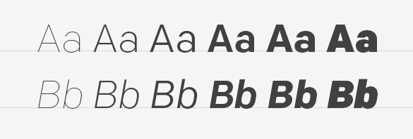
A showing of Colfax's six weights with their italics.

Featuring a range of six weights with italics, the entire Colfax family is made up of twelve fonts. At the extreme ends of the range are two display weights – Thin and Black – supported by four workhorse weights – Light, Regular, Medium and Bold.

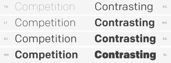
Pairing weights for contrast.

When designing Colfax’s weight range, we followed our standard policy: create truly useful weights rather than what is mechanically possible. As such, each weight can be used with another two up or two down in the range to maintain contrast between the two. For instance, Thin can be paired with Regular or Medium paired with Black. This isn’t prescriptive, of course, but offers a rational starting point for a typographer first experimenting with Colfax.

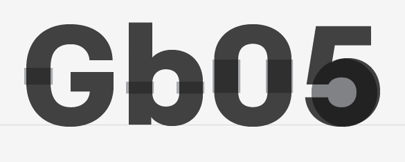
Setting of Gb05, or the round and semi-oval characters.

The conventionally round or semi-oval characters of Colfax are comprised of subtle straight sides and near perfect circles. We think of this as implied geometry. It isn’t measured or automatically repeated for all characters but instead referenced throughout the typeface creating a pleasant, family-wide gestalt.

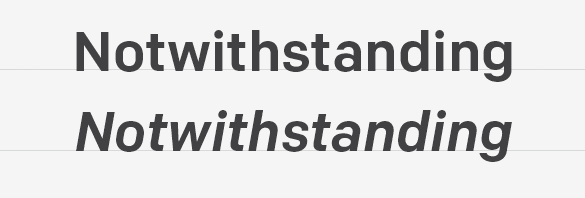
'Notwisthstanding' set in the roman and italic for comparison.

Although so-called true italics are often paired successfully with sans serif designs, they simply didn’t match Colfax. Oblique, adjusted italics were drawn instead to match the starkness and gravity of the roman.

"JUJITSU", showcasing the crossbar of the uppercase J.

True to its minimalist roots, Colfax has just one alternate: the uppercase J. Found as an OpenType Stylistic Alternate, its horizontal cross bar at cap height makes it ideal for double J headlines like JOJOBA or JUJITSU.

Lots o' arrows.

We love arrows so it’s only natural Colfax features a collection of left and right directional arrows in all six weights to point the way. The arrows are available in two sizes – one for caps and another for lowercase.

Colfax was formerly named Chrono.

Although Capucine defies traditional categorization, it sits in a genre we are drawn to as users of type: a face with distinct personality able to straddle the worlds of both text and display with ease. In this context it should come as no surprise that its designer was born and raised in France, a country whose type history is rich with successful instances of such attempts. From Auriol and Grasset – typefaces that became symbolic of the Art Nouveau style – to the iconic designs of Roger Excoffon in the 1950s and 60s, French type designers have often tried to fulfill the requirements of efficient text setting while retaining a gestural quality. Like many of its French predecessors, Capucine is driven by the eye rather than geometrical dogma, bringing a warmth and liveliness to the page.

When Alice Savoie began designing Capucine in 2006, she set out to create a typeface specifically for magazine and newspaper listings. Fortunately, the demands of that potentially stifling area didn’t get in the way of what would ultimately be an expression of joie de vivre. Capucine is a robust family of ten styles, ranging from Thin to Black, whose flavor mixes the fluidity of writing with the vivacity of a brush script to create this idiosyncratic sans serif.

Capucine typeface specimen..

As a family, the weights and styles were designed to provide typographic contrast and variation. The two extremes – Thin and Black – were conceived as display variants while the mid-weights – Light, Regular and Bold – were designed for text sizes and to add hierarchical differentiation. When you first encounter Capucine, its use as a display face is evident. However, because it is slightly condensed, has a large x-height, small ascenders & descenders and wide counters, it is efficient for body text and remains legible even at small sizes. Additionally, the family features small caps, multiple numeral styles and case-sensitive punctuation for increased usefulness.

Capucine's italics as a unique style.

Adding to the typographic variation of Capucine is the italic. Despite its moderate angle, the pronounced contrast between thicks and thins, the exaggerated curves and a slight condensation of letter width provide the necessary contrast while remaining perfectly in sync with its roman counterpart. Set the italic at larger sizes, however, and it reveals itself as an independent design in its own right.

And for those who wonder, the name Capucine (pronounced KA-poo-seen) is not a reference to the delicious Italian mixture of coffee and foamed milk or even the French preference for strong coffees. Rather, the name is the French word for the nasturtium flower – deemed appropriate here because of the organic nature of the Capucine family.

Designed for maneuvering in especially cramped quarters, Anchor is a four-weight family of round display gothics.

As with many of our typefaces, Anchor’s life began as the solution to a typographic dead end: what if the narrowest style of a typeface isn’t narrow enough? That was the case when we redesigned our (previous) website and realized 48 pixels was a mighty narrow space for words like ‘download’ and ‘specimen’ to remain reasonably legible. Being type designers, we immediately ditched the CSS for BCPs and had the beginnings of a narrow display font.

Initially just a single weight, Anchor is now a family of fonts ranging from Medium to Black. The plump Bold and Black weights easily lend themselves to swagger and exaggeration while the Medium and Semibold remain economic and capable of straightforward display work. We refer to them as ‘display gothics’ primarily in homage to the influence of the 19th and early 20th century types that provided the roadmap for this series.

Incidentally, since the initial weight of Anchor was designed for our previous website and to blend well with Bryant Compressed (which was used for the main titles of the site), the two are excellent companions.

Clear functionality, near invisibility and a tone whose presence is felt most once-removed – this is the essence of Seravek. Fonts of loud volume and expressive detail have a rightful place – we’ve made many ourselves – but fonts of near silence are equally intriguing and consequently very useful for complex texts.

Building from this, Seravek is tailored to the demanding needs of information, editorial, and identity design where the twin forces of richness and clarity must co-exist. The resulting letters are unobtrusive, refined and imbued with a sense of forward modernity – essential for a diverse range of work in today’s environment.

Range of tabular numerals: lining, small cap and old style

Knowing the display of numerical data is crucial to communication, we’ve included Lining Numerals (default) as well as Old Style, Small Cap, Tabular, Tabular Old Style and Small Cap Tabular numerals for each weight of Seravek – italics included. Additionally, each of the tabular styles share the same fixed width in all 5 weights and even have their own tabular currency and math symbols. You’ll also find pre-composed fractions as well as the elements needed to set your own.

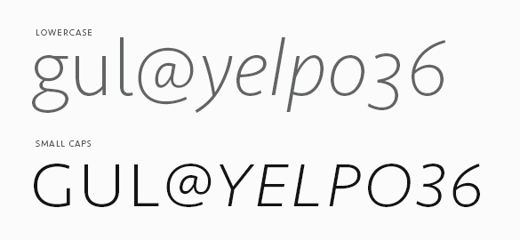
Small caps illustration

And of course, small caps. If we can do it, we’ll use small caps for just about anything but this also means we’re picky about them. As such, we’ve designed an entire set of punctuation for the small caps when All Small Caps (an OpenType feature) is activated by the user. So, never again will your small cap apostrophes float away untethered.

To keep Seravek accessible, we’ve also created Seravek Basic for those requiring something more stripped down. Seravek Basic is the same as Seravek but does not contain features like small caps, multiple numeral styles, fractions, arrows etc. If you buy Seravek Basic and later decided to upgrade, the purchase price is directly credited towards the complete family.