2 Apr 2021
New release: Sculpin
Introducing Sculpin — a stew of American sign painting, Swiss Modernism, and the stone chisel rendered to life in Bézier curves. The family is five weights, with matching italics, and a weight-axis variable font.
Introducing Sculpin — a stew of American sign painting, Swiss Modernism, and the stone chisel rendered to life in Bézier curves. The family is five weights, with matching italics, and a weight-axis variable font.
Typecon 2019 is coming up and it’s hosted in our glorious home state of Minnesota. Find here a totally random collection of items that may be of use when you’re in town.
Minnesota has plenty of place names that aren’t intuitive to pronounce, even for native English speakers. So if you’re wondering, here’s how you pronounce the following:
The Cities plant-based scene is bursting right now. Downtown Minneapolis is still a little sleepy, but it’s do-able. Behold the map below. It shows places where you can find vegan food that is clearly marked as such on the menu, along with specialty grocery stores and places to get sweets. But, that doesn’t mean you won’t find vegan food at other restaurants. Many of the Cities Asian restaurants can easily accommodate vegans and have been doing so before “vegan” was a thing. By the way, if you’ve never had mock duck, this is your time to try it. Also, there are usually food trucks downtown but check out the next section; that might be a weekday-only option.
The core of downtown Minneapolis generally caters to office workers. That means many restaurants and shops are only open Monday through Friday, 9 to 5ish. This is particularly true if a business is located in the skyway (a series of enclosed walkways that connect buildings so you don’t have to walk outside in the cold winter). Make sure to check hours before heading someplace downtown on the weekend.
The Minnesota State Fair is happening during Typecon. Honestly, you’re either a fair person or you’re not, and I wasn’t for many years until I had a child. But, if you are a fair person and you happen to be vegan, this list of vegan fair foods will come in handy:
Minnesota isn’t all “ya, you betcha” and Ole and Lena. We have amazing communities who’ve shared their native food cultures with us via restaurants. Food is extremely personal but when I think of the cuisine of the Cities, it is without a doubt from the Southeast Asian communities. If you can find some hotdish, by all means indulge, but here are alternate avenues to explore:
For the two of you who like going to new grocery stores when you visit unfamiliar cities, let me introduce you to United Noodles, a pan-Asian grocery store with 15,000 square feet of space that houses everything from fresh produce to snacks to small personal goods. If you need mango powder, sticky rice, mochiko, gochujang, sweet soy sauce, dark soy sauce, cooking sake, or you just want to find some sweet sesame snacks, United Noodles has you covered. And there’s so much more! Best of all, you can have lunch at their Unideli. This part of town is fairly industrial, so it won’t make your list of aesthetically pleasing trips, but Guy Fieri went there. I mean, come on!
If you’re like most typophiles, rummaging a city’s used bookstores is a priority when visiting. Sadly, there’s no Collinge & Clark in Minnesota and the antiquarian book scene is pretty dismal. However, you can try any Half Priced Books, James and Mary Laurie Booksellers downtown, or Magers and Quinn in Uptown. You might get lucky and find something interesting. Or, go to Walker Art Center and visit their gift shop and book store for new art and design books. Check out some contemporary art while you’re at it.
If you’re staying downtown and want to get in a run, I recommend heading toward the Mississippi River where there is a walking/bike trail that runs along its banks. When I lived downtown, I used meet the trail at the North Loop Playground then followed it all the way to the Stone Arch Bridge, went across the bridge then turned around and headed back. Not the most inventive loop but it got the job done and I didn’t get lost. If you’re sense of direction is better than mine, check out these routes:
If you can make it out of downtown, the Chain of Lakes, or any one of the three major city lakes which forms the chain, makes for a nice run:
See you at the conference! — Nicole
First, what are they?
For many years, type designers have used interpolation to help them make fonts. Imagine creating a new font and only two weights are completely drawn. By using interpolation, a type designer can create a full range of weights between the lightest and heaviest designs without having to draw each intermediate weight by hand. From Thin and Black, for example, it’s possible create the weights in between like Light, Regular, Medium, and SemiBold. These are called instances in interpolation land.

A typeface family might start by drawing the two extremes — the lightest and heaviest weights. The type designer draws these “by hand”, in contrast to the other weights that are created through computer generation/interpolation.
Variable fonts bring the power of interpolation to the font user. Instead of only the type designer’s pre-set weights to choose from, the entire spectrum becomes available. If a user likes the bold but they want to shave off a little weight because the font looks a pinch too heavy in certain web browsers, they can.
We’re using weight in our example, but variable fonts can also interpolate between roman and italic or standard and condensed widths. These are called axes, and every variable font will contain different axes. Some will include only a weight axis, others could include axes for optical sizing, contrast, changing terminals or grades.
The benefits
You’re already starting to see why variable fonts are exciting. The two most obvious benefits are typographic flexibility and reduced file size. Font users are able to more finely control the display of the fonts, changing the weight or width (or other axes) to respond to particular design or environment challenges. Sometimes the change is purely for aesthetics or fun.
On the web, where file size matters, it’s possible to deliver the choice described above in less bandwidth. Take our font Indivisible Web as an example. The traditional family is made up of 14 files each about 34k, totaling 476k (all files are WOFF2). The variable font, that contains the entire weight range plus all interpolated possibilities in between, is just two files totaling 108k. It’s not hard to appreciate the math there.

As designers and type makers delve deeper into what’s possible, innovative variable fonts and implementation ideas emerge. To get you started, have a look at: Variable fonts and the future of web design, the Faux Foundry, and Considering the old, designing the new.
The detractions
Being new, variable fonts are still in beta mode, literally. The tools type designers use to make them are still being refined and the world of software is still figuring out how to support this new format. As one might expect with a developing technology, not all software programs and browsers support variable fonts.
But (but!), many of the latest browsers do support them. And to follow that silver lining with bad news — using the fonts in just about any desktop app is a no-go right now with the exception of relatively recent versions of Photoshop CC or Illustrator CC. Find out more about what is supported where:
One final point about interpolation
Creating fonts that interpolate cleanly between hand-drawn instances or masters is an art and science. When interpolation is used to create a traditional (non-variable) font family, the results are often hand-tuned to bring back the snap and life that interpolation can suck out of the type. In other words, interpolation can result in a loss of quality when not done well. So, while interpolation is a time-saving tool for type designers, creating fonts that interpolate well is not as simple as the first diagram may have lead you to believe.

Although a type designer might be able to get away with hand-drawing only two weights, interpolation is often more complicated. This shows how Indivisible was created — hand-drawing four critical weights with only three created via interpolation (not to mention that there are also intermediate masters, but that’s a rabbit hole for another day).
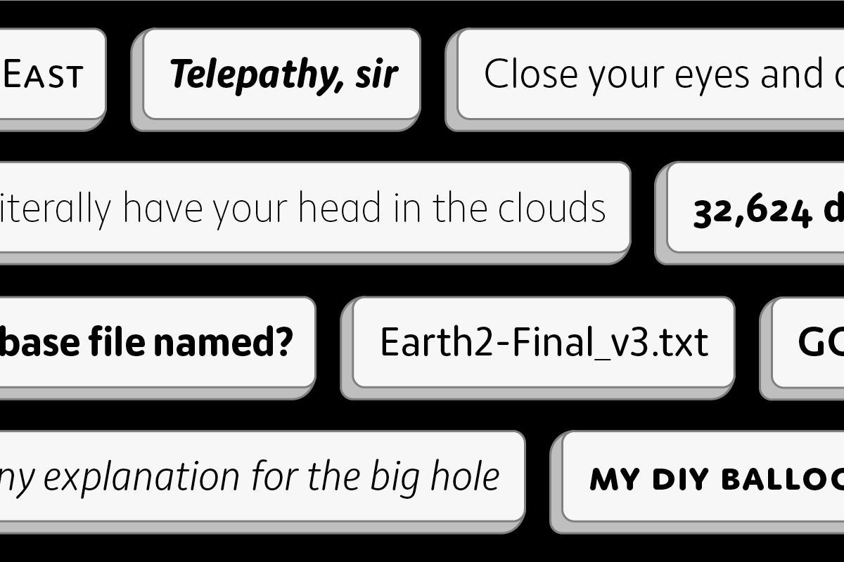
There are many benefits to variable fonts but they are also grounded by real-world constraints. Just make sure that while your head is in the clouds, you keep one foot on the ground!
Additional resources
Let’s get the obvious out of the way — we redesigned our website! Besides a visual refresh, we made a number of changes to make buying fonts from us easier and more convenient. So, what changed?
Currency
If you’d prefer to pay in another currency besides USD, you can! Forget currency exchange fees from your credit card company and pay in Euro, GBP, Australian or Canadian Dollars as well.
OpenType-featured webfonts
Font families with advanced OpenType features are now available as webfonts. Go ahead, use the small caps on your website!
Compare font families
Test different font families side-by-side. Whether you want to simply compare fonts, or find headline and body companions, it’s now possible to see fonts from different families together in the new type tester.
Mobile app licenses
You can now purchase a license for your mobile app directly on our website.
Clearer licenses
Usually the first thing you want to know when reading a font license is what you can and can’t do with the fonts. Knowing this, we reorganized the usage portion of our licenses into two sections — 1) what you can and 2) what you can’t do with the fonts. We hope this makes the license clearer and gets you to what you want to know faster.
No more domain limits
We removed the single domain limit from our webfont license. This makes purchasing easier on a number of fronts, for example, when you aren’t sure what the domain name will be, working in multiple development environments, or when organizations have multiple websites.
Email and digital campaigns
With the domain restriction removed, it paved the way for adding email campaign and digital advertisement usage rights in our webfont license. No need to purchase a separate license, just licenses the number of pageviews that cover those multiple uses.
Subsetting allowed
Want to knock down the file size of a webfont? Removing characters in a font, or subsetting, is now allowed by our webfont license. Chisel away, but do it carefully!
Those are the big changes. There are smaller tweaks here and there, too. For instance, some of you weren’t sure whether our fonts could be used for commercial purposes (they can!). Even though we felt this was implicit in the act of purchasing a license, we didn’t want anyone to have to guess or worry so we added it into our licenses. Problem solved.
One more thing before you go.
If you’ve previously purchase a webfont license from us, the license you purchased at the time is still in effect and none of these new terms apply. You can upgrade to the new license at any time though. Just sign in to your account and visit the purchase options page of your previously purchased webfont to see upgrade options.
© Norman Posselt (Monotype)
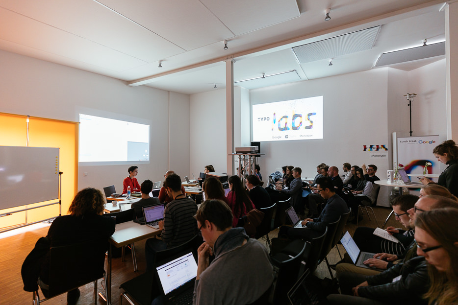
More than a week ago, I was in Berlin leading a workshop on bash shell scripting at the TYPO Labs 2017 conference (get a run down of my workshop on the TYPO blog). Shell scripting definitely sounds mysterious and impenetrable if you’ve never indulged. However, it’s a relatively straightforward way (or it can be) of telling your computer what you’d like it to do in a text file rather than clicking around a GUI. What’s great about it is that even writing simple scripts, however inelegant they may be, can save you valuable time.
I started learning bash shell scripting by looking at other scripts that dealt with fonts. So, I’m posting the script we wrote in my workshop to help someone else get started.
The script: make-specimens.sh
The script takes a folder of TrueType fonts and creates an HTML webfont specimen for each one. The specimen is a pre-written HTML file that gets copied over into a specimen folder, along with other required files, and a find/replace is performed to insert the name of the font in the @font-face path. There is also an option to run the fonts through TTFAutohint, but it must be installed for that to work. There are instructions on how to run the script in the script itself (just open the file in a text editor) but they assume a small amount of knowledge.
Keep in mind the important thing isn’t necessarily what the script does, but the methods it presents — looping through fonts, using and modifying variables, or writing if statements, for example. They are useful beginnings.
Download the script and supporting files: Make-Specimens-Script.zip
Learning More
There are more shell scripting tutorials then you could possibly ever read. Here are some I’ve bookmarked at varying levels of depth:
Writing Shell Scripts
A quick guide to writing scripts using the bash shell
Shell Script Basics
Bash scripting quirks & safety tips
One Last Thing
In my workshop, I started by showing a script I wrote that packages our fonts — creating folders, putting the right fonts in the right folders, injecting a license into each one and finally zipping them all up. Here are lines for two important steps in that process:
The line below copies a file into every folder in the working directory. It will not copy the file into subdirectories of those folders. Change <path to license file> to the path of the file you want to copy into each directory.
echo */ | xargs -n 1 cp -R -p <path to license file>
This line zips every folder in the working directory and puts the zipped folders in a folder called ‘xFinalZips’. It will zip the ‘xFinalZips’ folder too but who cares, just delete it! You have to create the ‘xFinalZips’ folder for this to work, so that’s what the mkdir line does. The folder name can be changed to anything you want, of course.
mkdir xFinalZips
find . -type d -d 1 -exec zip -r xFinalZips/{} {} \;
Happy scripting! — Nicole
We’re excited to announce our latest typeface, Moniker by Eric Olson. Moniker is a rounded sans serif that captures the informal tone of the genre while maintaining a sensible workhorse mentality. The family is made up of five weights with lively italics, and with features like small caps and multiple numeral styles, the fonts can take on the small (tables and text) and big (headlines and logos).
Moniker is available for desktop, webfont and app licenses. And it’s offered in full and basic versions. The basic version has a smaller character set — and price — so you can start there and always upgrade later.