In the realm of the command line, where black and white and monospaced fonts reign, the software company Charm is breathing new life into the terminal. Their mission is to make the command line glamorous and if their website is any testament to what they can bring to your CLI, they are succeeding.
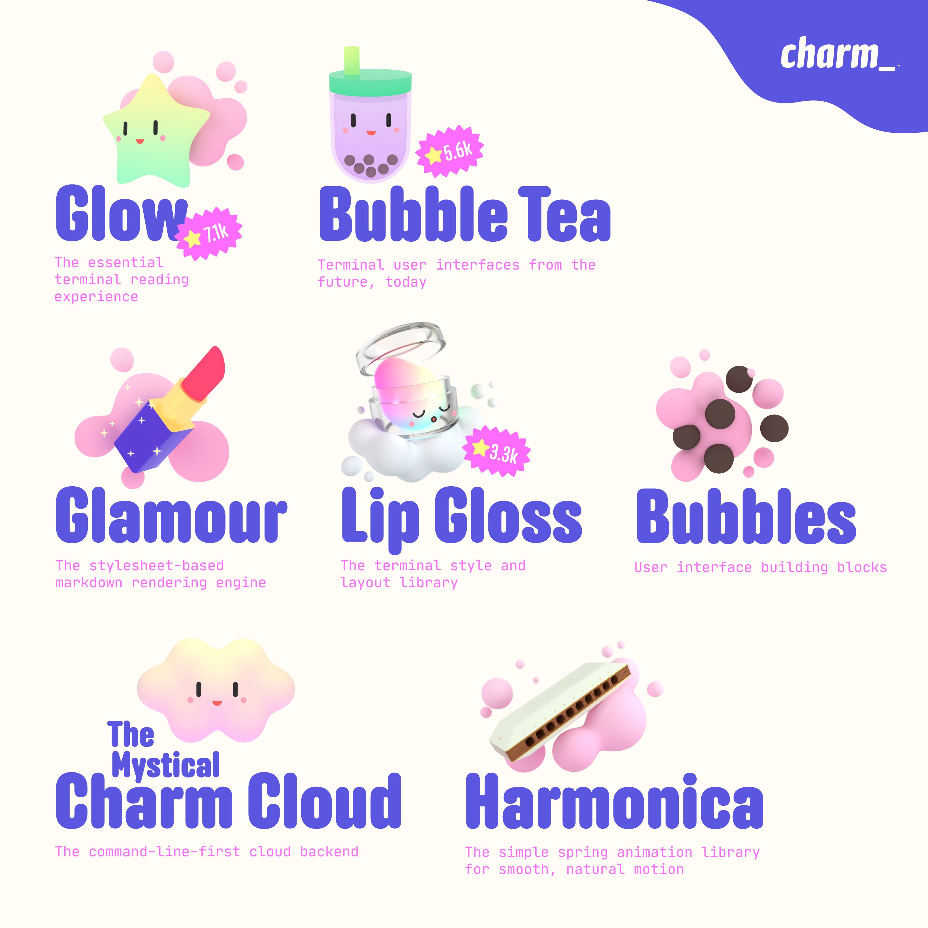
Christian Rocha is the designer behind Charm’s website and uses Anchor as the primary display face. It is whimsical without being silly, and plump enough to support subtle gradients laid on top. Anchor also makes a home for those hypnotic animations of … glowing? chroming? disco? Whatever it is, it’s fantastic.
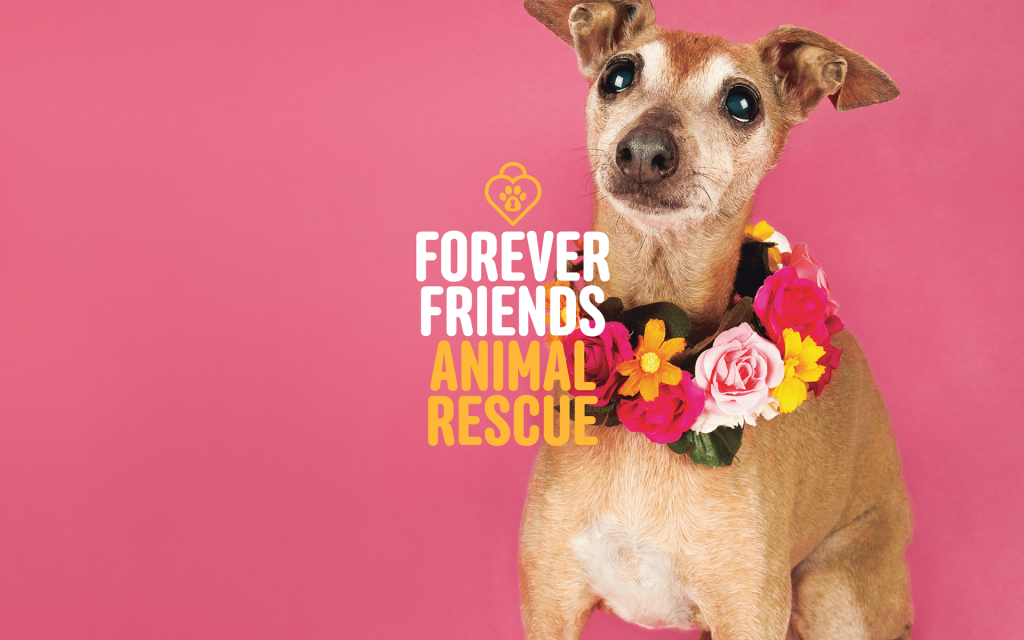
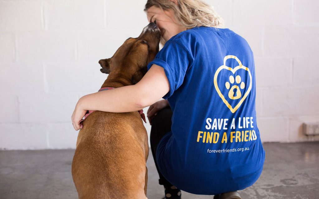
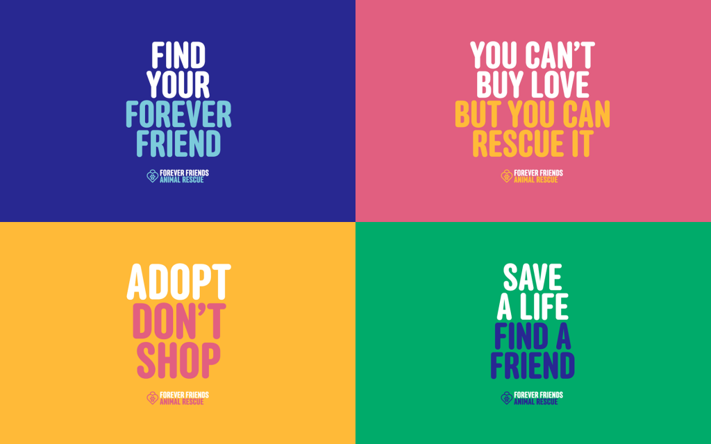
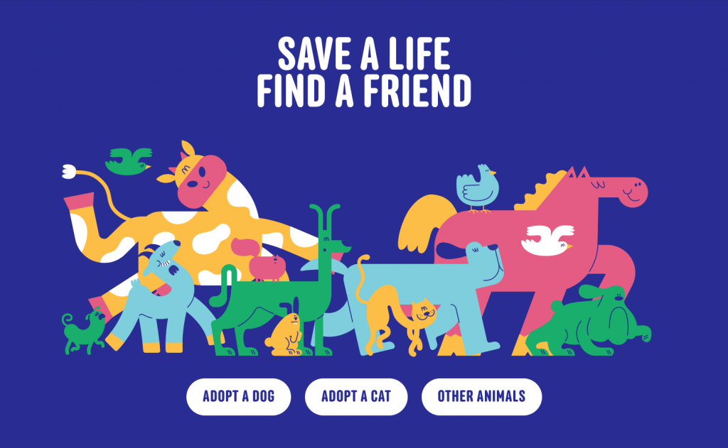
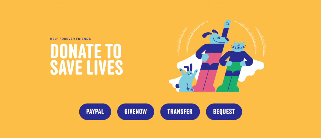
Forever Friends is a volunteer-run organization in Australia that rescues, rehabilitates and rehomes animals in need. Susu Studio completely re-imagined their identity and choose Anchor as the organization’s primary typeface. Photography by Sebastian Avila.
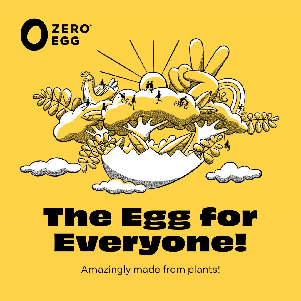
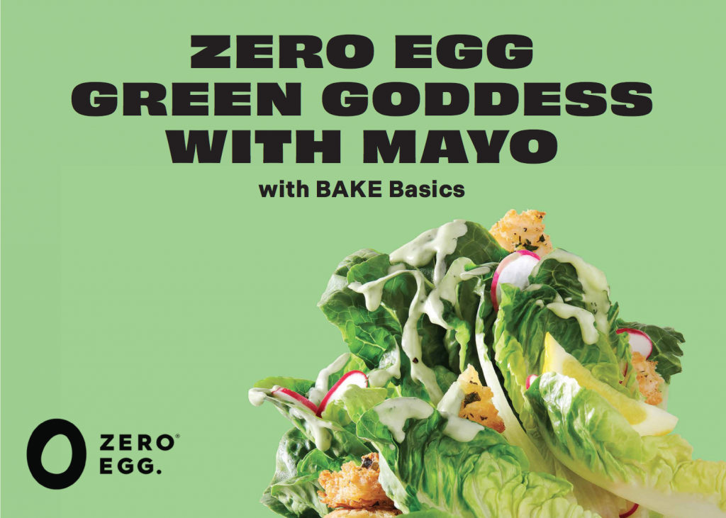
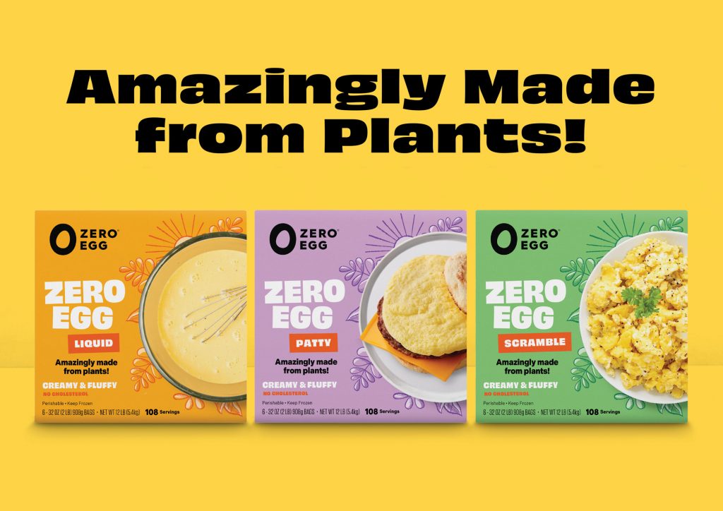
Seattle-based brand firm Partly Sunny was hired by the Israeli company Zero Egg to help launch their product in the United States. They chose Indivisible for sub-heads and body text, with OH no Type Co’s Obviously Wide taking lead on display.
Introducing Sculpin — a stew of American sign painting, Swiss Modernism, and the stone chisel rendered to life in Bézier curves. The family is five weights, with matching italics, and a weight-axis variable font.
Typecon 2019 is coming up and it’s hosted in our glorious home state of Minnesota. Find here a totally random collection of items that may be of use when you’re in town.
Pronunciation guide
Minnesota has plenty of place names that aren’t intuitive to pronounce, even for native English speakers. So if you’re wondering, here’s how you pronounce the following:
The Cities plant-based scene is bursting right now. Downtown Minneapolis is still a little sleepy, but it’s do-able. Behold the map below. It shows places where you can find vegan food that is clearly marked as such on the menu, along with specialty grocery stores and places to get sweets. But, that doesn’t mean you won’t find vegan food at other restaurants. Many of the Cities Asian restaurants can easily accommodate vegans and have been doing so before “vegan” was a thing. By the way, if you’ve never had mock duck, this is your time to try it. Also, there are usually food trucks downtown but check out the next section; that might be a weekday-only option.
The core of downtown Minneapolis generally caters to office workers. That means many restaurants and shops are only open Monday through Friday, 9 to 5ish. This is particularly true if a business is located in the skyway (a series of enclosed walkways that connect buildings so you don’t have to walk outside in the cold winter). Make sure to check hours before heading someplace downtown on the weekend.
The great Minnesota
get-together, vegan edition
The Minnesota State Fair is happening during Typecon. Honestly, you’re either a fair person or you’re not, and I wasn’t for many years until I had a child. But, if you are a fair person and you happen to be vegan, this list of vegan fair foods will come in handy:
Minnesota isn’t all “ya, you betcha” and Ole and Lena. We have amazing communities who’ve shared their native food cultures with us via restaurants. Food is extremely personal but when I think of the cuisine of the Cities, it is without a doubt from the Southeast Asian communities. If you can find some hotdish, by all means indulge, but here are alternate avenues to explore:
For the two of you who like going to new grocery stores when you visit unfamiliar cities, let me introduce you to United Noodles, a pan-Asian grocery store with 15,000 square feet of space that houses everything from fresh produce to snacks to small personal goods. If you need mango powder, sticky rice, mochiko, gochujang, sweet soy sauce, dark soy sauce, cooking sake, or you just want to find some sweet sesame snacks, United Noodles has you covered. And there’s so much more! Best of all, you can have lunch at their Unideli. This part of town is fairly industrial, so it won’t make your list of aesthetically pleasing trips, but Guy Fieri went there. I mean, come on!
Design books, new and used
If you’re like most typophiles, rummaging a city’s used bookstores is a priority when visiting. Sadly, there’s no Collinge & Clark in Minnesota and the antiquarian book scene is pretty dismal. However, you can try any Half Priced Books, James and Mary Laurie Booksellers downtown, or Magers and Quinn in Uptown. You might get lucky and find something interesting. Or, go to Walker Art Center and visit their gift shop and book store for new art and design books. Check out some contemporary art while you’re at it.
Running Routes
If you’re staying downtown and want to get in a run, I recommend heading toward the Mississippi River where there is a walking/bike trail that runs along its banks. When I lived downtown, I used meet the trail at the North Loop Playground then followed it all the way to the Stone Arch Bridge, went across the bridge then turned around and headed back. Not the most inventive loop but it got the job done and I didn’t get lost. If you’re sense of direction is better than mine, check out these routes:
First, what are they?
For many years, type designers have used interpolation to help them make fonts. Imagine creating a new font and only two weights are completely drawn. By using interpolation, a type designer can create a full range of weights between the lightest and heaviest designs without having to draw each intermediate weight by hand. From Thin and Black, for example, it’s possible create the weights in between like Light, Regular, Medium, and SemiBold. These are called instances in interpolation land.
A typeface family might start by drawing the two extremes — the lightest and heaviest weights. The type designer draws these “by hand”, in contrast to the other weights that are created through computer generation/interpolation.
Variable fonts bring the power of interpolation to the font user. Instead of only the type designer’s pre-set weights to choose from, the entire spectrum becomes available. If a user likes the bold but they want to shave off a little weight because the font looks a pinch too heavy in certain web browsers, they can.
We’re using weight in our example, but variable fonts can also interpolate between roman and italic or standard and condensed widths. These are called axes, and every variable font will contain different axes. Some will include only a weight axis, others could include axes for optical sizing, contrast, changing terminals or grades.
The benefits
You’re already starting to see why variable fonts are exciting. The two most obvious benefits are typographic flexibility and reduced file size. Font users are able to more finely control the display of the fonts, changing the weight or width (or other axes) to respond to particular design or environment challenges. Sometimes the change is purely for aesthetics or fun.
On the web, where file size matters, it’s possible to deliver the choice described above in less bandwidth. Take our font Indivisible Web as an example. The traditional family is made up of 14 files each about 34k, totaling 476k (all files are WOFF2). The variable font, that contains the entire weight range plus all interpolated possibilities in between, is just two files totaling 108k. It’s not hard to appreciate the math there.
The detractions
Being new, variable fonts are still in beta mode, literally. The tools type designers use to make them are still being refined and the world of software is still figuring out how to support this new format. As one might expect with a developing technology, not all software programs and browsers support variable fonts.
But (but!), many of the latest browsers do support them. And to follow that silver lining with bad news — using the fonts in just about any desktop app is a no-go right now with the exception of relatively recent versions of Photoshop CC or Illustrator CC. Find out more about what is supported where:
Variable Fonts Support at the OS, desktop app, and web level from Nick Sherman.
One final point about interpolation
Creating fonts that interpolate cleanly between hand-drawn instances or masters is an art and science. When interpolation is used to create a traditional (non-variable) font family, the results are often hand-tuned to bring back the snap and life that interpolation can suck out of the type. In other words, interpolation can result in a loss of quality when not done well. So, while interpolation is a time-saving tool for type designers, creating fonts that interpolate well is not as simple as the first diagram may have lead you to believe.
Although a type designer might be able to get away with hand-drawing only two weights, interpolation is often more complicated. This shows how Indivisible was created — hand-drawing four critical weights with only three created via interpolation (not to mention that there are also intermediate masters, but that’s a rabbit hole for another day).
There are many benefits to variable fonts but they are also grounded by real-world constraints. Just make sure that while your head is in the clouds, you keep one foot on the ground!