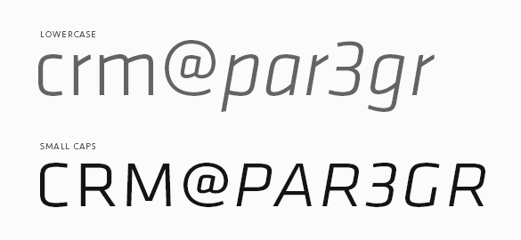
Frustrated with a lack of fonts both versatile and modern, we set out to design Klavika as a full-featured, do-it-all sans serif for the needs of the 21st century. Our result is a design that’s unadorned, modern and infinitely flexible. To achieve this, Klavika follows a decidedly hybrid typographic path – a cross of humanist and geometric influences with allegiances to neither. Crisp and open shapes keep the font legible in small sizes while the straight-sided characters anchor headlines and display work solidly in place. And since part of the goal was flexibility, we’re happy to report that since its introduction in 2004, Klavika has found its way into a wide variety of media from print to pixels.

To be truly versatile, a font should be reasonably extensive as well. Klavika has a wide range of typographic features and – as is common with our fonts – showers special attention on small caps. They are essential for setting acronyms and initials (amongst other things) and excellent for titling and display work. Special attention has also been paid to the width of the capitals, specifically increasing it, for better legibility at small sizes and added punch in headlines.

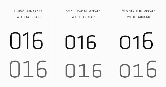
Numerals are another of the typographic features. Because a varied array of numerals is essential to contemporary communication, Klavika contains multiple styles. You’ll find Lining (the default style), Old Style, Small Cap, Tabular, Tabular Old Style and Small Cap Tabular numerals for each weight of Klavika – italics included.
If your requirements don’t call for all those typographic features, Klavika Basic was created with you in mind. It is the same as Klavika but without features like small caps, multiple numeral styles and arrows. If you buy Klavika Basic and later decide to upgrade to the fully-featured Klavika, the purchase price is directly credited towards the complete family.