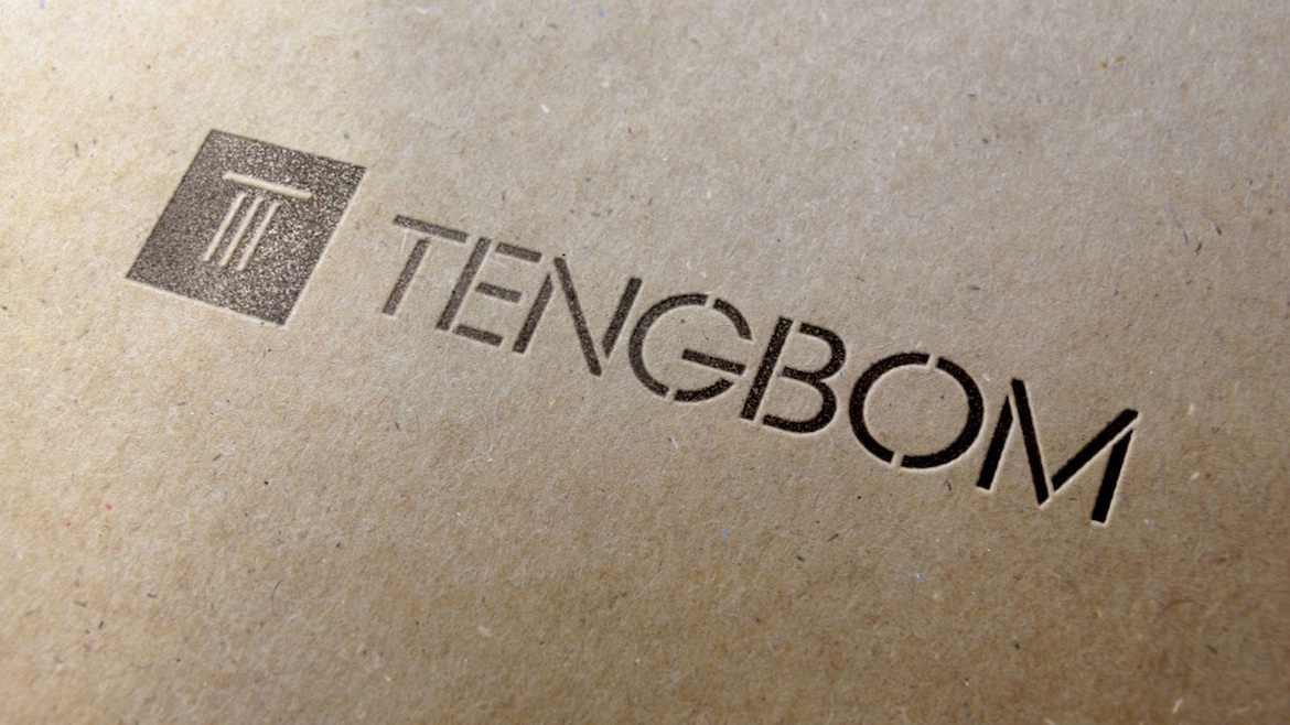
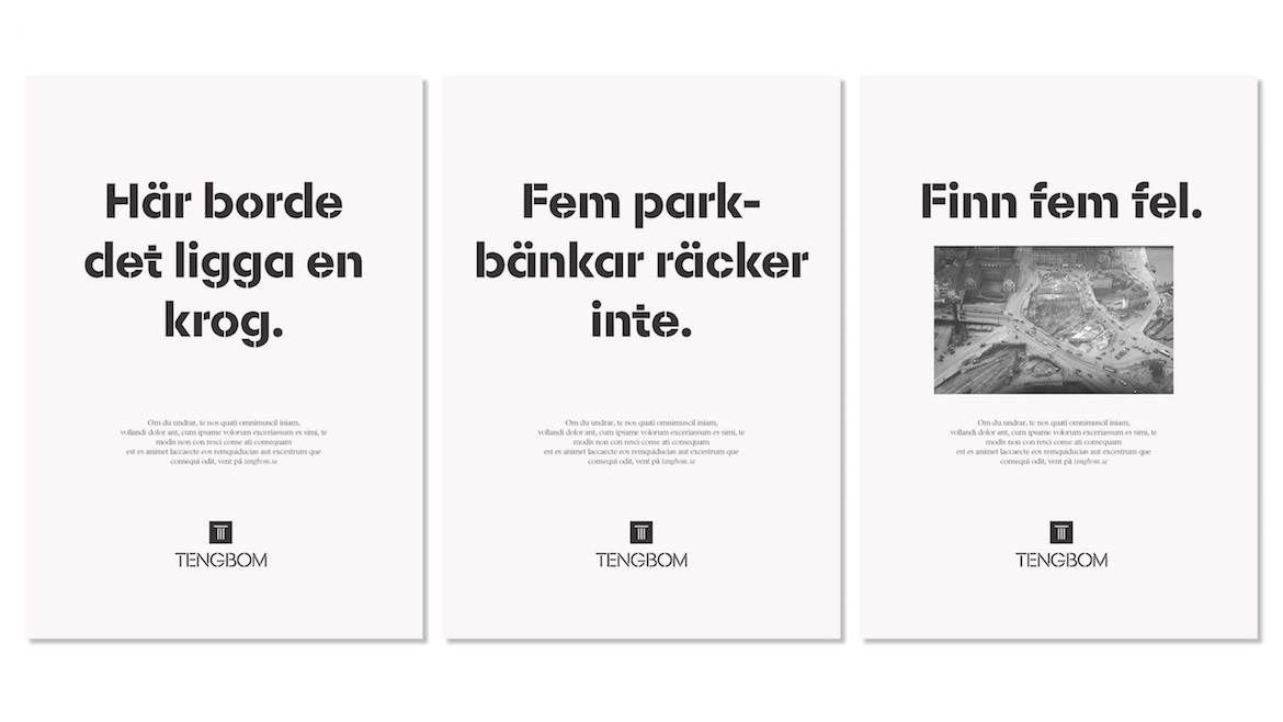
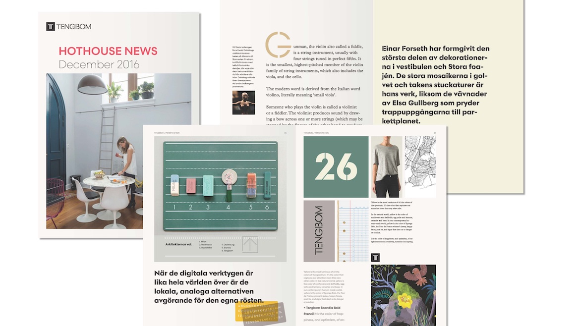
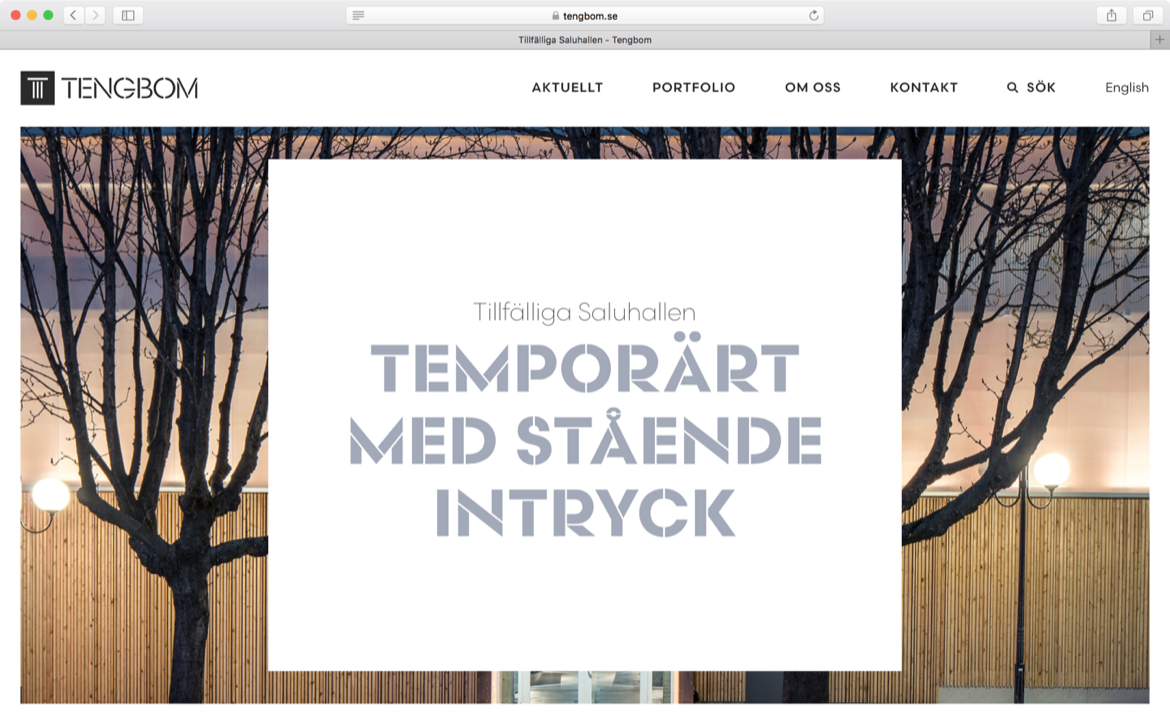
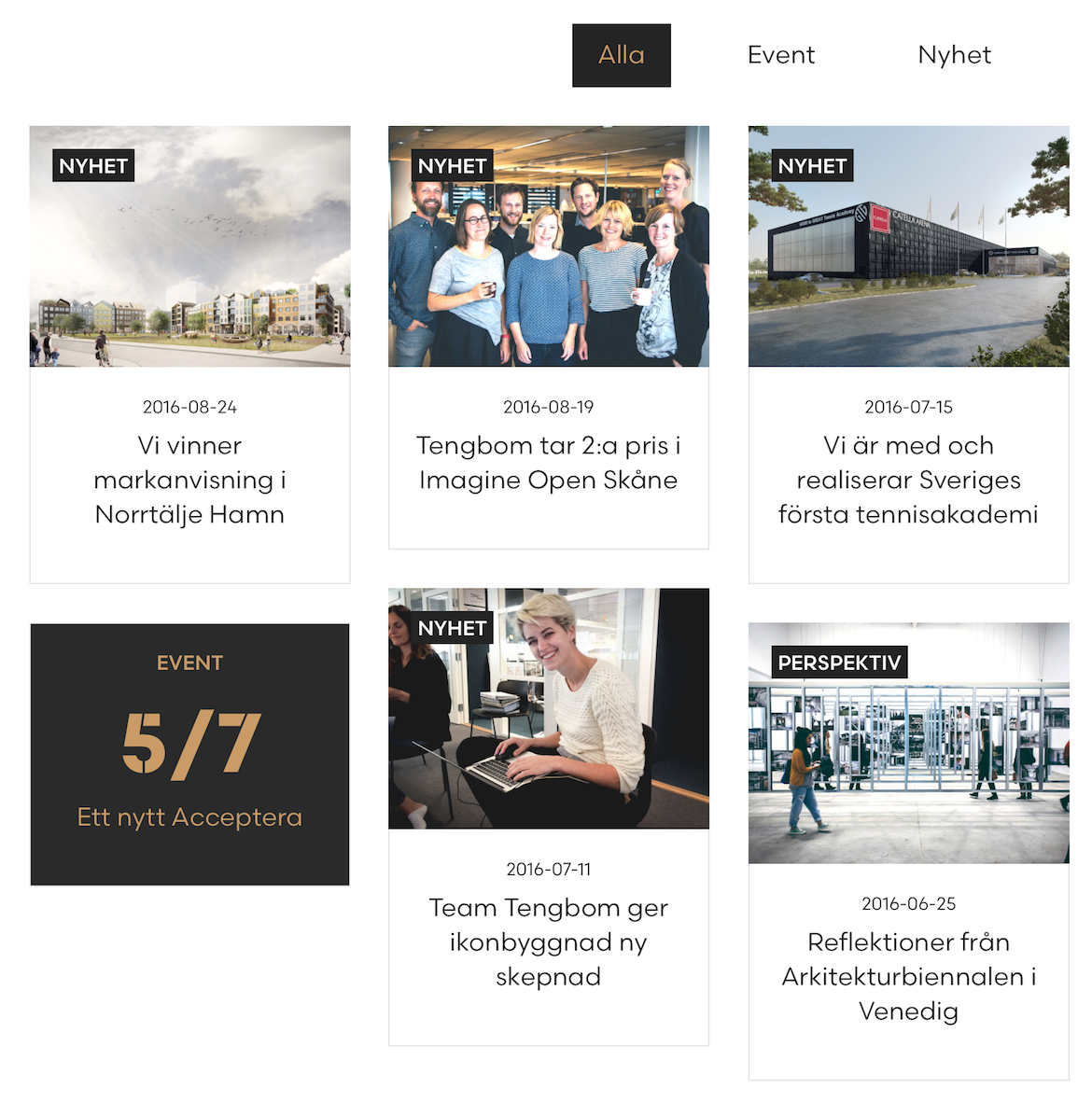
Tengbom, a Scandinavian architectural firm, has a new visual identity and it’s full of Scandia. Developed by Oscar Liedgren Studio, the branding takes full advantage of our latest typeface and also features a new style — Scandia Light Stencil.
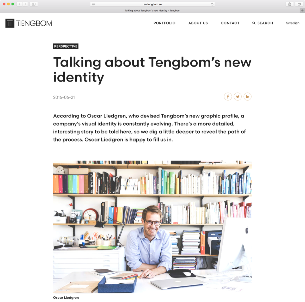
Scandia was released with just one stencil font, but Liedgren thought a second, lighter weight would carry them even further. He came to us after creating Tengbom’s new logo, based on Scandia Regular, and worked with Eric Olson to design the custom font. Since there was always potential for more stencil weights, we’re glad they asked.
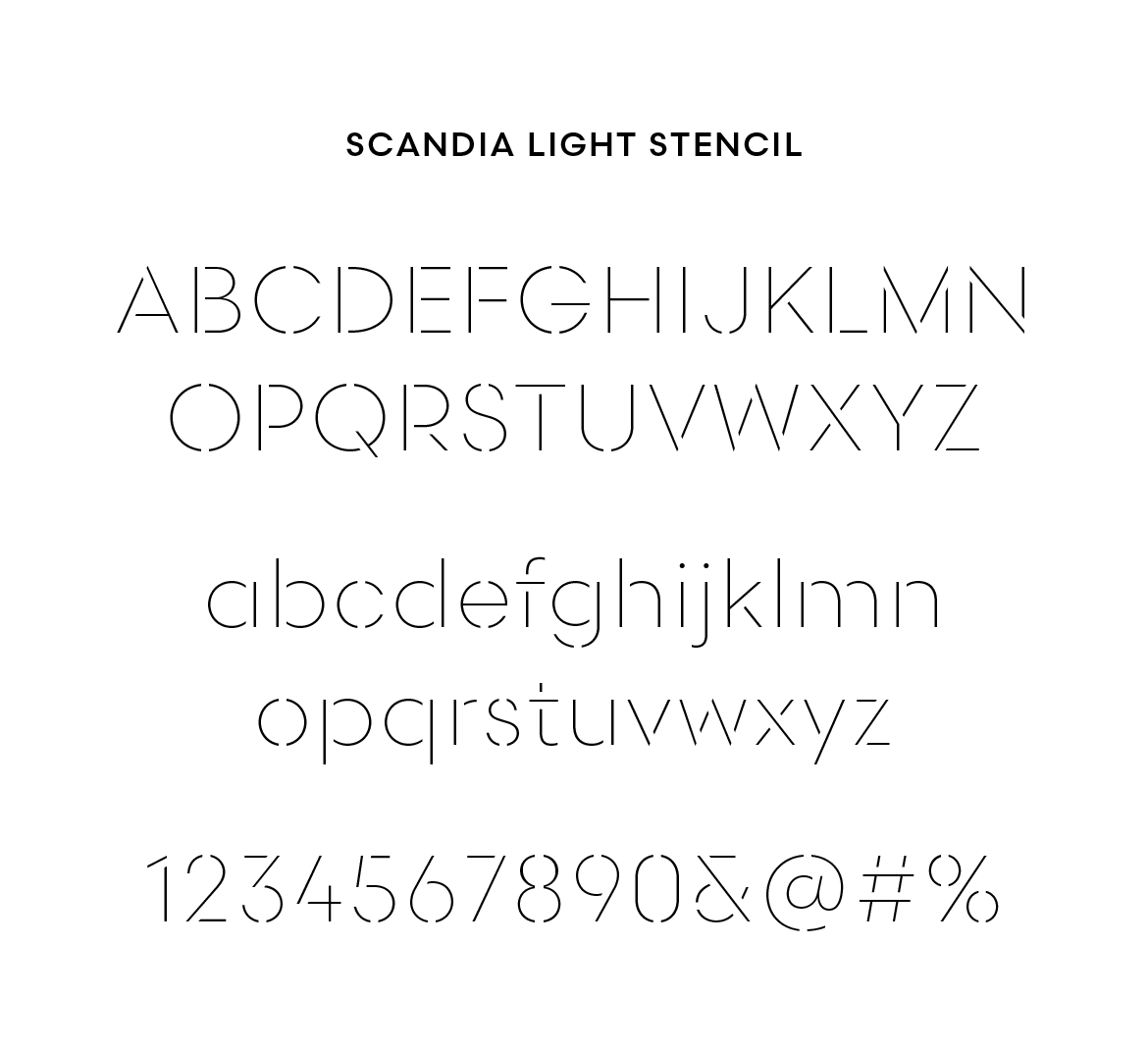
No doubt stencils and architecture have an affinity for each other. Liedgren was keenly aware of the relationship but after surveying the competition, he found it wasn’t as common as he imagined. In the end, their use of stencils accent Tengbom’s own design work, adding a nice level of detail across print and web.
‘I think type in the context of identity can help you either to “belong” to a world (like that of architecture) or “stand apart”,’ Liedgren explained via email. ‘Both are valid strategies and need to be seen in the light of all other graphic elements and imagery at hand. In the end, what makes it work or not, is in the detail, in the craft, and in the way it’s applied.’

—
Visit Tengbom.se to see the webfonts served up. And you can see more in-use samples at Oscar Liedgren Studio. Print images courtesy Oscar Liedgren.