Archive for 2017

A couple of Pique things turned up at once so here we are. Check out Nicole Dotin’s typeface in use for an important NYC Health campaign and then watch two videos about its design. While we’re at it, go ahead and take 10% off any license of Pique offered on the site until end-of-day Friday, August 4th (that’s the ‘week’ in Pique Week). Just use the coupon code ‘piqueweek’ at checkout.


In Use: Bare it All
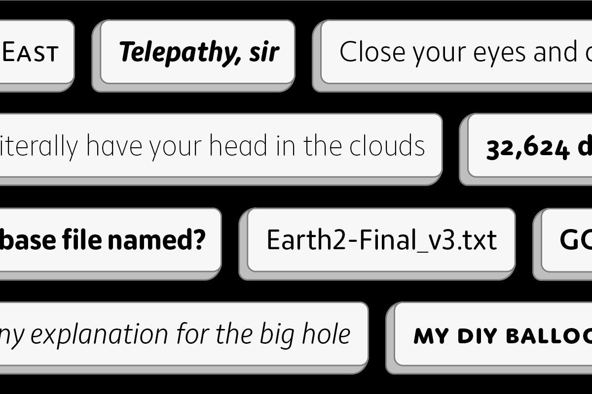
Thanks to Quentin Schmerber for tipping us off to this NYC campaign, after spotting Pique on the subway. “Bare it All” encourages LGBTQ patients to have open discussions with their doctors. And to spread the message, Pique boldly sweeps in across black and white images in print ads and their video.


How was it made?
In the latest Fontribute video, Erin McLaughlin and Thomas Jockin deconstruct and discuss Pique and Lokal Script in some detail.

After watching the video, Nicole picked up her brush marker to (re)construct Pique and show how the marker underpins the design.

To learn more about Pique, visit Pique’s page. #piqueweek

17 Apr 2017

Yep, stop clicking…

© Norman Posselt (Monotype)

© Norman Posselt (Monotype)

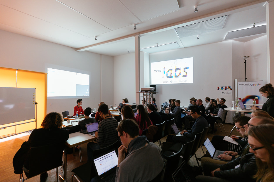
More than a week ago, I was in Berlin leading a workshop on bash shell scripting at the TYPO Labs 2017 conference (get a run down of my workshop on the TYPO blog). Shell scripting definitely sounds mysterious and impenetrable if you’ve never indulged. However, it’s a relatively straightforward way (or it can be) of telling your computer what you’d like it to do in a text file rather than clicking around a GUI. What’s great about it is that even writing simple scripts, however inelegant they may be, can save you valuable time.

I started learning bash shell scripting by looking at other scripts that dealt with fonts. So, I’m posting the script we wrote in my workshop to help someone else get started.


The script: make-specimens.sh
The script takes a folder of TrueType fonts and creates an HTML webfont specimen for each one. The specimen is a pre-written HTML file that gets copied over into a specimen folder, along with other required files, and a find/replace is performed to insert the name of the font in the @font-face path. There is also an option to run the fonts through TTFAutohint, but it must be installed for that to work. There are instructions on how to run the script in the script itself (just open the file in a text editor) but they assume a small amount of knowledge.

Keep in mind the important thing isn’t necessarily what the script does, but the methods it presents — looping through fonts, using and modifying variables, or writing if statements, for example. They are useful beginnings.

Download the script and supporting files: Make-Specimens-Script.zip


Learning More
There are more shell scripting tutorials then you could possibly ever read. Here are some I’ve bookmarked at varying levels of depth:

Writing Shell Scripts
A quick guide to writing scripts using the bash shell
Shell Script Basics
Bash scripting quirks & safety tips


One Last Thing
In my workshop, I started by showing a script I wrote that packages our fonts — creating folders, putting the right fonts in the right folders, injecting a license into each one and finally zipping them all up. Here are lines for two important steps in that process:

One license for each folder

The line below copies a file into every folder in the working directory. It will not copy the file into subdirectories of those folders. Change <path to license file> to the path of the file you want to copy into each directory.

echo */ | xargs -n 1 cp -R -p <path to license file>

Zip each folder

This line zips every folder in the working directory and puts the zipped folders in a folder called ‘xFinalZips’. It will zip the ‘xFinalZips’ folder too but who cares, just delete it! You have to create the ‘xFinalZips’ folder for this to work, so that’s what the mkdir line does. The folder name can be changed to anything you want, of course.

mkdir xFinalZips
find . -type d -d 1 -exec zip -r xFinalZips/{} {} \;

Happy scripting! — Nicole

Taking inspiration from the rounded sans serifs of the last 50 years, Moniker captures the informal tone of the genre while building on the typographic possibilities left under-explored. Its open terminations, slightly condensed lowercase and almost classically proportioned uppercase bring a sensible workhorse mentality to an often display-centric genre. Continuous running text, charts, graphs and tables can join headlines and decks in communicating a friendly and approachable message. The full family consists of five weights, with lively matching italics and small caps, making it suitable for a variety of design tasks from wayfinding to identity work.

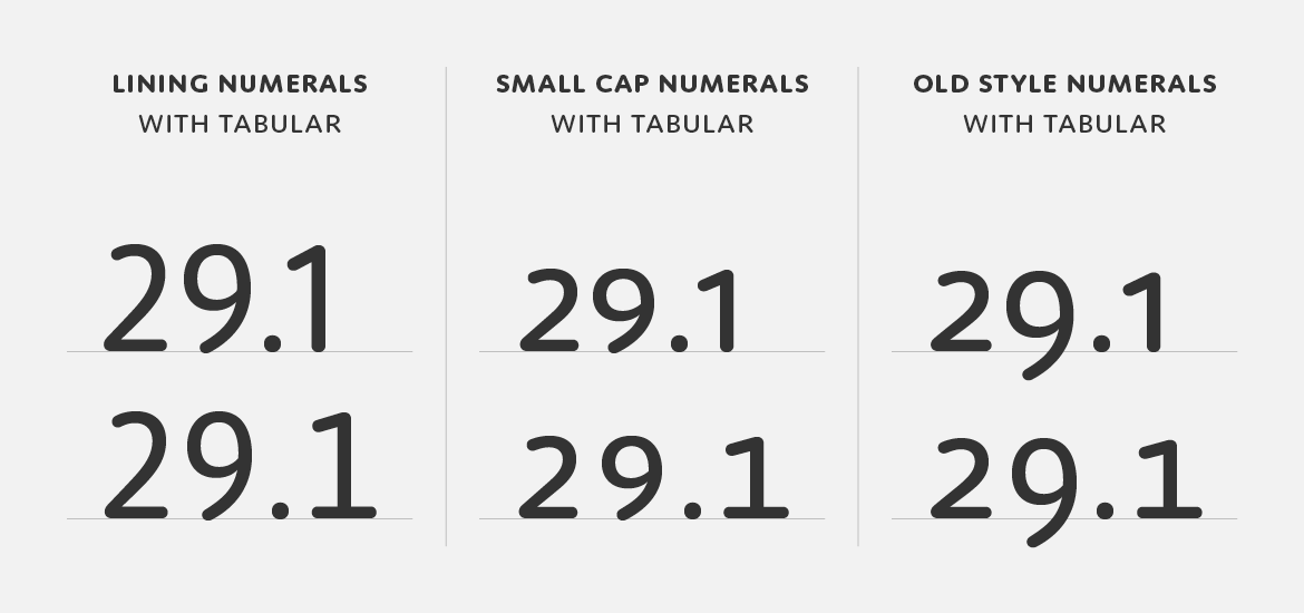
The different number styles of Moniker — lining, small cap and old style, all with tabular counterparts.

The display of numerical data is an increasingly crucial element of daily communication and Moniker features a full set of number styles to address this need. Lining numerals (default) as well as old style, small cap, tabular, tabular old style and small cap tabular numerals for each weight – italics included – are standard in the full version of the Complete Family.

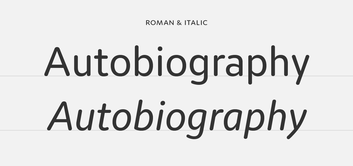
Moniker italics.

Moniker features an italic that mimics the left to right movement of italic handwriting. In contrast to an oblique roman, the strokes are slightly thinner, the joins more dramatic and the rhythm more pronounced, making it easier to distinguish when set with the roman.

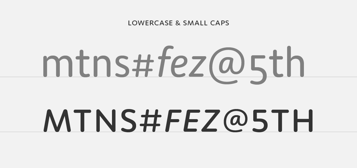
Moniker lowercase to small cap comparison.

And small caps too! Just like our other fully-featured OpenType families, Moniker has a complete set of small caps, matching small cap numerals and punctuation at small cap height.

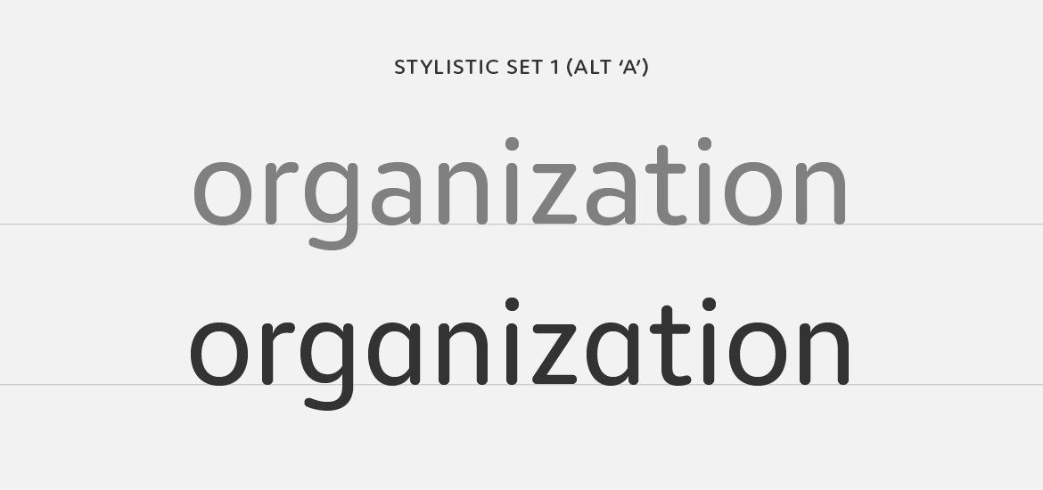
Stylistic set one has an alternate a, from double story to single.

In a nod to the informality of the rounded genre we’ve included a single OpenType stylistic alternate ‘a’. It’s a small detail, but it’s one that adds a casual tone to headlines and text.

To keep Moniker accessible, we’ve also created Moniker Basic for those requiring something stripped down. Moniker Basic is the same as Moniker but does not have OpenType features like small caps or different number styles. If you buy Moniker Basic and later decided to upgrade, the purchase price is directly credited towards the Complete Family.

15 Mar 2017

New Release: Moniker

CM_Moniker

We’re excited to announce our latest typeface, Moniker by Eric Olson. Moniker is a rounded sans serif that captures the informal tone of the genre while maintaining a sensible workhorse mentality. The family is made up of five weights with lively italics, and with features like small caps and multiple numeral styles, the fonts can take on the small (tables and text) and big (headlines and logos).

Moniker is available for desktop, webfont and app licenses. And it’s offered in full and basic versions. The basic version has a smaller character set — and price so you can start there and always upgrade later.