2 Apr 2021
New release: Sculpin
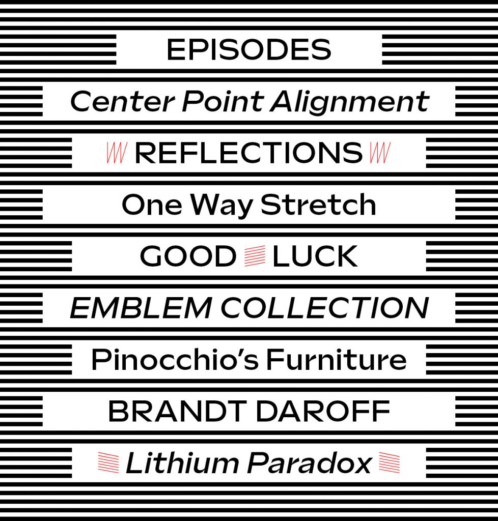
Introducing Sculpin — a stew of American sign painting, Swiss Modernism, and the stone chisel rendered to life in Bézier curves. The family is five weights, with matching italics, and a weight-axis variable font.
Introducing Sculpin — a stew of American sign painting, Swiss Modernism, and the stone chisel rendered to life in Bézier curves. The family is five weights, with matching italics, and a weight-axis variable font.
We’re excited to announce our latest typeface, Moniker by Eric Olson. Moniker is a rounded sans serif that captures the informal tone of the genre while maintaining a sensible workhorse mentality. The family is made up of five weights with lively italics, and with features like small caps and multiple numeral styles, the fonts can take on the small (tables and text) and big (headlines and logos).
Moniker is available for desktop, webfont and app licenses. And it’s offered in full and basic versions. The basic version has a smaller character set — and price — so you can start there and always upgrade later.
We’re excited to announce the release of two new typefaces, Scandia and Scandia Line. Although they’re siblings deep down, their differences are more apparent than their similarities. Designed first, Scandia Line is a skeletal sans serif made entirely without curves. Scandia came next, taking Line’s circular proportions but abandoning the all-angle policy for generous curves instead.
Each family has four weights with Scandia offering corresponding italics. As if that weren’t enough, Scandia and Scandia Line also include a stencil variant and several alternates for added versatility. The family’s matching proportions make them a perfect typographic pair but their distinct personalities allow them to function nicely on their own.
Available now, you can license Scandia and Scandia Line in web and desktop formats. For more about each family, visit their respective pages or take a look at their PDF specimens.

Customers have asked and we’ve always agreed – why doesn’t Klavika have a Black weight? Or an Extra Light? Good questions. Those lead us to wonder, what about an Ultra Black or a Thin as well? Why not fully explore the weight range, expand on the original and add something new? Sounds like the start of a great project!
And with that, Klavika Display was born. Available in four weights – Thin, Extra Light, Black and Ultra Black – and two widths – Standard and Condensed – the family is an addition to the existing Klavika and Klavika Condensed families. Although designed as en extension of the original series, Klavika Display works equally well on its own as a boastful display font. Singles, packs and the complete family are available in both desktop and webfont formats.

We’re pleased to announce the release of our new typeface Colfax. At home within a range of design environments, Colfax is a refined oval sans serif of twelve styles ranging from Thin to Black with matching italics for each. Singles, packs and the complete family are available in both desktop and webfont formats.
Colfax was formerly named Chrono.

Our Klavika series has just been expanded to make room for a new Condensed width. Have a look at the complete specs or download the PDF.