13 Dec 2016
More Elena, More Control
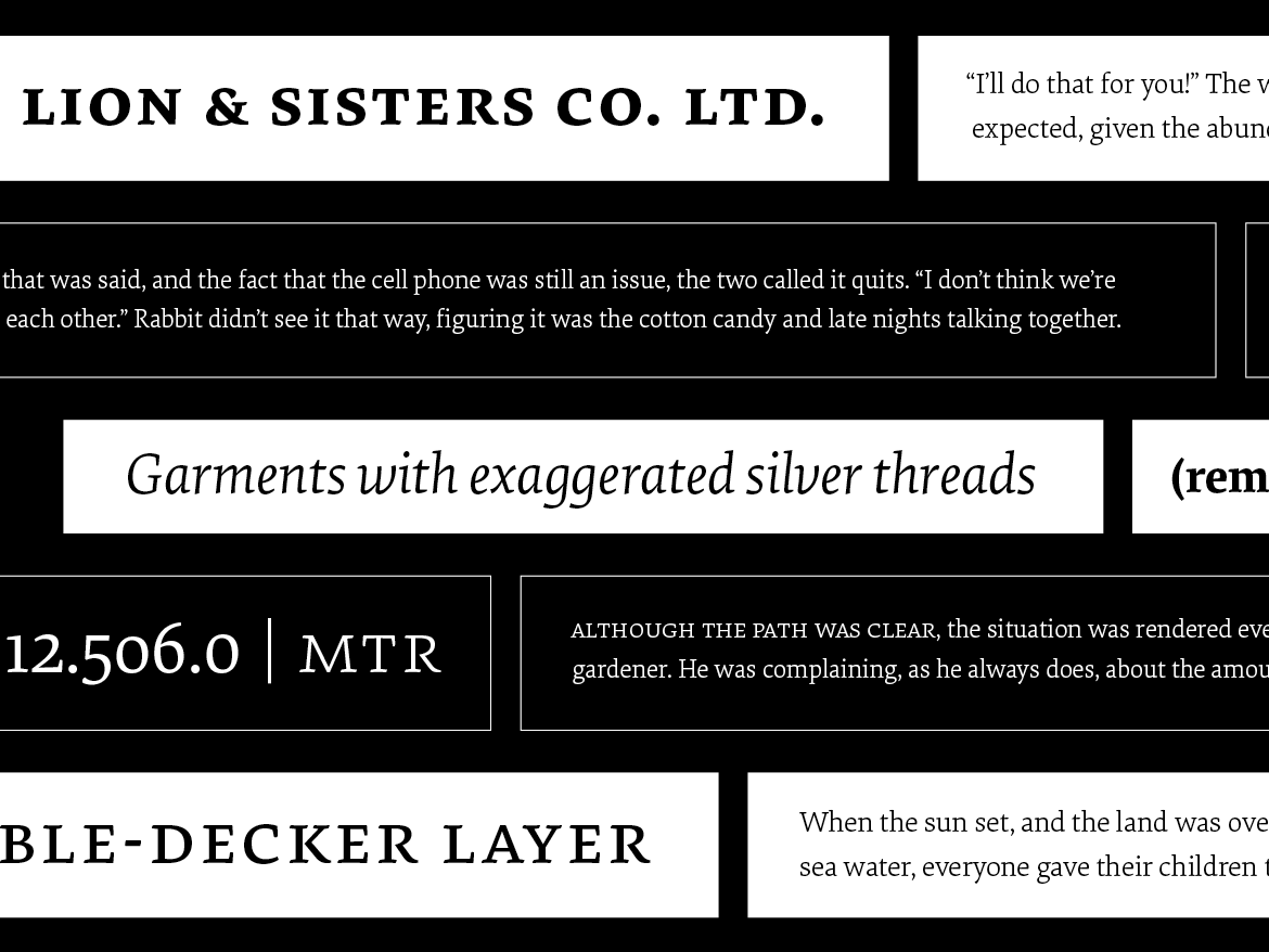
Elena, designed by Nicole Dotin, has doubled in size with two new weights. Adding to the Regular and Bold, a Light and Medium bring a twist of variability to this modern serif typeface. The new styles form a trio of text weights – rather than follow a traditional linear weight model – and serve as lighter and heavier gradations of the Regular. These new fonts are designed to offer finer control over page color, hierarchy, and type pairings.
Originally released in 2011, Elena was made for extended reading. It has since found its way into every medium, from books to blogs, and even the popular reading app Instapaper. This release expands on that mission, reaffirming its commitment to text that’s meant to be read.
As before, the fonts are offered in Full and Basic versions. The Basic has a smaller character set — and price — so it’s a good way to test the family before you dive into all of its features. And if you’ve previously licensed Elena, you can upgrade without paying for what you already bought, whether that was a single style or family.
