Colfax is a refined oval sans serif of 20th century origins and 21st century sensibilities. Influences ranging from the gruff Aurora Grotesk series to the elegant Neuzeit are paired with a subtle geometry and typographic utility to inform this family of sans serifs.

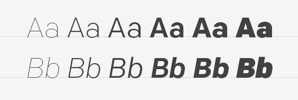
Featuring a range of six weights with italics, the entire Colfax family is made up of twelve fonts. At the extreme ends of the range are two display weights – Thin and Black – supported by four workhorse weights – Light, Regular, Medium and Bold.

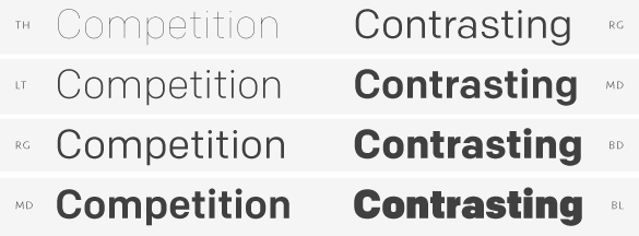
When designing Colfax’s weight range, we followed our standard policy: create truly useful weights rather than what is mechanically possible. As such, each weight can be used with another two up or two down in the range to maintain contrast between the two. For instance, Thin can be paired with Regular or Medium paired with Black. This isn’t prescriptive, of course, but offers a rational starting point for a typographer first experimenting with Colfax.

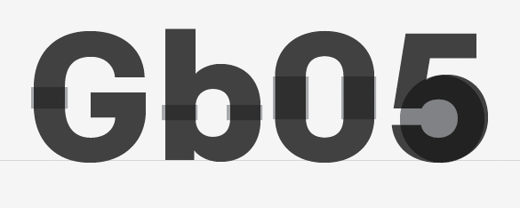
The conventionally round or semi-oval characters of Colfax are comprised of subtle straight sides and near perfect circles. We think of this as implied geometry. It isn’t measured or automatically repeated for all characters but instead referenced throughout the typeface creating a pleasant, family-wide gestalt.

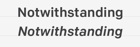
Although so-called true italics are often paired successfully with sans serif designs, they simply didn’t match Colfax. Oblique, adjusted italics were drawn instead to match the starkness and gravity of the roman.

True to its minimalist roots, Colfax has just one alternate: the uppercase J. Found as an OpenType Stylistic Alternate, its horizontal cross bar at cap height makes it ideal for double J headlines like JOJOBA or JUJITSU.

We love arrows so it’s only natural Colfax features a collection of left and right directional arrows in all six weights to point the way. The arrows are available in two sizes – one for caps and another for lowercase.
Colfax was formerly named Chrono.