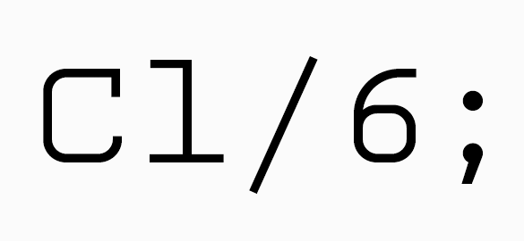
Named in tribute to designer Howard ‘Bud’ Kettler whose ubiquitous Courier graces computers the world over, Kettler is a simple monospaced font of two weights. Like its mentor, Kettler is a twelve-pitch monospaced font – 12 characters fit within 1 inch at 10 point size. But before visions of Steelcase desks, IBM Selectric typewriters, and 12-inch bubble monitors take you away, remember that Kettler is a decidedly 21st century font.

Built from a basic set of repeated ovals and stems, Kettler is a subtle blend of utilitarian slab serifs and modern curves. Allowing ample room for the exchange between black and white space, the slabs anchor the font to the baseline while the oval curves facilitate eye movement from one glyph to the next. The character fit is regular enough for clean page color and just wide enough to avoid the unseemly letter crashing common to monospaced fonts. As such, Kettler is ideal for tabular information (we’ve been using it for client invoicing since its release) but also equally comfortable pulling display and headline duty if the task requires.