Clear functionality, near invisibility and a tone whose presence is felt most once-removed – this is the essence of Seravek. Fonts of loud volume and expressive detail have a rightful place – we’ve made many ourselves – but fonts of near silence are equally intriguing and consequently very useful for complex texts.
Building from this, Seravek is tailored to the demanding needs of information, editorial, and identity design where the twin forces of richness and clarity must co-exist. The resulting letters are unobtrusive, refined and imbued with a sense of forward modernity – essential for a diverse range of work in today’s environment.

Knowing the display of numerical data is crucial to communication, we’ve included Lining Numerals (default) as well as Old Style, Small Cap, Tabular, Tabular Old Style and Small Cap Tabular numerals for each weight of Seravek – italics included. Additionally, each of the tabular styles share the same fixed width in all 5 weights and even have their own tabular currency and math symbols. You’ll also find pre-composed fractions as well as the elements needed to set your own.
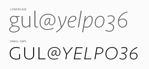
And of course, small caps. If we can do it, we’ll use small caps for just about anything but this also means we’re picky about them. As such, we’ve designed an entire set of punctuation for the small caps when All Small Caps (an OpenType feature) is activated by the user. So, never again will your small cap apostrophes float away untethered.
To keep Seravek accessible, we’ve also created Seravek Basic for those requiring something more stripped down. Seravek Basic is the same as Seravek but does not contain features like small caps, multiple numeral styles, fractions, arrows etc. If you buy Seravek Basic and later decided to upgrade, the purchase price is directly credited towards the complete family.