1 Sep 2011
Type at the Minnesota State Fair
The first Minnesota State Fair was in 1859, and since then (with just five exceptions due to wars and polio outbreaks), it has been held every year at the summer’s close. Facing this bittersweet farewell, Minnesotans choose to go out with a bang, bringing together a sensory-bombarding celebration of food, fun, agriculture, industry, art, music, history and overall indulgence.
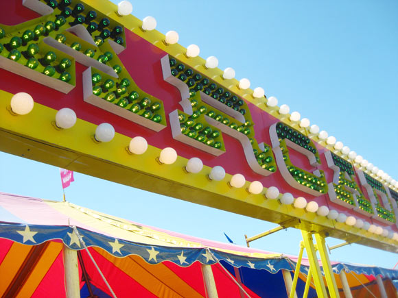
We three at Process Type Foundry packed up and hit the fairgrounds with cameras in hand to capture the explosion of type and lettering (both terrific and terrible) to be found.
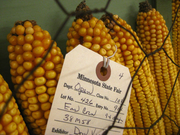
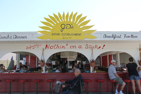
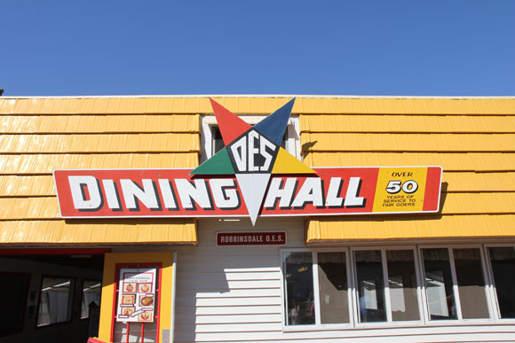
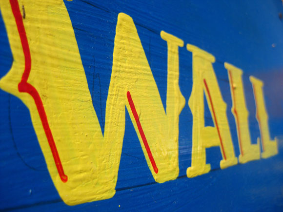
From practical tags and signs showcasing Minnesota’s best crops, to the showy stands of the food vendors, the hand-lettered ephemera in the Fair’s historic Heritage Square and the glittering gaudiness of the Midway, we certainly weren’t disappointed.
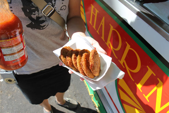
And of course, we couldn’t help indulging ourselves in a little deep-fried food, which is the hallmark of the Fair. The fried green tomatoes were delicious.
See many more photos of our typographic tour over on Flickr.
