Archive for 2015

Sample specimen of Scandia & Scandia Line

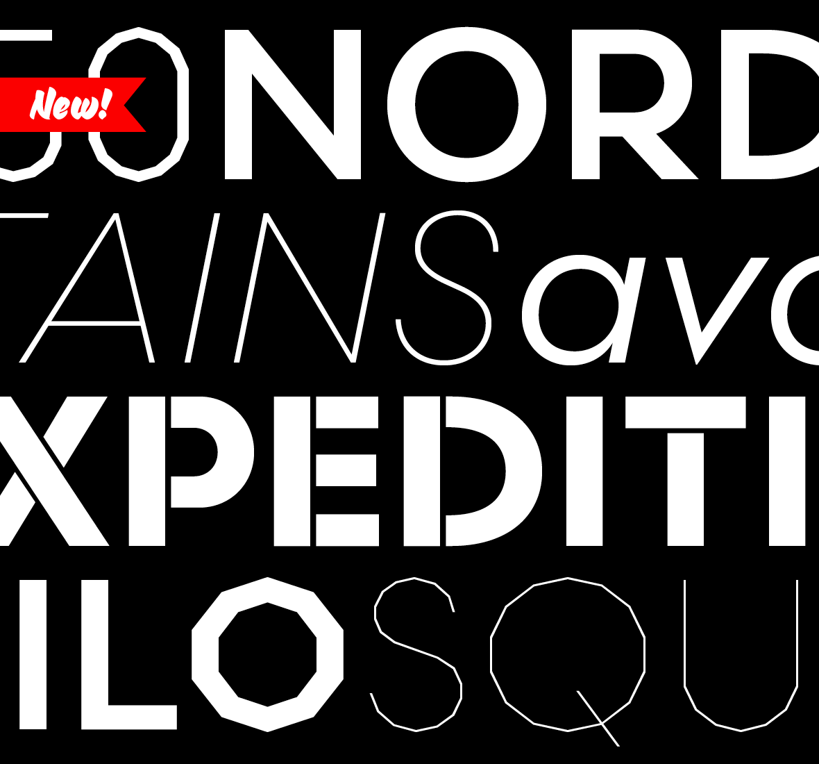
We’re excited to announce the release of two new typefaces, Scandia and Scandia Line. Although they’re siblings deep down, their differences are more apparent than their similarities. Designed first, Scandia Line is a skeletal sans serif made entirely without curves. Scandia came next, taking Line’s circular proportions but abandoning the all-angle policy for generous curves instead.

Each family has four weights with Scandia offering corresponding italics. As if that weren’t enough, Scandia and Scandia Line also include a stencil variant and several alternates for added versatility. The family’s matching proportions make them a perfect typographic pair but their distinct personalities allow them to function nicely on their own.

Available now, you can license Scandia and Scandia Line in web and desktop formats. For more about each family, visit their respective pages or take a look at their PDF specimens.

A magnified comparison of Elena Web that was auto-hinted and manually-hinted.

More good news on the rendering front. As we promised last May when we improved Colfax Web, Klavika Web, and Klavika Condensed Web, we had other webfonts to refine. And in September we updated several other families with new, manually-hinted versions.

Elena, each Bryant family, and Stratum 1 & 2 have all been significantly improved for screen rendering. These new fonts eliminate many of the irregularities that stem from a browser and operating system’s translation of a font’s design to screen. Now, the design of these typefaces is upheld more consistently when viewed in a browser and readability — a paramount concern — is enhanced.


Elena Web, Before & After

Elena Web, auto-hinted and manually-hinted

The auto-hinted (top) and manually-hinted (bottom) versions of Elena Web rendered at 24, 20, and 16 pixels by IE 11 in Windows 8.1. A few noticeable improvements: at 24px, the contrast of the ‘a’ is fixed; at 20px, the ‘g’ is truer to the original design; and at 16px, the loopy ‘e’ is straightened.


If you licensed or downloaded any of these webfonts after September, you don’t have to do anything — you’re using the new fonts. Otherwise, log in to your Account and re-download the fonts. Those of you using Typekit, republish your kits that contain these webfonts and the latest versions will be served.