Posts tagged “From the Stacks”

Lettering is so often composed of perfect, soaring curves. Never a hair out of place. So, I was delighted to run into this tin that once held fruit cake from Blum’s, a well-loved San Francisco bakery closed since the 70s.
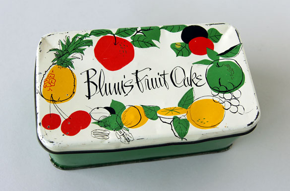
Blum's Fruit Cake

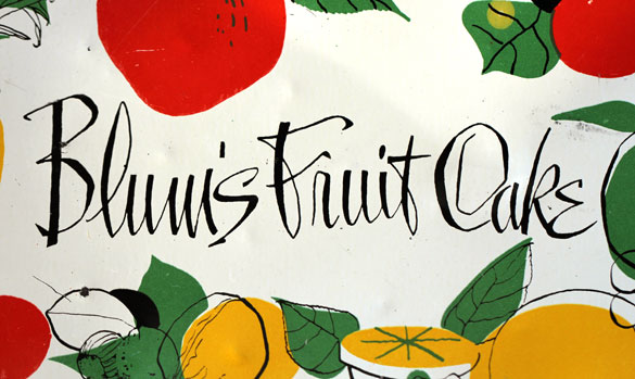
Blum's - the close up.

The overall tone of the lettering is quick, fluid and slightly textured with a bit of angularity thrown in particularly at the baseline. When you get to the letters at the end or beginning of a word, say the B and s in Blum’s, things take a decidedly idiosyncratic turn. The angularity and texture is magnified and (dare I say it) the shapes feel slightly awkward. But, it’s those gestures that add such charm and warmth to the piece, a reminder that surprise and consistency are often perfect bedfellows.

For a closer look at the lettering, check out a full-sized detail on Flickr.
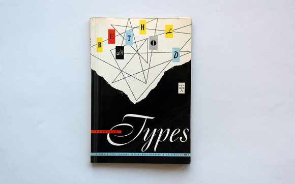
As type designers we naturally have many type specimens stashed away in our collection, though very few of them manage to elevate type beyond the typical waterfall showings and text settings. There are exceptions of course, but the latest addition goes the extra mile.

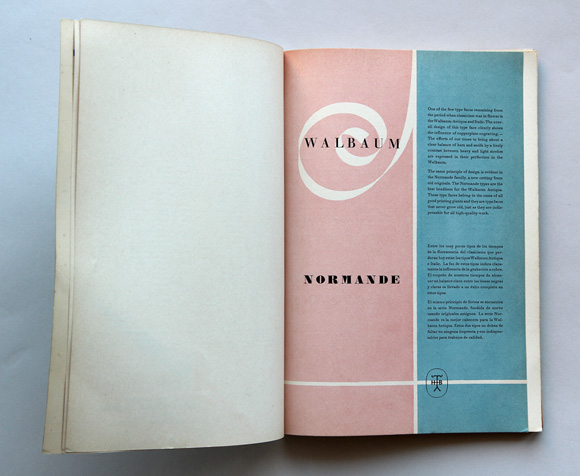
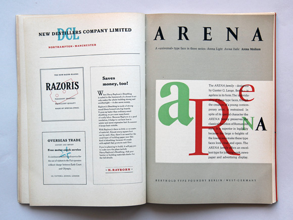
With its gorgeous layouts and ersatz ads, we can’t help but appreciate this specimen from Berthold Type Foundry, numbered “525B”. Find many more mid-century (no specific year is given) specimen layouts after the jump.

Berthod Type Foundry Specimen 525B

Berthod Type Foundry Specimen 525B

Berthod Type Foundry Specimen 525B

Continue reading

7 Jul 2011

Summer Reading

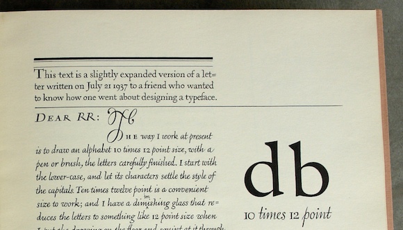
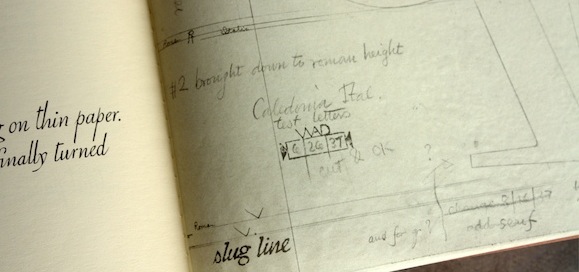
Detail of WAD to RR: a letter about designing type

When we saw today’s release of the summer reading list for the University of Reading typeface design students, one title stood out. Gerry Leonidas, director of the program, has put together a great index of references that includes an influential monograph by William Addison Dwiggins.

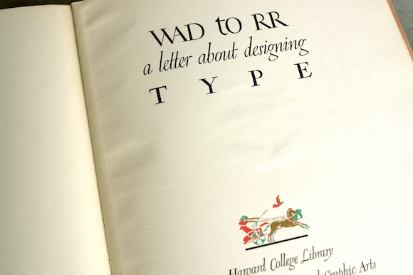
Dwiggins, an American illustrator and book designer, came to type design later in life. He wrote WAD to RR: a letter about designing type to colleague Rudolph Ruzicka in 1940, offering rare insight into the typeface design process. We pulled out our copy of the Dwiggins text from our collection.

Cover of WAD to RR: a letter about designing type

Dwiggins, who is credited with coining the term “graphic designer”, is a particularly compelling character for the lively variety of his work. In addition to his work in advertising, book design, calligraphy and type design, he also operated a marionette theater. Though he studied lettering with Frederic Goudy as a young man, he didn’t take up type design until his late forties, when he was invited by the Mergenthaler Linotype Company to create a contemporary sans-serif typeface that then turned into the idiosyncratic sans Metro.

Detail of WAD to RR: a letter about designing type

View more photos of our copy on Flickr, or read the entire letter here.