11 Jul 2012
An Interview, Some Outtakes and Credits
If you happened by the FontFeed recently, you’ll find an interview with Process Type Foundry partners Eric Olson and Nicole Dotin by Yves Peters. Go ahead, read the words. Sometimes, though, we just want to ogle the pictures. Here are photos from the interview along with extended annotations, outtakes and some extras.
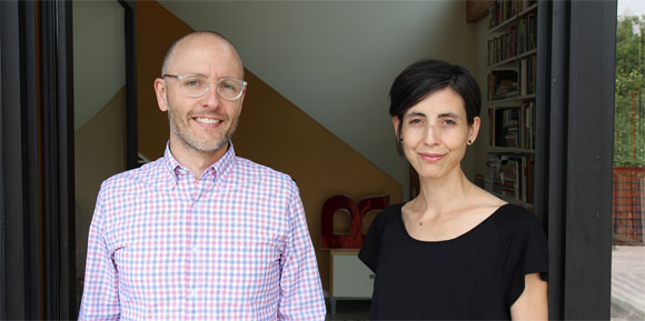
Eric and Nicole standing in the doorway of the Process Type Foundry studio.
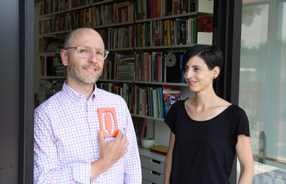
At some point, our photo shoot started to sour after taking shot after shot. There was nothing left to do but lighten the mood. Obviously, Eric grabbed a house number designed by Erik Spiekermann and placed it where it belonged.
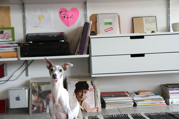
This is Charlie, the silent third partner of Process, in the studio along with Bob Dylan, an old Mac Cube, our record player and various drawings by 3-year-olds.
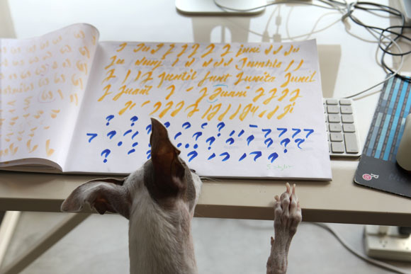
After posing for his photo, Charlie popped by Nicole’s desk to see what she was working on and offer insight. Or, he might have been looking for a treat.
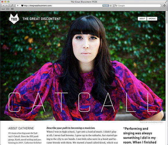 Designed and published by Ryan and Tina Essmaker, The Great Discontent features various weights of Stratum 1 alongside body text set in FontFont’s Meta Serif. More importantly, it features interviews with the makers of today.
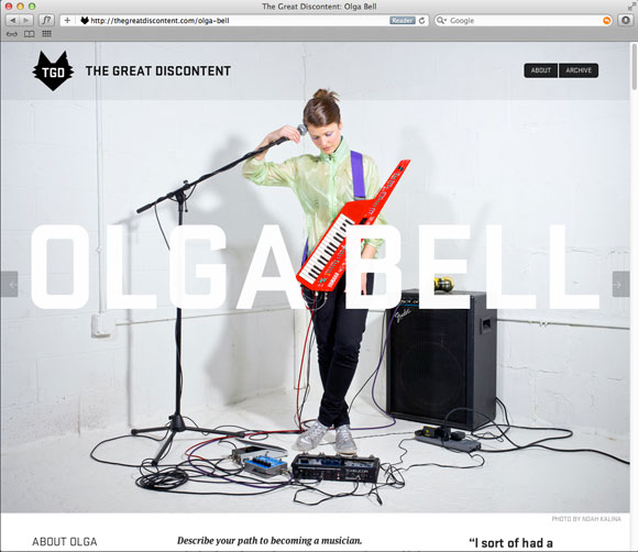
“Do you guys know that thing that Ira Glass talks about? Where you start out and you know your taste is really good, but your ability needs to catch up to that taste?” An interview with Olga Bell on The Great Discontent.
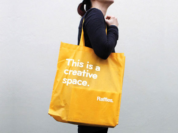
Bryant and yellow belong together. This bag was one part of a larger rebrand of Raffles, a design school based in Sydney, Australia. Find more of the identity using Bryant on the Naughtyfish website, the firm that handled the redesign.
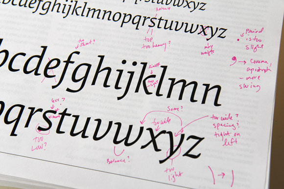
A test print for Elena Italic. Most of Nicole’s test prints are marked up in colored pen. Red, pink, blue and green are favorite colors for making messy, almost indecipherable notes for later decryption and then correction. The arm of the k needs … finesse.
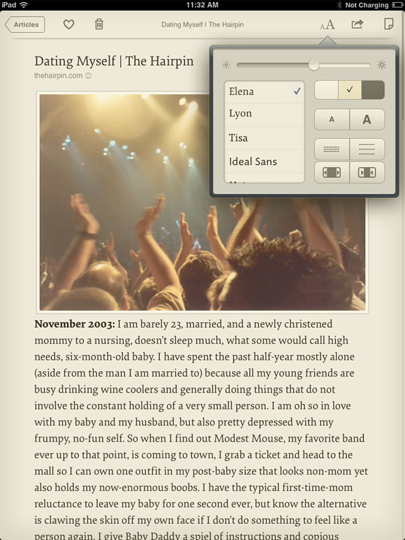
Elena found its way into Instapaper, a popular app by Marco Arment for collecting and saving content to read later. If you happen to click on the link above for Marco, notice his personal site is set in Elena too (at the time of posting).
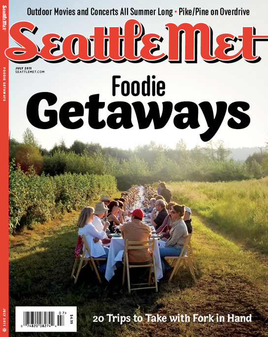
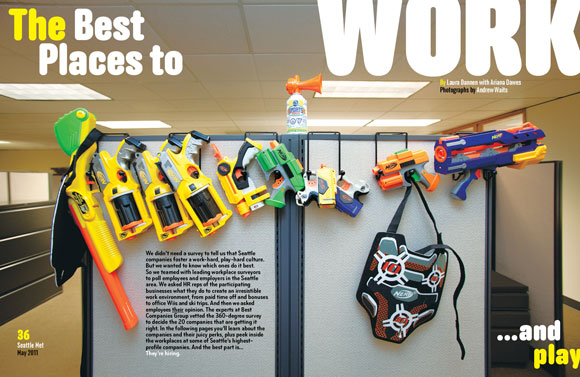
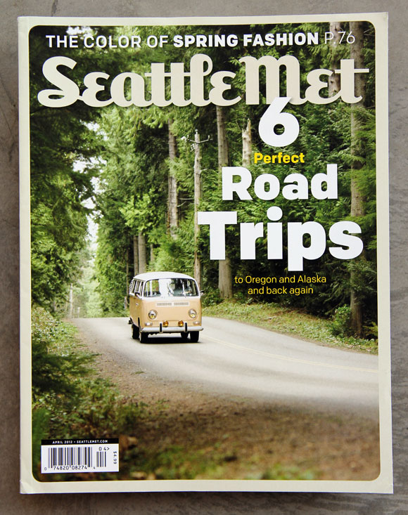
It’s no secret we love seeing our fonts in use and used well. It is a secret however, that we hope to one day see every font in our library used in a single magazine. As far as we know, Seattle Met is the front-runner in our imagined competition. Capucine, Anchor, Bryant, Bryant Compressed and Colfax have all graced the magazine since design director André Mora took the helm. Only 13 more fonts to go, Mr. Mora.
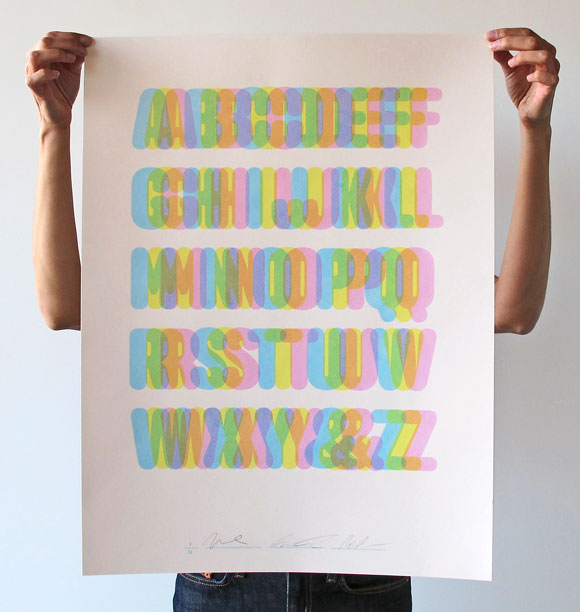
During the summer of 2010, we jumped into the seemingly rarefied world of print and made a limited-edition poster celebrating Anchor (long since sold out). Designed by Abi Chase, it was a three-color screenprint featuring an unusually pastel palette when compared to our typical propensity towards CMYK.
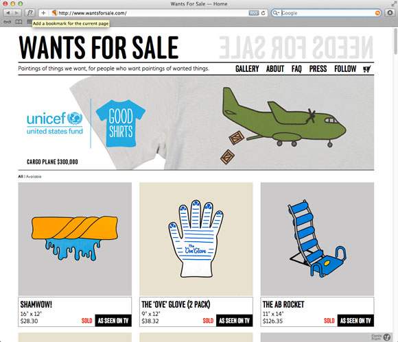
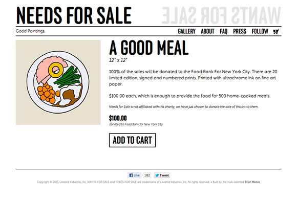
And last but not least, a random bonus. >Wants for Sale was started in July of 2007 by Christine and Justin Gignac. A couple of months later, they took the same basic concept and started Needs for Sale. The concept? The couple paints pictures of needs, anything from basic necessities like food or shelter to research for curing diseases. The paintings are offered for purchase and 100% of the sale is donated to a charity whose mission it is to meet that need.
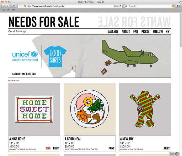
Anchor is used for all headlines and titling.
A nice way to end, right?