Unlike other design mediums, type design works backwards from what is already agreed upon. That is to say, as readers, we’ve more or less come to a consensus on what an ‘a’ or a ‘b’ looks like so the job of type designers doesn’t often include rethinking such things. And for good reason: typefaces are for communicating messages from writers and designers directly to readers, not expressing oneself at the expense of readers.
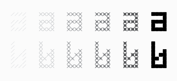
But what about the process of constructing typefaces? Fortunately it remains wide open. FindReplace is the result of tinkering with the typeface-making process while aiming for a result resembling conventional letterforms. Of the six weights from Thin to Black, all styles honor this goal. They also honor the most basic of design origins: the line.
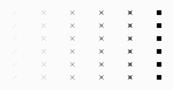
As the conjoined name implies, FindReplace is the bi-product of the Find and Replace function found in many software applications. Just like word processing software, the primary font design tool FontLab features a Find and Replace function allowing for the replacement of curves and objects instead of words. Taking this operation to the extreme, FindReplace was built by simply replacing a single line with progressively thicker versions of the same line throughout the entire font. The result is six weights with identical metrics and kerning that can replace one another for gradation effects or even be layered for added drama. And as you’ve likely gathered, though the letterforms resemble conventional shapes, the font is best used for sizes larger than text.

