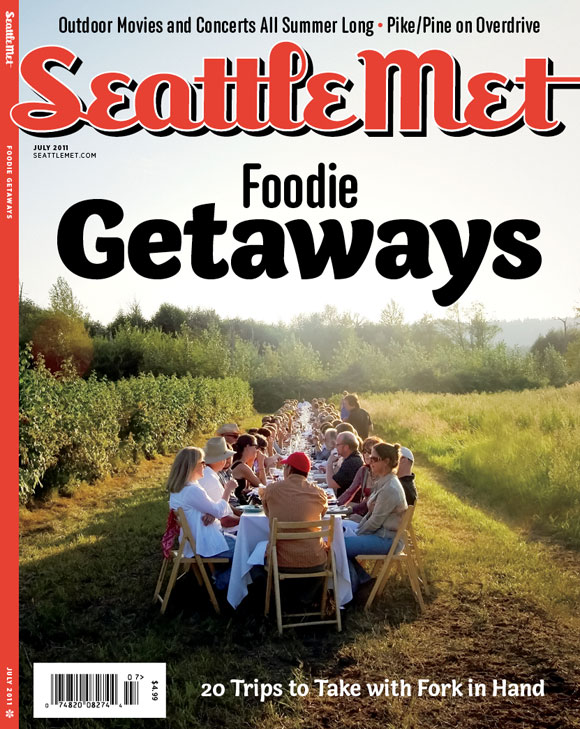
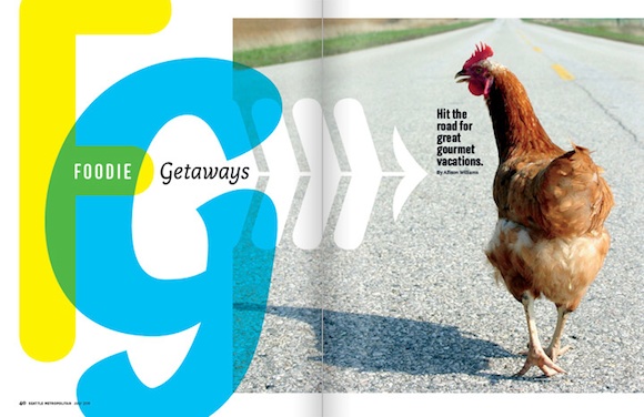
Seattle Met, a magazine covering the local scene in Seattle, WA, has been using Anchor and Bryant Compressed since May, when designer André Mora came on board. But it was for the summery July issue, with its focus on farms, foraging and other foodie adventures that Mora paired Anchor with the agile Capucine, named after the French word for the Nasturtium flower.

As the newest addition to our family of typefaces, it’s great to see Capucine being put to use here in a way that showcases its flexibility, from display headlines to captions.
