Frustrated with a lack of fonts both versatile and modern, we set out to design Klavika as a full-featured, do-it-all sans serif for the needs of the 21st century. Our result is a design that’s unadorned, modern and infinitely flexible. To achieve this, Klavika follows a decidedly hybrid typographic path – a cross of humanist and geometric influences with allegiances to neither. Crisp and open shapes keep the font legible in small sizes while the straight-sided characters anchor headlines and display work solidly in place. And since part of the goal was flexibility, we’re happy to report that since its introduction in 2004, Klavika has found its way into a wide variety of media from print to pixels.

Showing the small caps of Klavika.

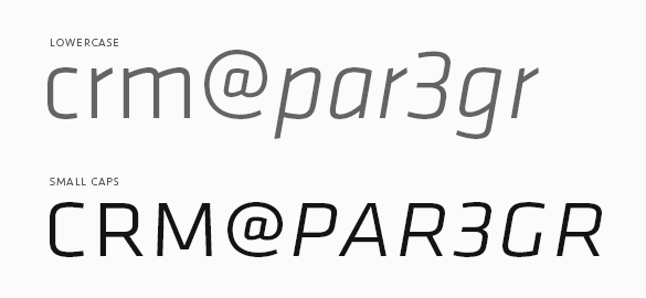
To be truly versatile, a font should be reasonably extensive as well. Klavika has a wide range of typographic features and – as is common with our fonts – showers special attention on small caps. They are essential for setting acronyms and initials (amongst other things) and excellent for titling and display work. Special attention has also been paid to the width of the capitals, specifically increasing it, for better legibility at small sizes and added punch in headlines.

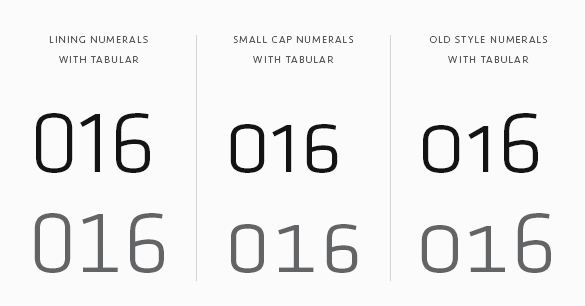
Numerals are another of the typographic features. Because a varied array of numerals is essential to contemporary communication, Klavika contains multiple styles. You’ll find Lining (the default style), Old Style, Small Cap, Tabular, Tabular Old Style and Small Cap Tabular numerals for each weight of Klavika – italics included.

If your requirements don’t call for all those typographic features, Klavika Basic was created with you in mind. It is the same as Klavika but without features like small caps, multiple numeral styles and arrows. If you buy Klavika Basic and later decide to upgrade to the fully-featured Klavika, the purchase price is directly credited towards the complete family.

Unlike other design mediums, type design works backwards from what is already agreed upon. That is to say, as readers, we’ve more or less come to a consensus on what an ‘a’ or a ‘b’ looks like so the job of type designers doesn’t often include rethinking such things. And for good reason: typefaces are for communicating messages from writers and designers directly to readers, not expressing oneself at the expense of readers.

The six weights of FindReplace.

But what about the process of constructing typefaces? Fortunately it remains wide open. FindReplace is the result of tinkering with the typeface-making process while aiming for a result resembling conventional letterforms. Of the six weights from Thin to Black, all styles honor this goal. They also honor the most basic of design origins: the line.

The peices that make up FindReplace's letters.

As the conjoined name implies, FindReplace is the bi-product of the Find and Replace function found in many software applications. Just like word processing software, the primary font design tool FontLab features a Find and Replace function allowing for the replacement of curves and objects instead of words. Taking this operation to the extreme, FindReplace was built by simply replacing a single line with progressively thicker versions of the same line throughout the entire font. The result is six weights with identical metrics and kerning that can replace one another for gradation effects or even be layered for added drama. And as you’ve likely gathered, though the letterforms resemble conventional shapes, the font is best used for sizes larger than text.

Named in tribute to designer Howard ‘Bud’ Kettler whose ubiquitous Courier graces computers the world over, Kettler is a simple monospaced font of two weights. Like its mentor, Kettler is a twelve-pitch monospaced font – 12 characters fit within 1 inch at 10 point size. But before visions of Steelcase desks, IBM Selectric typewriters, and 12-inch bubble monitors take you away, remember that Kettler is a decidedly 21st century font.

Kettler

Built from a basic set of repeated ovals and stems, Kettler is a subtle blend of utilitarian slab serifs and modern curves. Allowing ample room for the exchange between black and white space, the slabs anchor the font to the baseline while the oval curves facilitate eye movement from one glyph to the next. The character fit is regular enough for clean page color and just wide enough to avoid the unseemly letter crashing common to monospaced fonts. As such, Kettler is ideal for tabular information (we’ve been using it for client invoicing since its release) but also equally comfortable pulling display and headline duty if the task requires.

Named for the collaboration of Frank Sheeran, Ian Chai and Glenn Chappell that produced the FIGlet program, FIG is a set of three typefaces in the spirit of early email and ASCII art explorations. Written in 1991 using the programming language C, the FIGlet program allowed users to create letters with basic ASCII characters and then paste them into a software program of choice. Alphabets of surprising ingenuity – often made using just a single element – could then be tasked for everything from email signatures to banners and posters.

FIG sans and serif

Taking inspiration from this reductionist approach, FIG Sans and Serif follow the FIGlet construction principal literally and rigidly: they are made from a single element. FIG Sans uses only the + symbol while FIG Serif uses the * symbol to construct each character. As your eyes have now gathered, these are display fonts to be sure – larger sizes are encouraged.

FIG script

In contrast to these hardline construction principles, FIG Script follows a less rigid structure to arrive at something of an upright geometric script. However, after a lot of trial and error it became obvious that a script with too few angles was illegible. The resulting surprise pairing of primitive geometry against swooping ascenders/descenders makes for a script that’s both delicate and versatile.