elena-blog5

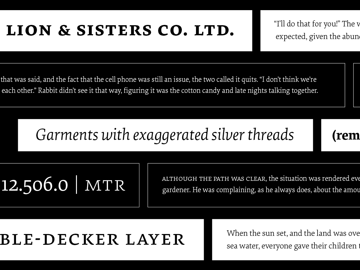
Elena, designed by Nicole Dotin, has doubled in size with two new weights. Adding to the Regular and Bold, a Light and Medium bring a twist of variability to this modern serif typeface. The new styles form a trio of text weights – rather than follow a traditional linear weight model – and serve as lighter and heavier gradations of the Regular. These new fonts are designed to offer finer control over page color, hierarchy, and type pairings.

Originally released in 2011, Elena was made for extended reading. It has since found its way into every medium, from books to blogs, and even the popular reading app Instapaper. This release expands on that mission, reaffirming its commitment to text that’s meant to be read.

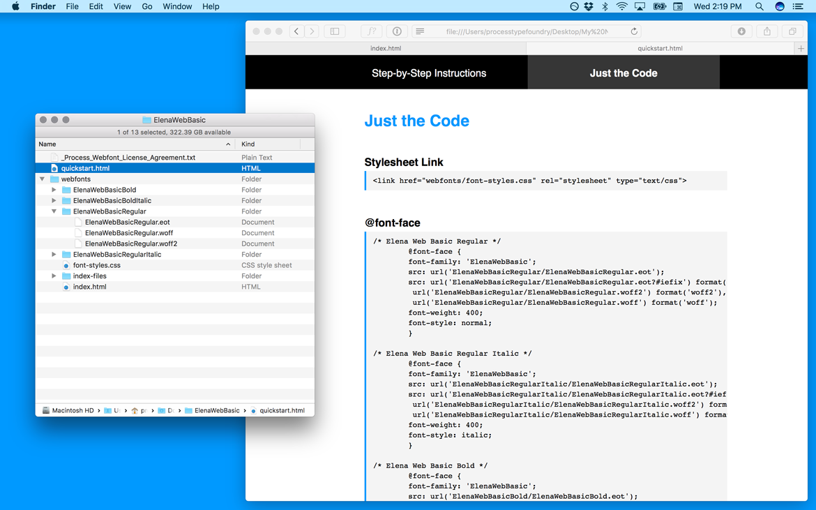
As before, the fonts are offered in Full and Basic versions. The Basic has a smaller character set — and price so it’s a good way to test the family before you dive into all of its features. And if you’ve previously licensed Elena, you can upgrade without paying for what you already bought, whether that was a single style or family.

webfont-guide-desktop

Getting webfonts up and running on a website can be challenging or just plain tedious. To take some of the sting out of it, we’ve written a quick start guide to help you implement the webfonts right away.

Take it Step-by-Step
The new guide, included in all our webfont packages, has step-by step instructions as well as a pre-written stylesheet for self-hosting webfonts. Just upload the included webfonts folder to your server, add a link to the stylesheet, style some text and you’re done. If it doesn’t go as smoothly as advertised, there’s a troubleshooting section too.

Jump Straight to the Code
You can also skip the steps and jump straight to pre-written CSS @font-face rules and classes. For packages with multiple weights or styles, the relationships between the fonts have already been worked out and are specific to the fonts in your order. The font-family name is shared, the font-weights use number values, and the font-styles are set to normal or italic, making it easier to manage related webfonts.

Need to deal with FOUT, want to make sure kerning is on, or prefer to serve fewer formats? Go for it! The quick start guide offers a solid beginning but isn’t prescriptive – feel free to adjust it based on the priorities of your site. Now go and enjoy the ten or twenty minutes you’ve been spared by not having to write @font-face code!


If you’ve purchased webfonts from us in the past, re-download an order from your account to get the quick start guide.

What began as a retooling of our production process ended up as a full-scale rebuild of every font in our library. The new, updated fonts are now available to all customers as free upgrades. The changes are almost entirely technical in nature – in other words, the design of the typefaces remains the same – but the improvements are beneficial to everyone, particularly those who licensed webfonts or who regularly use Microsoft Office applications on Windows. Many of the changes were based on customer feedback so if you ever experience problems with our fonts, get in touch – we’re here to help.

So, what changed?

Desktop Font Changes

  • OpenType fonts now work better in Microsoft Office programs. If you’ve seen styles behave unusually or not show up at all, this should fix that.
  • Certain fonts are now style-linked for better behavior in programs that require style changes be made using the Bold or Italic buttons.
  • Font menu organization has changed for three families: Bryant Condensed, Bryant Compressed and Klavika Condensed. The fonts are now grouped as their own family rather than under their larger family name (see illustration below). Some programs were unable to handle the larger number of fonts in a single grouping. This also results in better cross-platform compatibility.
  • Other minor improvements.
Process_Blog_Font-Update_img-desktop

The way three families display in the font menu has changed. In this example, Bryant Compressed & Condensed are no longer grouped together under Bryant.


Webfont Changes

  • WOFF 2.0 format added. Webfont packages now include WOFF2, WOFF, and EOT files for each style. This new format offers compression advantages over the original WOFF format.
  • OpenType code, once stripped for file size, has been added back into the fonts. This does not add OpenType features, but restores the ability to access them via CSS for any OpenType features in the font. For most of the current webfont library that translates to ligatures and fractions.
  • Fixed glitches that occurred in certain browsers hindering rendering or kerning.
  • Further minor improvements to rendering of all non-manually hinted fonts.
Process_Blog_Font-Update_img-webfonts

We added the WOFF2 font format to all webfont packages for a total of three format options. The examples on the right show the file size differences between WOFF and WOFF2.


How to Upgrade
First, sign into your account and re-download your licensed fonts. Desktop users should uninstall existing fonts, restart, and then install the new fonts — in that order. Because the internal names of the fonts changed for the three reorganized families — Bryant Condensed or Compressed, and Klavika Condensed – existing documents using those fonts will have to replace the old fonts with the new fonts inside the document. Webfont users, upload the new versions to your server and check that the new font file names match the old. And for those of you using Typekit, republish your kits and the latest versions will be served.

Process foundry page on Fontstand

After a month on Fontstand we’ve made all of our typefaces available. If you haven’t seen Fontstand, it’s a free Mac application that allows you try fonts at no cost and rent them on a monthly basis. We offered five select families when the app debuted but now our entire library is there to test and rent. Read a bit more about the app in this blog post.

If you want to dive in, visit our foundry page on Fontstand.

Scandia on Fontstand

There’s a new way to test our typefaces, and not just that – you can rent them too. Fontstand, a desktop Mac application, lets you try fonts for free for one hour as well as rent them on a monthly basis at 10% of the normal license cost. Whether you rent or trial, the chosen fonts work right away in your design apps without you having to install them. At launch, Fontstand offers hundreds of typefaces from over twenty independent foundries.

Clicking a ‘buy’ button isn’t always easy. Maybe you need to test the fonts before committing, maybe you want to make sure the client approves, or maybe you’re a design student on a tight budget. We get that – we’ve been there – and we think Fontstand can help. This new approach to licensing is a great way to get your hands on high-quality typefaces and ensure that you’re using the right font for the job. You can think of renting as an extensive test or as a way to use fonts for a limited time – you can always rent the fonts again when you revisit a project – and once you rent for twelve total months, the fonts are yours to download.

To get started with Fontstand, visit fontstand.com. And the links below will take you directly to the fonts we currently offer. If there are any typefaces you’d love to see on Fontstand, send us an email or tweet.

Process on Fontstand: