13 Mar 2015

Minnesota by Design

The Nerf Ball. Masking tape. The Hüsker Dü logo. Cheerios and Wheaties. This is Minnesota design and we haven’t even mentioned the architecture. Or the chairs. Or the rollerblades (don’t roll your eyes). Or the magnetic poetry (don’t roll your eyes!).

Walker Art Center launched a web-based initiative called Minnesota by Design and as you can see, we can’t pick a favorite. That’s why it’s such an honor to have Klavika included in the collection. Eric, who designed Klavika in 2004, was born in Minnesota and we’re proud to uphold the culture that has been here long before us.

MNxD_Maple

The virtual gallery allows the Walker to include works that can’t be practically collected – like a park. It also means webfonts. We were excited to see Maple chosen as the typeface for the project, used for everything from navigation to descriptions and even the map that represents the origins of the designs.

So if you’re interested in some design history – much of this work extends far beyond Minnesota – take a look yourself but beware the rabbit hole. Soon you’ll know plenty about the Honeycrisp apple. Tonka Toys. Paul Bunyan. Marcel Breuer…

Sample specimen of Scandia & Scandia Line

We’re excited to announce the release of two new typefaces, Scandia and Scandia Line. Although they’re siblings deep down, their differences are more apparent than their similarities. Designed first, Scandia Line is a skeletal sans serif made entirely without curves. Scandia came next, taking Line’s circular proportions but abandoning the all-angle policy for generous curves instead.

Each family has four weights with Scandia offering corresponding italics. As if that weren’t enough, Scandia and Scandia Line also include a stencil variant and several alternates for added versatility. The family’s matching proportions make them a perfect typographic pair but their distinct personalities allow them to function nicely on their own.

Available now, you can license Scandia and Scandia Line in web and desktop formats. For more about each family, visit their respective pages or take a look at their PDF specimens.

A magnified comparison of Elena Web that was auto-hinted and manually-hinted.

More good news on the rendering front. As we promised last May when we improved Colfax Web, Klavika Web, and Klavika Condensed Web, we had other webfonts to refine. And in September we updated several other families with new, manually-hinted versions.

Elena, each Bryant family, and Stratum 1 & 2 have all been significantly improved for screen rendering. These new fonts eliminate many of the irregularities that stem from a browser and operating system’s translation of a font’s design to screen. Now, the design of these typefaces is upheld more consistently when viewed in a browser and readability — a paramount concern — is enhanced.


Elena Web, Before & After

Elena Web, auto-hinted and manually-hinted

The auto-hinted (top) and manually-hinted (bottom) versions of Elena Web rendered at 24, 20, and 16 pixels by IE 11 in Windows 8.1. A few noticeable improvements: at 24px, the contrast of the ‘a’ is fixed; at 20px, the ‘g’ is truer to the original design; and at 16px, the loopy ‘e’ is straightened.


If you licensed or downloaded any of these webfonts after September, you don’t have to do anything — you’re using the new fonts. Otherwise, log in to your Account and re-download the fonts. Those of you using Typekit, republish your kits that contain these webfonts and the latest versions will be served.

25 Jul 2014

New Release: Pique

It’s summer here in Minneapolis and we’re celebrating with our newest release Pique! Combining the energetic elements of a brush script with the cool rationalization of digital beziers, Pique is a single weight display face overflowing with typographic personality.

Over the years, we’ve been refining our webfonts for better performance but today we’re happy to announce significant improvements to select fonts. Colfax Web, Klavika Web and Klavika Condensed Web are now manually hinted — for ClearType and greyscale — providing a high degree of readability across browsers. In addition to manual hinting, some character shapes were adjusted to render nicely down to 14 pixels.

So what does this look like? Although auto-hinting can do a decent job, it often fails to describe the nuances of certain character shapes across a range of sizes leaving a typeface perfectly readable at some sizes while leaving others muddy. The examples below show where auto-hinting failed the hardest (on the left) with manual hinting to the rescue (on the right).


Before hinting, on the left; after, right.
From top to bottom: Klavika Web Condensed Regular, Klavika Web Medium and Colfax Web Bold. All samples are set at 14px and rendered by Firefox 28 on Windows 8.


How can I take advantage of the updates?
Download the new fonts. For previous webfont purchasers, start by logging into your account. The font packages have been updated so simply re-download your order. Or, send us a quick request for the new fonts and we’ll email them to you (be sure to include your order number).

Republish your kit on Typekit. If you’re using Typekit, republish any kits containing the updated fonts to use the latest versions.

Up next
The web versions of Colfax, Klavika and Klavika Condensed were the first in line for the updates, but Elena Web, Stratum 1 & 2 Web and Bryant 2 Web are on deck.

31 May 2013

Buy smart, upgrade!

In a nutshell, our upgrade program let’s you add licenses or more family members of previously purchased fonts without re-paying for what you’ve already purchased. The benefit, in both cases, is that you can buy what you need, when you need it, without penalty. It’s also a great way to try out fonts, starting with a single weight or pack, knowing you won’t pay for those fonts again if you purchase larger packs that contain the same fonts later on.

There are three basic types of upgrades but they can be combined in just about any conceivable way. Both desktop and web fonts are upgradable but only purchases made directly through the Process Type Foundry are eligible.


1) Add more fonts from the same family
Start small, with just a single, then purchase the full family when you need a larger typographic palette. Or, for a larger family, start with a single, move to a pack and purchase the whole family when you’re convinced it’s a good fit.

Example: add more fonts from the same family

Example: Buy Capucine Basic Black for $39 and when you’re ready for more, purchase the Basic Pack 2 for $60 (normally $99 with $39 taken off since Pack 2 contains the previously purchased Black weight).


2) Add OpenType Features
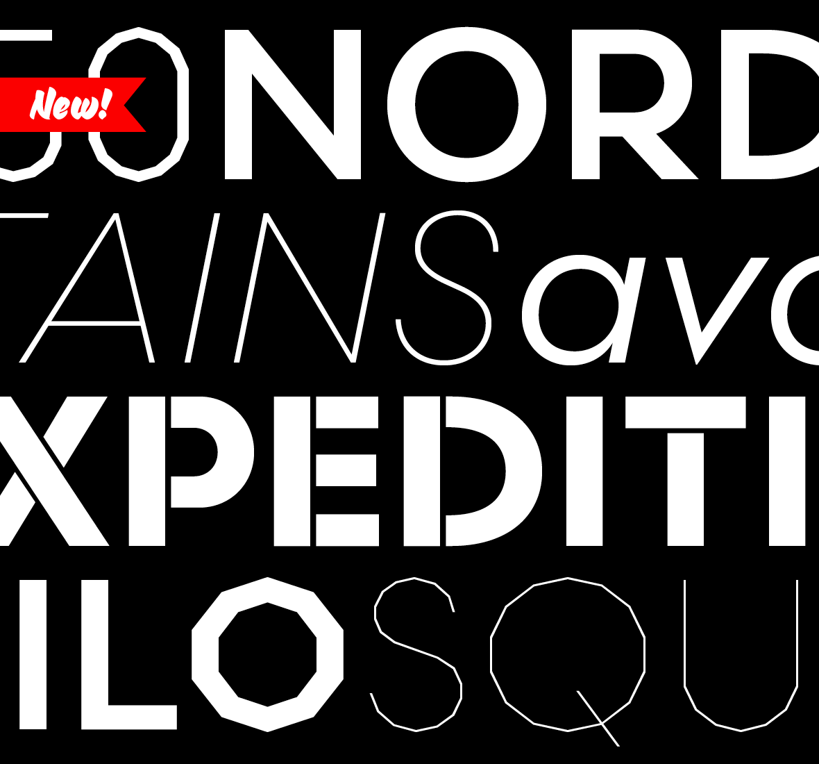
Bryant, Capucine, Elena, Klavika and Seravek all have various OpenType features like small caps, arrows and multiple numeral styles. They’re offered in two flavors for different budgets: the full versions have all their OpenType features and a higher price, and the basic sets have fewer features and a lower price. If you’re not sure you’ll use all the features, start with a basic character set and upgrade to the full version whenever you’re ready.

Example: upgrade from a basic character set to fully-featured.

Example: Buy Elena Basic Complete Family for $99. When you’re ready to add the small caps to your repertoire, purchase the full version for another $100 (normally $199 minus $99 from the previous purchase of the Basic family).


3) Add computers
This is the most straightforward of upgrade options. When your team has grown or the fonts you’ve purchased are on more computers than you’re licensed for, add more easily.

Adding computers.

Adding computers, the view from the Purchase Options page for Bryant Compressed.

To add more computers, in this instance to an existing one computer license of Bryant Compressed Bold, simply choose the number of computers you’d like and ‘add’ to cart. That’s it! The previous purchase price of $39 is factored into the cost and the extra license ends up at just $4.

For all upgrades, the first step is to log into your account. Once logged in, any prices affected by upgrades will show up in blue.