17 Aug 2010

Designing Anchor

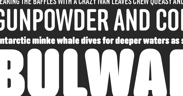
Designed for maneuvering in especially cramped quarters, Anchor is a four-weight family of round display gothics.

As with many of our typefaces, Anchor’s life began as the solution to a typographic dead end: what if the narrowest style of a typeface isn’t narrow enough? That was the case when we redesigned our (previous) website and realized 48 pixels was a mighty narrow space for words like ‘download’ and ‘specimen’ to remain reasonably legible. Being type designers, we immediately ditched the CSS for BCPs and had the beginnings of a narrow display font.

Initially just a single weight, Anchor is now a family of fonts ranging from Medium to Black. The plump Bold and Black weights easily lend themselves to swagger and exaggeration while the Medium and Semibold remain economic and capable of straightforward display work. We refer to them as ‘display gothics’ primarily in homage to the influence of the 19th and early 20th century types that provided the roadmap for this series.

Incidentally, since the initial weight of Anchor was designed for our previous website and to blend well with Bryant Compressed (which was used for the main titles of the site), the two are excellent companions.
17 Aug 2010

New Release: Anchor

Anchor is our new four-weight family of round display gothics designed for maneuvering in especially cramped quarters. With weights ranging from Medium to Black, Anchor promises plump over-indulgence in the heavy weights and relatively sober display capabilities in the lighter weights. Of note are Anchor’s inflated arrows that can be seen throughout the specimens on this site. Available exclusively at the Process Type Foundry.

See the Anchor typeface family and learn all the details about our latest release.

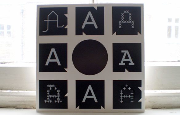
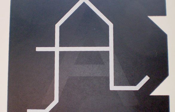
Longtime Process Type Foundry collaborator Allon Kaye of Entr’acte sent along this 12″ sleeve using eight of our capital A’s. It’s probably best to let Allon describe the project:

“it’s an over-over-overprint of process [type foundry] ‘a’s for an event-only edition (15 copies) of a new 12″ (alpha, by jo thomas).

these were originally overprinted for an event called avoid. the printers ran too many copies, so i overprinted the ‘avid’ lettering (‘o’ was the centre hole) with a blocky, abstract ‘entracte’. i’ve been using these ‘reject’ sleeves for promos etc., but every so often i get to do something a bit more special with them.”

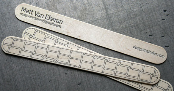
We can say with some certainty that Matt Van Ekeren is the first to print our Stratum onto a tongue depressor that doubles as a business card and call them ‘business depressors’. We’re also pretty certain they won’t fit in your wallet but they’re all the more charming for it.