Not All Who Wander Are Lost card

Designer Ross Moody and his 55 Hi’s imprint are one of the reasons we love running our own type foundry. It’s been said that type design is a lonely, difficult and frustrating endeavor and while that can be true, it’s also immensely gratifying when the bi-product of your work is so surprising.

FIG Script default

‘Is that our FIG Script?’ we wondered. When set in all caps, a script face doesn’t traditionally connect. So what gives? Capable hands. Ross deftly connected the caps, modified certain letters and added flourishing touches.

Not All Who Wander Are Lost card

‘Not all who wander are lost’ is a derivative of a line from a J.R.R. Tolkien poem titled, ‘All that is gold does not glitter.’ The poem appeared in the Lord of the Rings trilogy and the original line read, ‘Not all those who wander are lost.’ The poem and its place in the trilogy is documented on Wikipedia.

Ross has created limited edition, hand screen printed posters and postcards of ‘Not all who wonder are lost’ as well.

February Print Magazine with Kettler

The February issue of Print magazine, guest art directed by ProjectProjects, featured our oldest typeface Kettler. Starting on the cover and continuing throughout the issue, Kettler quietly punctuates conversations between a panel of selected guests on the subject of collaboration between disciplines.

February Print Magazine with Kettler

Kettler played a role in another magazine designed by ProjectProjects called Work, now out-of-print. It’s been a joy to see Kettler used by such capable hands.

Elephants never forget

When buying used books, sometimes a glimpse of the previous owner comes with them. Inside our copy of “Lettering Poster Design For Pen And Brush” by Ross F. George, copyright 1941, is a very lightly used lettering practice sheet.

Wick logo variations

On the opposite side of same sheet are several variations on the wordmark “Wick”. The previous owner’s last name?

30 Nov 2010

Designing Capucine

Although Capucine defies traditional categorization, it sits in a genre we are drawn to as users of type: a face with distinct personality able to straddle the worlds of both text and display with ease. In this context it should come as no surprise that its designer was born and raised in France, a country whose type history is rich with successful instances of such attempts. From Auriol and Grasset – typefaces that became symbolic of the Art Nouveau style – to the iconic designs of Roger Excoffon in the 1950s and 60s, French type designers have often tried to fulfill the requirements of efficient text setting while retaining a gestural quality. Like many of its French predecessors, Capucine is driven by the eye rather than geometrical dogma, bringing a warmth and liveliness to the page.

When Alice Savoie began designing Capucine in 2006, she set out to create a typeface specifically for magazine and newspaper listings. Fortunately, the demands of that potentially stifling area didn’t get in the way of what would ultimately be an expression of joie de vivre. Capucine is a robust family of ten styles, ranging from Thin to Black, whose flavor mixes the fluidity of writing with the vivacity of a brush script to create this idiosyncratic sans serif.

Capucine typeface specimen..

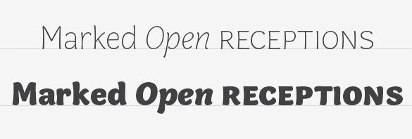
As a family, the weights and styles were designed to provide typographic contrast and variation. The two extremes – Thin and Black – were conceived as display variants while the mid-weights – Light, Regular and Bold – were designed for text sizes and to add hierarchical differentiation. When you first encounter Capucine, its use as a display face is evident. However, because it is slightly condensed, has a large x-height, small ascenders & descenders and wide counters, it is efficient for body text and remains legible even at small sizes. Additionally, the family features small caps, multiple numeral styles and case-sensitive punctuation for increased usefulness.

Capucine's italics as a unique style.

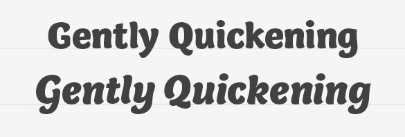
Adding to the typographic variation of Capucine is the italic. Despite its moderate angle, the pronounced contrast between thicks and thins, the exaggerated curves and a slight condensation of letter width provide the necessary contrast while remaining perfectly in sync with its roman counterpart. Set the italic at larger sizes, however, and it reveals itself as an independent design in its own right.

And for those who wonder, the name Capucine (pronounced KA-poo-seen) is not a reference to the delicious Italian mixture of coffee and foamed milk or even the French preference for strong coffees. Rather, the name is the French word for the nasturtium flower – deemed appropriate here because of the organic nature of the Capucine family.

30 Nov 2010

New Release: Capucine

More than four years in the making, we’re proud to finally announce the release of Capucine, a new family of types designed by Alice Savoie. With influences ranging from calligraphy to Art Nouveau to brush scripts, this five-weight family offers – to put it in a single phrase – joie de vivre. See more of Capucine and learn all the details about our latest release.

Durban stadium seating

Durban, South Africa’s busiest port city, constructed the magnificent Moses Mabhida Stadium which allowed them to be a host stadium for the 2010 FIFA World Cup games. Büro für Gestaltung designed the wayfinding and identity and covered the stadium from the seats to the murals with our Klavika. When the games were over, Jonathan Jackson of WeShouldDoItAll was kind enough to send along images of the stadium with a particular emphasis on the use of Klavika. This booklet was created to showcase his photographs, the stadium and our typeface.

Launch: Klavika at the 2010 FIFA World Cup Booklet