Lecture at the Walker

We recently spoke at this year’s Insights Design Lecture Series hosted by the Walker Art Center and AIGA MN. The lecture was recorded and can be seen here: Walker Channel (also available through iTunes and YouTube).

The New York Times Magazine has unveiled a new custom family of 13 fonts from the Process Type Foundry. Named Sunday, the family of sans serifs may be viewed at a local newstand or find the project in our custom section.

27 Mar 2007

Designing Seravek

Clear functionality, near invisibility and a tone whose presence is felt most once-removed – this is the essence of Seravek. Fonts of loud volume and expressive detail have a rightful place – we’ve made many ourselves – but fonts of near silence are equally intriguing and consequently very useful for complex texts.

Building from this, Seravek is tailored to the demanding needs of information, editorial, and identity design where the twin forces of richness and clarity must co-exist. The resulting letters are unobtrusive, refined and imbued with a sense of forward modernity – essential for a diverse range of work in today’s environment.

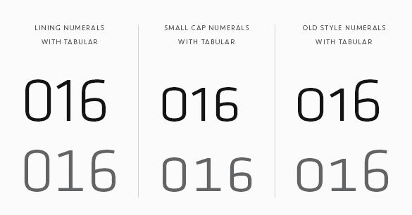
Range of tabular numerals: lining, small cap and old style

Knowing the display of numerical data is crucial to communication, we’ve included Lining Numerals (default) as well as Old Style, Small Cap, Tabular, Tabular Old Style and Small Cap Tabular numerals for each weight of Seravek – italics included. Additionally, each of the tabular styles share the same fixed width in all 5 weights and even have their own tabular currency and math symbols. You’ll also find pre-composed fractions as well as the elements needed to set your own.
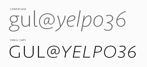
Small caps illustration

And of course, small caps. If we can do it, we’ll use small caps for just about anything but this also means we’re picky about them. As such, we’ve designed an entire set of punctuation for the small caps when All Small Caps (an OpenType feature) is activated by the user. So, never again will your small cap apostrophes float away untethered.

To keep Seravek accessible, we’ve also created Seravek Basic for those requiring something more stripped down. Seravek Basic is the same as Seravek but does not contain features like small caps, multiple numeral styles, fractions, arrows etc. If you buy Seravek Basic and later decided to upgrade, the purchase price is directly credited towards the complete family.

18 Nov 2004

Designing Klavika

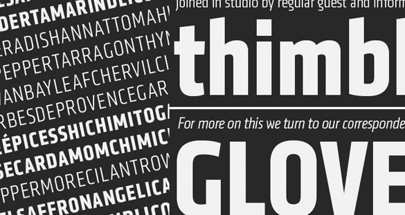
Frustrated with a lack of fonts both versatile and modern, we set out to design Klavika as a full-featured, do-it-all sans serif for the needs of the 21st century. Our result is a design that’s unadorned, modern and infinitely flexible. To achieve this, Klavika follows a decidedly hybrid typographic path – a cross of humanist and geometric influences with allegiances to neither. Crisp and open shapes keep the font legible in small sizes while the straight-sided characters anchor headlines and display work solidly in place. And since part of the goal was flexibility, we’re happy to report that since its introduction in 2004, Klavika has found its way into a wide variety of media from print to pixels.

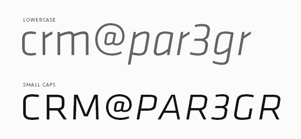
Showing the small caps of Klavika.

To be truly versatile, a font should be reasonably extensive as well. Klavika has a wide range of typographic features and – as is common with our fonts – showers special attention on small caps. They are essential for setting acronyms and initials (amongst other things) and excellent for titling and display work. Special attention has also been paid to the width of the capitals, specifically increasing it, for better legibility at small sizes and added punch in headlines.

Numerals are another of the typographic features. Because a varied array of numerals is essential to contemporary communication, Klavika contains multiple styles. You’ll find Lining (the default style), Old Style, Small Cap, Tabular, Tabular Old Style and Small Cap Tabular numerals for each weight of Klavika – italics included.

If your requirements don’t call for all those typographic features, Klavika Basic was created with you in mind. It is the same as Klavika but without features like small caps, multiple numeral styles and arrows. If you buy Klavika Basic and later decide to upgrade to the fully-featured Klavika, the purchase price is directly credited towards the complete family.