Posts tagged “In use”

Fringe Division

Fringe Division - Detail

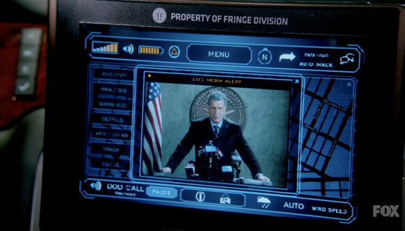
As fans of J.J. Abrams, co-creator of the television show ‘Fringe,’ we were tickled by this tiny use of one of our typefaces in the show. From the episode ‘Everything in Its Right Place,’ the in-car communication and navigation system is branded the property of Fringe Division using Klavika, appropriately and soberly set in all caps.

Durban stadium seating

Durban, South Africa’s busiest port city, constructed the magnificent Moses Mabhida Stadium which allowed them to be a host stadium for the 2010 FIFA World Cup games. Büro für Gestaltung designed the wayfinding and identity and covered the stadium from the seats to the murals with our Klavika. When the games were over, Jonathan Jackson of WeShouldDoItAll was kind enough to send along images of the stadium with a particular emphasis on the use of Klavika. This booklet was created to showcase his photographs, the stadium and our typeface.

Launch: Klavika at the 2010 FIFA World Cup Booklet

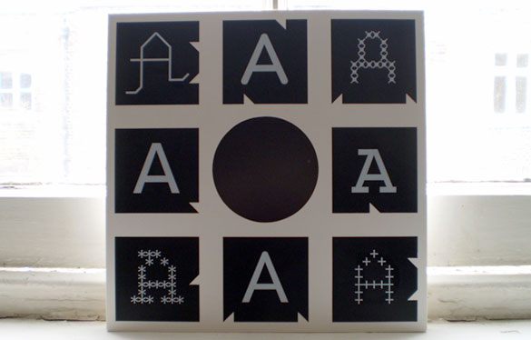
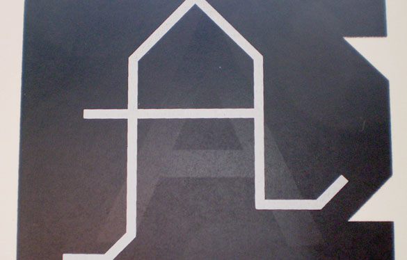
Longtime Process Type Foundry collaborator Allon Kaye of Entr’acte sent along this 12″ sleeve using eight of our capital A’s. It’s probably best to let Allon describe the project:

“it’s an over-over-overprint of process [type foundry] ‘a’s for an event-only edition (15 copies) of a new 12″ (alpha, by jo thomas).

these were originally overprinted for an event called avoid. the printers ran too many copies, so i overprinted the ‘avid’ lettering (‘o’ was the centre hole) with a blocky, abstract ‘entracte’. i’ve been using these ‘reject’ sleeves for promos etc., but every so often i get to do something a bit more special with them.”

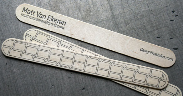
We can say with some certainty that Matt Van Ekeren is the first to print our Stratum onto a tongue depressor that doubles as a business card and call them ‘business depressors’. We’re also pretty certain they won’t fit in your wallet but they’re all the more charming for it.