Posts tagged “Scandia”

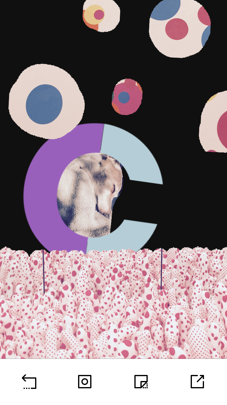
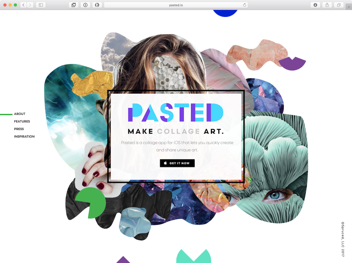
Pasted is a collage app, from James Mercer of The Shins and Zeke Howard and Ben Fogarty of The Brigade, a design studio in Portland. It’s an inventive tool that lets you mask photos, add filters, and layer graphics to make artwork. After creating their logo with Scandia Stencil, they expanded the concept into a full alphabet pack, so you can paste the two-tone letters into your collage and they’ll react to the filters. It’s always fun to see our fonts used in creative ways — if you’re ever interested in licensing for a mobile app, just get in touch.

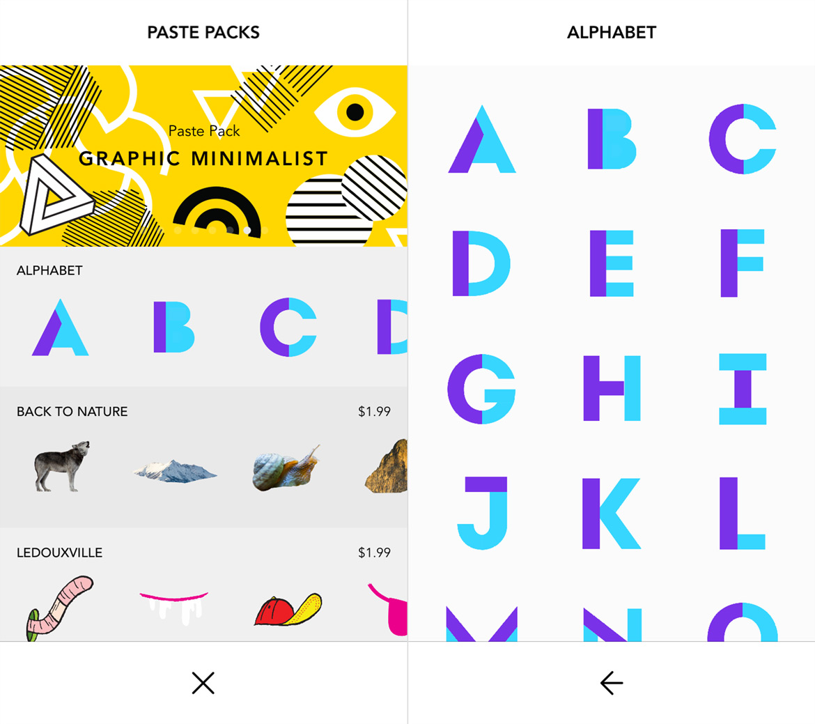
“Stencil fonts feel like they have a unique place in collage art. As a result, Scandia really felt right. It’s almost like some of the geometric stickers were used to assemble the logo.”—Ben Fogarty
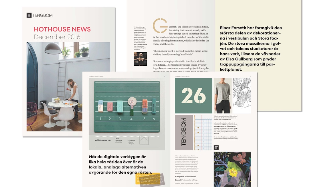
tengbom_id_2016-05-03_page_27_5000

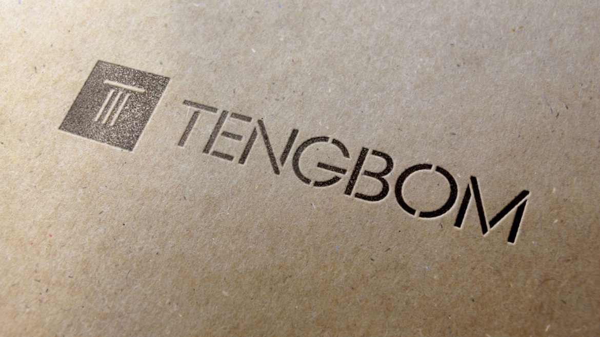
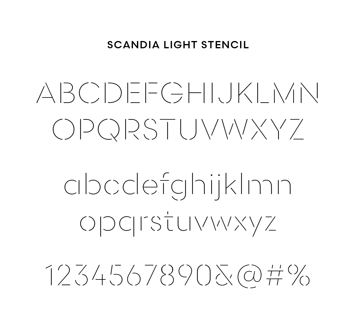
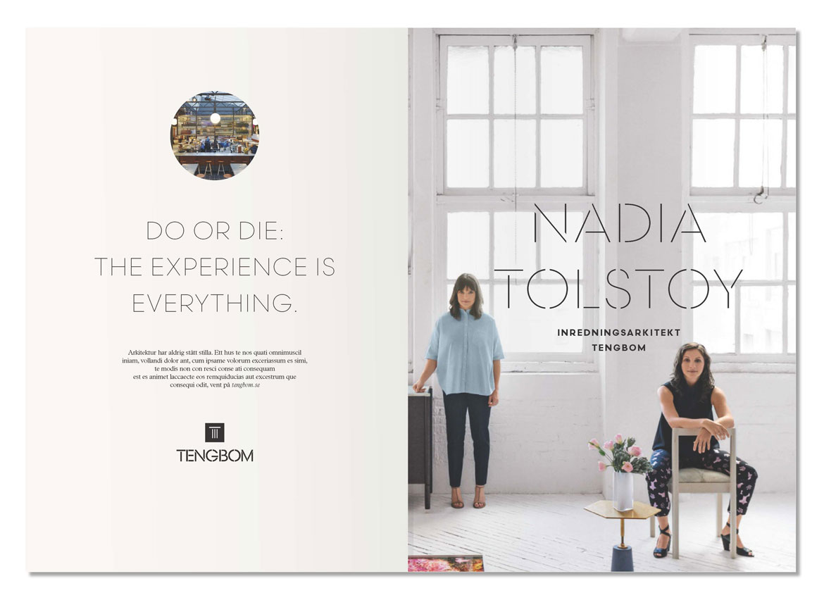
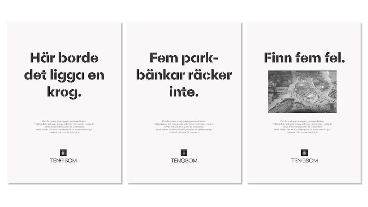
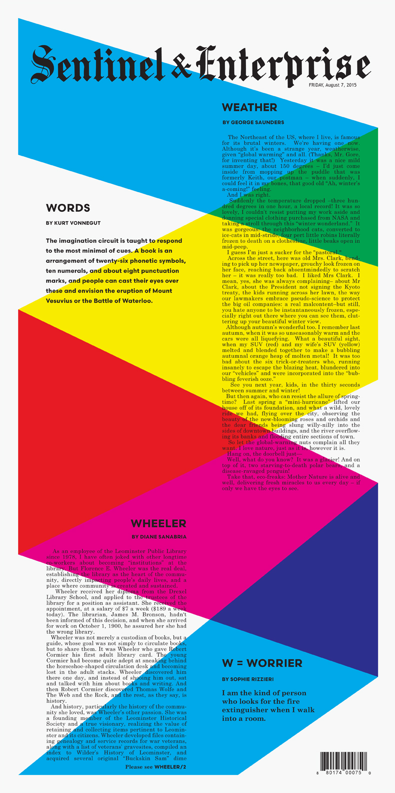
Tengbom, a Scandinavian architectural firm, has a new visual identity and it’s full of Scandia. Developed by Oscar Liedgren Studio, the branding takes full advantage of our latest typeface and also features a new style — Scandia Light Stencil.

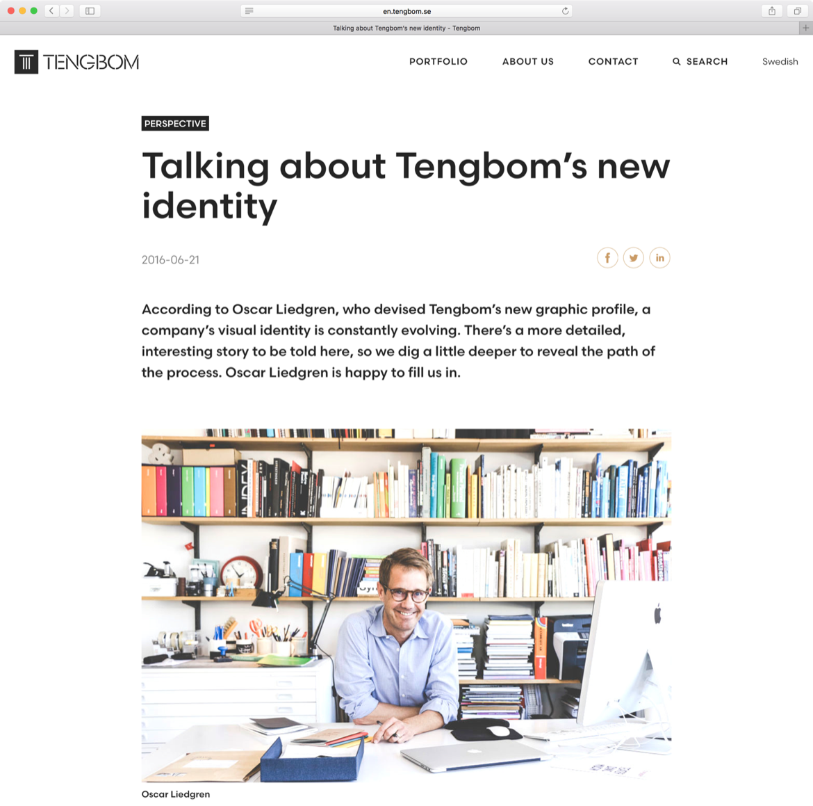
Scandia was released with just one stencil font, but Liedgren thought a second, lighter weight would carry them even further. He came to us after creating Tengbom’s new logo, based on Scandia Regular, and worked with Eric Olson to design the custom font. Since there was always potential for more stencil weights, we’re glad they asked.

tengbom-scandia-light-sample

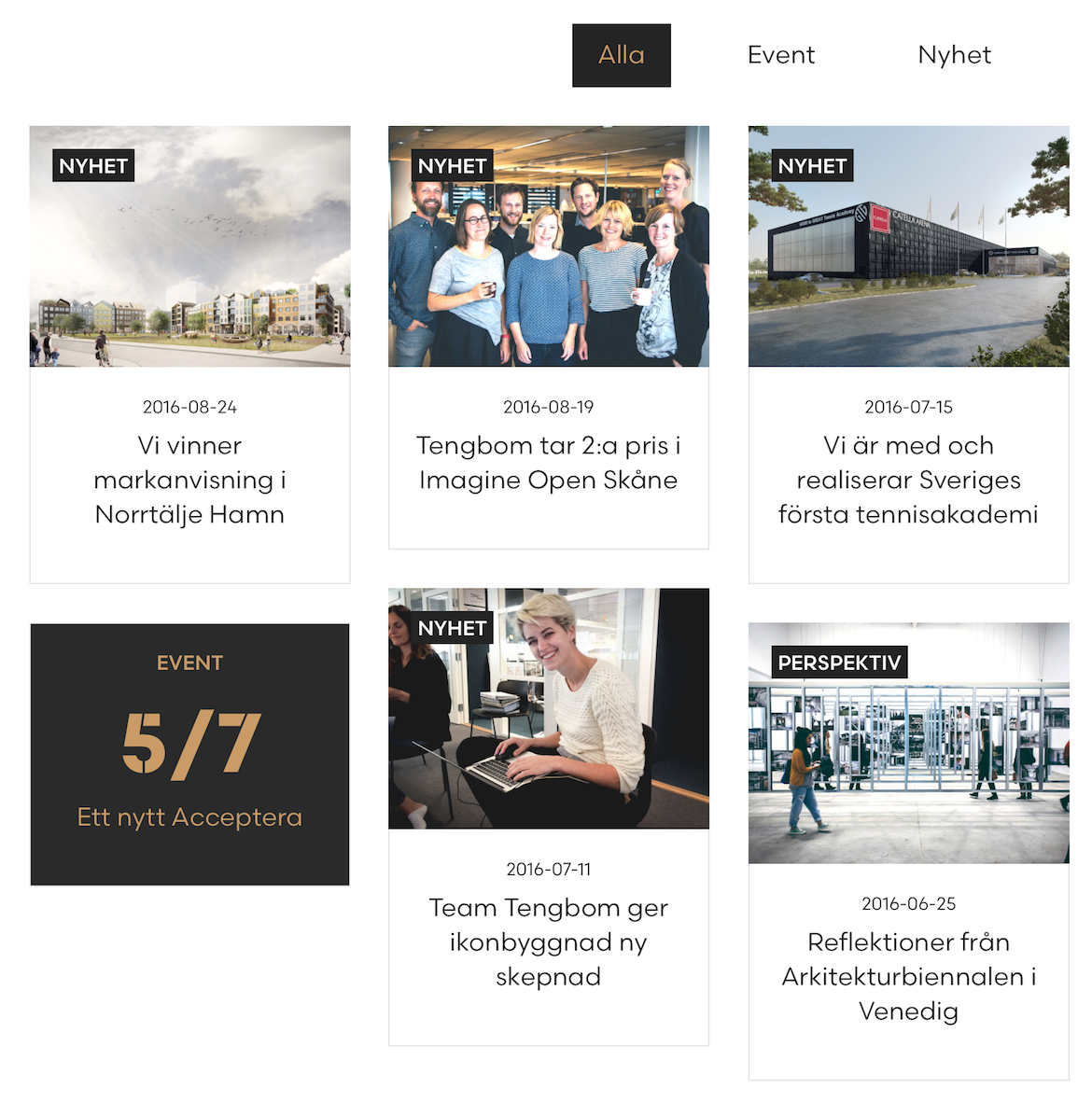
No doubt stencils and architecture have an affinity for each other. Liedgren was keenly aware of the relationship but after surveying the competition, he found it wasn’t as common as he imagined. In the end, their use of stencils accent Tengbom’s own design work, adding a nice level of detail across print and web.

‘I think type in the context of identity can help you either to “belong” to a world (like that of architecture) or “stand apart”,’ Liedgren explained via email. ‘Both are valid strategies and need to be seen in the light of all other graphic elements and imagery at hand. In the end, what makes it work or not, is in the detail, in the craft, and in the way it’s applied.’

tengbom_id_2016-05-03_page_31_5000


Tengbom-portfolio3b

alla-crop

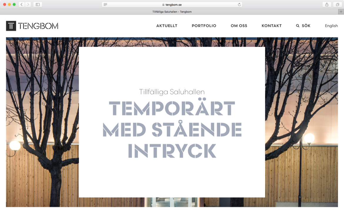
Tengbom-blog2


Visit Tengbom.se to see the webfonts served up. And you can see more in-use samples at Oscar Liedgren Studio. Print images courtesy Oscar Liedgren.

Scandia on Fontstand

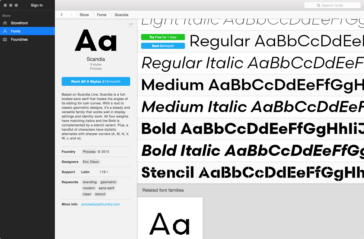
There’s a new way to test our typefaces, and not just that – you can rent them too. Fontstand, a desktop Mac application, lets you try fonts for free for one hour as well as rent them on a monthly basis at 10% of the normal license cost. Whether you rent or trial, the chosen fonts work right away in your design apps without you having to install them. At launch, Fontstand offers hundreds of typefaces from over twenty independent foundries.

Clicking a ‘buy’ button isn’t always easy. Maybe you need to test the fonts before committing, maybe you want to make sure the client approves, or maybe you’re a design student on a tight budget. We get that – we’ve been there – and we think Fontstand can help. This new approach to licensing is a great way to get your hands on high-quality typefaces and ensure that you’re using the right font for the job. You can think of renting as an extensive test or as a way to use fonts for a limited time – you can always rent the fonts again when you revisit a project – and once you rent for twelve total months, the fonts are yours to download.

To get started with Fontstand, visit fontstand.com. And the links below will take you directly to the fonts we currently offer. If there are any typefaces you’d love to see on Fontstand, send us an email or tweet.

Process on Fontstand:

Sample specimen of Scandia & Scandia Line

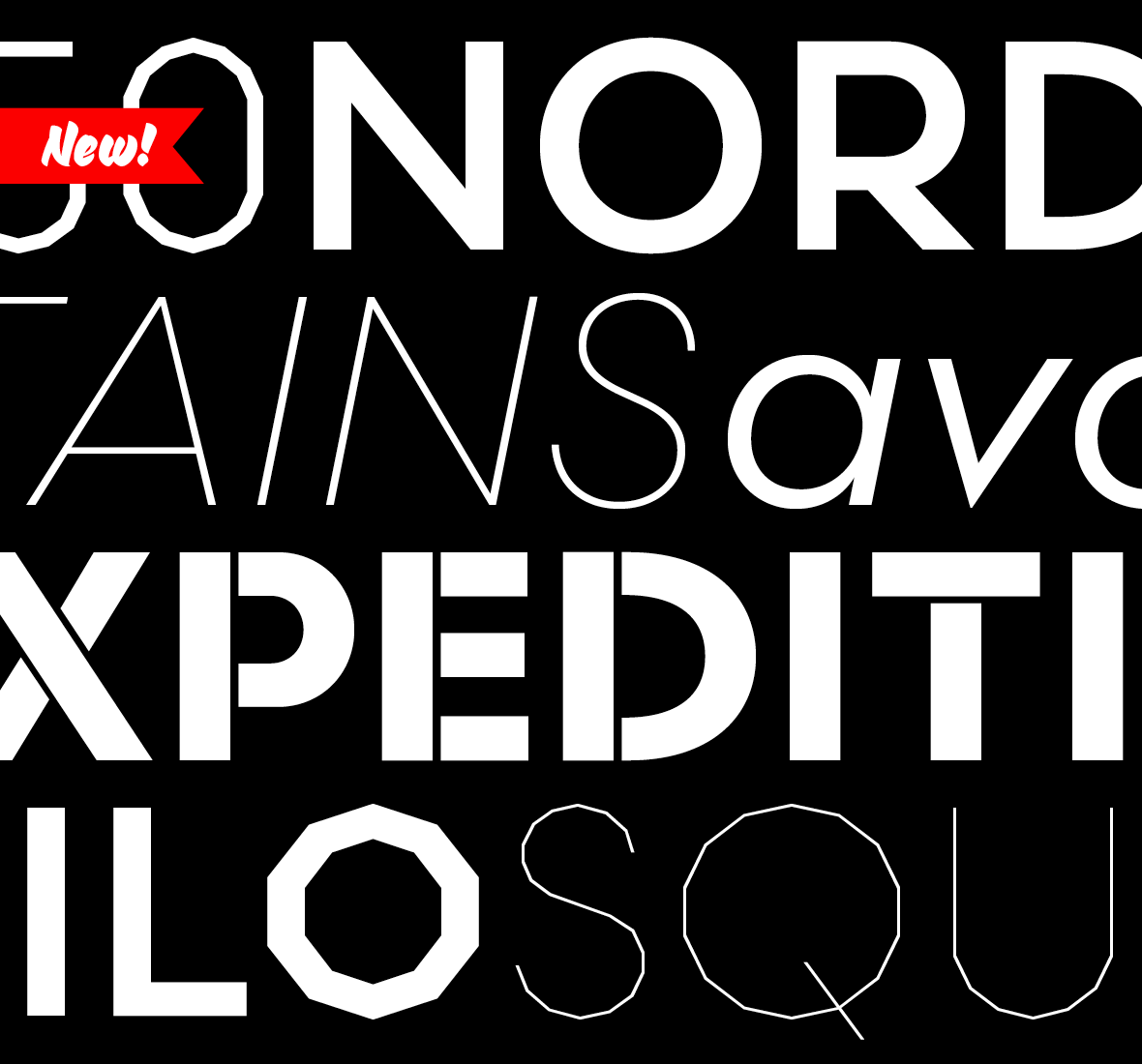
We’re excited to announce the release of two new typefaces, Scandia and Scandia Line. Although they’re siblings deep down, their differences are more apparent than their similarities. Designed first, Scandia Line is a skeletal sans serif made entirely without curves. Scandia came next, taking Line’s circular proportions but abandoning the all-angle policy for generous curves instead.

Each family has four weights with Scandia offering corresponding italics. As if that weren’t enough, Scandia and Scandia Line also include a stencil variant and several alternates for added versatility. The family’s matching proportions make them a perfect typographic pair but their distinct personalities allow them to function nicely on their own.

Available now, you can license Scandia and Scandia Line in web and desktop formats. For more about each family, visit their respective pages or take a look at their PDF specimens.