It’s 2012 already but before we say goodbye to 2011 entirely, there were tidbits from the last 365 we don’t want to forget. And while we’re at it, we’ve included a preview of typefaces slated for release in the New Year.
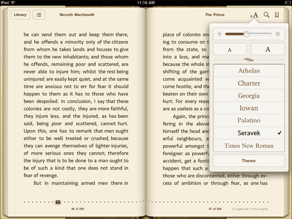
Seravek in Apple's iBooks

Seravek in iBooks
The 1.5 update to Apple’s iBooks app included several new typefaces, our Seravek among them. Of the seven type choices within the app, Seravek is the only sans serif.

Read more about the new fonts in iBooks:
Apple Updates iBooks App with Nighttime Reading Theme, New Fonts, More on MacRumors
Version 1.5 Improves Typography in iBooks on iPad and iPhone on the FontFeed
FontSwap in iBooks on BoingBoing
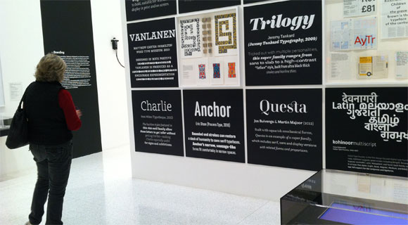
Anchor at Walker Art Center

Anchor at the Walker Art Center
Like MoMA’s acquisition of several typefaces last year, the exhibition Graphic Design: Now in Production currently on view at the Walker Art Center highlights typefaces as significant cultural artifacts in their own right. Anchor was featured among a number of other typefaces as further evidence of the emerging role of designers as producers.

Five Long Years
After five years of tweaking, polishing and refining, we finally pressed the launch button on Nicole’s typeface Elena. Up next for Nicole? A display font loosely inspired by the rhythms of the brush marker.
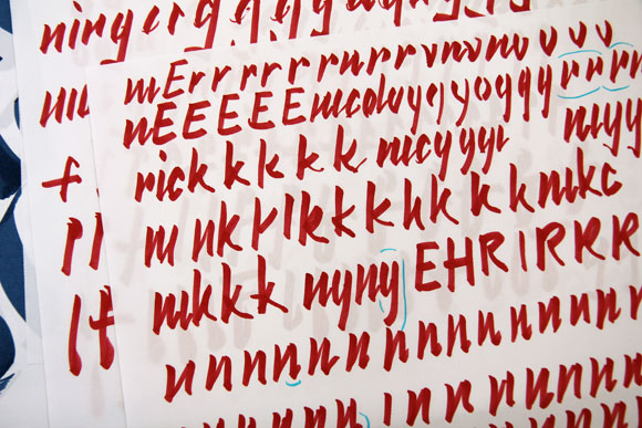
Starter material for Nicole's new typeface.

1% for the Planet
As members of 1% for the Planet, we donate one percent of our yearly sales to non-profit organizations working to improve the environment. This year we lent our support primarily to local organizations like the Will Steger Foundation, the Midtown Greenway Coalition, Friends of the Boundary Waters Wilderness and the Sibley Bike Depot. Our one non-local exception was the Washington-based Sea Shepherd.

One year on: Webfonts and Capucine
October 6 of 2010 marked the launch of our webfonts program making 2011 our first full year with webfonts on offer. And the report so far? Roughly 38% of fonts purchased on our site were either webfonts or webfont/desktop combinations.
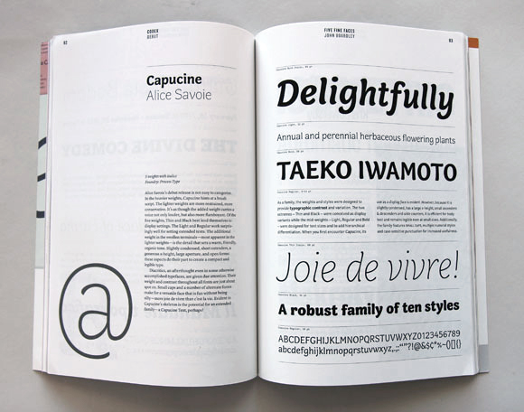
Capucine featured in Codex magazine.

Alice’s typeface Capucine also celebrated its first year post-release. We were delighted to see it featured in the inaugural issue of Codex. Of course, seeing it used for what Alice originally intended – as a typeface for magazine listings – in the November issue of Seattle Met also made our list of wonderful things.
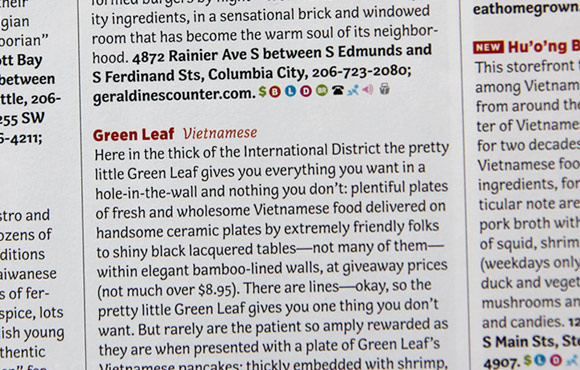
Capucine in Seattle Met magazine.

Henry B. Weimelt
We were surprised to learn this year that Eric’s great grandfather, Henry B. Weimelt, was a passionate letter maker when not working his shift at the local Post Office. For years, relatives told tales of his after-hours letter work but it wasn’t until this year that his collection of hundreds – if not thousands – of handcrafted letters were uncovered and gifted to Eric. After sorting through the collection though, Henry’s intentions remain a mystery. What were the letters used for? Why did he make them? We’ve posted one half of one small box on our Flickr account.
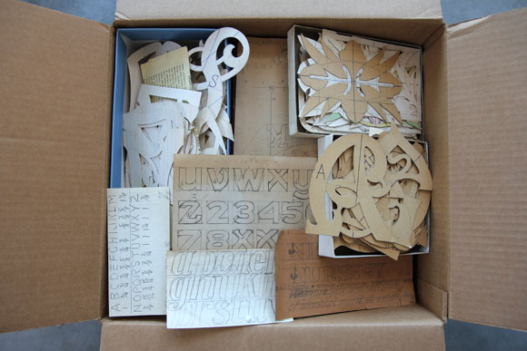
Henry B. Weimelt and his letters.

On Deck for 2012
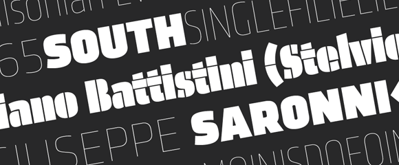
And last but not least, a good deal of 2011 was spent focusing on releases for 2012. In the New Year Eric will release his 12-font family Chrono followed by the boisterous display companion to Klavika, Klavika Display.
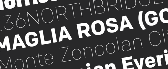
Chrono Typeface

Klavika Display Typeface

2012 also marks our ten-year anniversary. Thank you for ten wonderful years (officially in June) and here’s to ten more. All our best in this new year!
10 Nov 2011

Meet the Stack

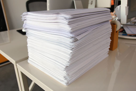
The stack

It took me five years to develop Elena. During that time, my constant companion was what we have taken to calling ‘the stack.’ Standing roughly a foot tall, the stack is a chronological collection of laser prints used to test Elena.

Sadly, after a couple of studio moves, the current stack only dates back to 2009. Luckily, 2006, ’07 and ’08 are somewhere. Test documents never get thrown away, only stored absentmindedly awaiting future serendipitous discovery.

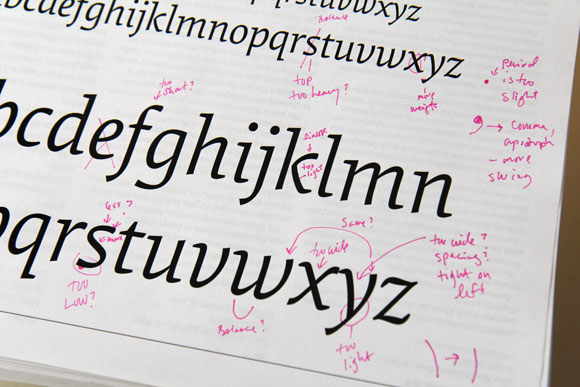
The stack - abc's

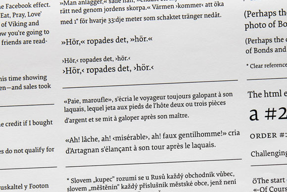
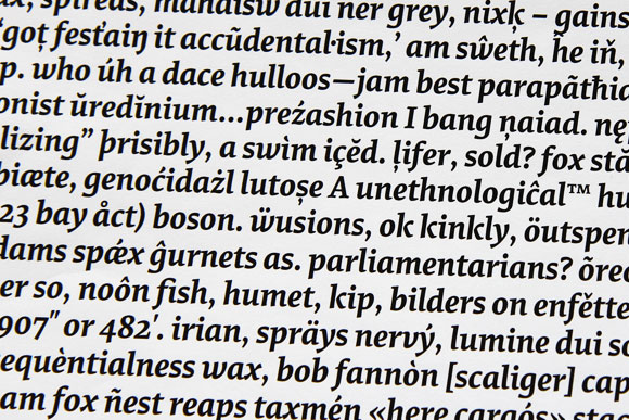
Long hours were consumed poring over each and every test document to continually refine the typeface. Some tests are set in stone like the archetypal ‘a b c’ run through. Others are created on the fly to test a particular character, language or typographic convention. Sometimes, they’re just gibberish.

The stack - punctuation

The stack - gibberish

Whatever happens to the stack in the end (shoved into a box and stored in the basement?), it’s a tangible testament to the effort and thought process of a typeface.
ND

1 Nov 2011

New Release: Elena

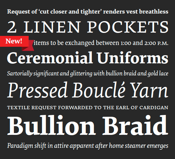
Elena specimen

We’re pleased to announce the long-awaited release of Elena from type designer and Process Type Foundry partner Nicole Dotin. Designed specifically for text and extended reading, Elena is a contemporary text face well suited for magazines, books and editorial design. Pairing the inspiration of the broad-nibbed pen with a desire for a modern page color, Elena is a face of economical proportions, moderate x-height and spare details.

Available in Regular and Bold with accompanying Italics, each style of Elena is replete with the necessary features one would expect for proper text work like small caps, case sensitive forms and a diverse range of numeral styles including those specifically for small caps. Basic versions start at $39 and full versions at $75.

The first Minnesota State Fair was in 1859, and since then (with just five exceptions due to wars and polio outbreaks), it has been held every year at the summer’s close. Facing this bittersweet farewell, Minnesotans choose to go out with a bang, bringing together a sensory-bombarding celebration of food, fun, agriculture, industry, art, music, history and overall indulgence.

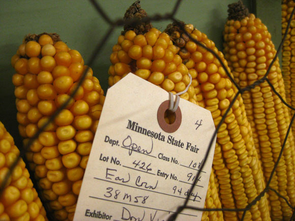
We three at Process Type Foundry packed up and hit the fairgrounds with cameras in hand to capture the explosion of type and lettering (both terrific and terrible) to be found.

From practical tags and signs showcasing Minnesota’s best crops, to the showy stands of the food vendors, the hand-lettered ephemera in the Fair’s historic Heritage Square and the glittering gaudiness of the Midway, we certainly weren’t disappointed.

MNStateFair_1.jpg

Continue reading

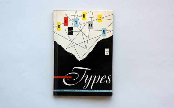
As type designers we naturally have many type specimens stashed away in our collection, though very few of them manage to elevate type beyond the typical waterfall showings and text settings. There are exceptions of course, but the latest addition goes the extra mile.

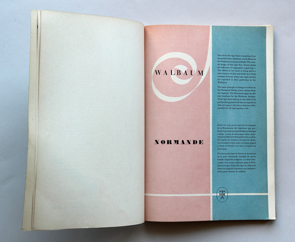
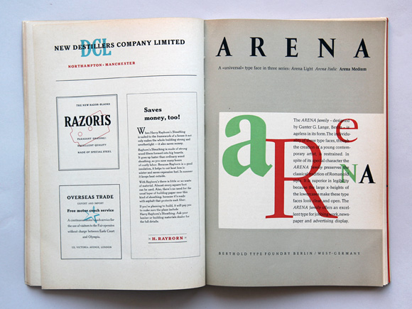
With its gorgeous layouts and ersatz ads, we can’t help but appreciate this specimen from Berthold Type Foundry, numbered “525B”. Find many more mid-century (no specific year is given) specimen layouts after the jump.

Berthod Type Foundry Specimen 525B

Berthod Type Foundry Specimen 525B

Berthod Type Foundry Specimen 525B

Continue reading

7 Jul 2011

Summer Reading

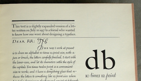
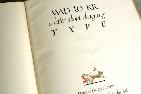
Detail of WAD to RR: a letter about designing type

When we saw today’s release of the summer reading list for the University of Reading typeface design students, one title stood out. Gerry Leonidas, director of the program, has put together a great index of references that includes an influential monograph by William Addison Dwiggins.

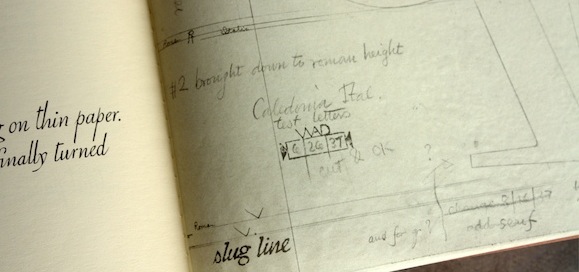
Dwiggins, an American illustrator and book designer, came to type design later in life. He wrote WAD to RR: a letter about designing type to colleague Rudolph Ruzicka in 1940, offering rare insight into the typeface design process. We pulled out our copy of the Dwiggins text from our collection.

Cover of WAD to RR: a letter about designing type

Dwiggins, who is credited with coining the term “graphic designer”, is a particularly compelling character for the lively variety of his work. In addition to his work in advertising, book design, calligraphy and type design, he also operated a marionette theater. Though he studied lettering with Frederic Goudy as a young man, he didn’t take up type design until his late forties, when he was invited by the Mergenthaler Linotype Company to create a contemporary sans-serif typeface that then turned into the idiosyncratic sans Metro.

Detail of WAD to RR: a letter about designing type

View more photos of our copy on Flickr, or read the entire letter here.