Fringe Division

Fringe Division - Detail

As fans of J.J. Abrams, co-creator of the television show ‘Fringe,’ we were tickled by this tiny use of one of our typefaces in the show. From the episode ‘Everything in Its Right Place,’ the in-car communication and navigation system is branded the property of Fringe Division using Klavika, appropriately and soberly set in all caps.

6 Mar 2012

Designing Colfax

Colfax is a refined oval sans serif of 20th century origins and 21st century sensibilities. Influences ranging from the gruff Aurora Grotesk series to the elegant Neuzeit are paired with a subtle geometry and typographic utility to inform this family of sans serifs.

A showing of Colfax's six weights with their italics.

Featuring a range of six weights with italics, the entire Colfax family is made up of twelve fonts. At the extreme ends of the range are two display weights – Thin and Black – supported by four workhorse weights – Light, Regular, Medium and Bold.

Pairing weights for contrast.

When designing Colfax’s weight range, we followed our standard policy: create truly useful weights rather than what is mechanically possible. As such, each weight can be used with another two up or two down in the range to maintain contrast between the two. For instance, Thin can be paired with Regular or Medium paired with Black. This isn’t prescriptive, of course, but offers a rational starting point for a typographer first experimenting with Colfax.

Setting of Gb05, or the round and semi-oval characters.

The conventionally round or semi-oval characters of Colfax are comprised of subtle straight sides and near perfect circles. We think of this as implied geometry. It isn’t measured or automatically repeated for all characters but instead referenced throughout the typeface creating a pleasant, family-wide gestalt.

'Notwisthstanding' set in the roman and italic for comparison.

Although so-called true italics are often paired successfully with sans serif designs, they simply didn’t match Colfax. Oblique, adjusted italics were drawn instead to match the starkness and gravity of the roman.

"JUJITSU", showcasing the crossbar of the uppercase J.

True to its minimalist roots, Colfax has just one alternate: the uppercase J. Found as an OpenType Stylistic Alternate, its horizontal cross bar at cap height makes it ideal for double J headlines like JOJOBA or JUJITSU.

Lots o' arrows.

We love arrows so it’s only natural Colfax features a collection of left and right directional arrows in all six weights to point the way. The arrows are available in two sizes – one for caps and another for lowercase.

Colfax was formerly named Chrono.

6 Mar 2012

New Release: Colfax

Colfax

We’re pleased to announce the release of our new typeface Colfax. At home within a range of design environments, Colfax is a refined oval sans serif of twelve styles ranging from Thin to Black with matching italics for each. Singles, packs and the complete family are available in both desktop and webfont formats.

Colfax was formerly named Chrono.

When I want to share something with someone these days, I send a quick email or a tweet. My time is often limited and my attention pulled in multiple directions so I’ve come to value the quickness and ease of communicating by digital means.

Yesterday though, my mom sent me a recipe hand-written by my grandmother who passed away some time ago. Even though she sent it by email, the minute I saw my grandmother’s handwriting a flood of memories came to me about her – her sizable collection of shells, the tiny Keds she wore, her love of a particular shade of green that pervaded the interior decor of her home and the game Boobytrap I used to play only at her house. All of that, from just her handwriting.

Ginny's Buckwheat Cakes Recipe

Her writing style was utilitarian and deliberate probably stemming from her days as an elementary school teacher. Certainly nothing remarkable. Those letterforms were uniquely her own though – a combination of her culture, how she learned to write, her personality, career, age and all the other aspects that create a person’s distinct hand.

In a world saturated with digital messages often conveyed by an assortment of repetitive and preselected typefaces, writing creates a direct link to the person and not just the content. Send out those tweets and status updates, but don’t neglect to write it down every now and then.

PS: Ginny’s Buckwheat Cakes Recipe
ND

It’s 2012 already but before we say goodbye to 2011 entirely, there were tidbits from the last 365 we don’t want to forget. And while we’re at it, we’ve included a preview of typefaces slated for release in the New Year.

Seravek in Apple's iBooks

Seravek in iBooks
The 1.5 update to Apple’s iBooks app included several new typefaces, our Seravek among them. Of the seven type choices within the app, Seravek is the only sans serif.

Read more about the new fonts in iBooks:
Apple Updates iBooks App with Nighttime Reading Theme, New Fonts, More on MacRumors
Version 1.5 Improves Typography in iBooks on iPad and iPhone on the FontFeed
FontSwap in iBooks on BoingBoing

Anchor at Walker Art Center

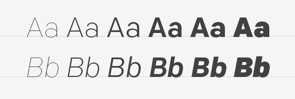
Anchor at the Walker Art Center
Like MoMA’s acquisition of several typefaces last year, the exhibition Graphic Design: Now in Production currently on view at the Walker Art Center highlights typefaces as significant cultural artifacts in their own right. Anchor was featured among a number of other typefaces as further evidence of the emerging role of designers as producers.

Five Long Years
After five years of tweaking, polishing and refining, we finally pressed the launch button on Nicole’s typeface Elena. Up next for Nicole? A display font loosely inspired by the rhythms of the brush marker.

Starter material for Nicole's new typeface.

1% for the Planet
As members of 1% for the Planet, we donate one percent of our yearly sales to non-profit organizations working to improve the environment. This year we lent our support primarily to local organizations like the Will Steger Foundation, the Midtown Greenway Coalition, Friends of the Boundary Waters Wilderness and the Sibley Bike Depot. Our one non-local exception was the Washington-based Sea Shepherd.

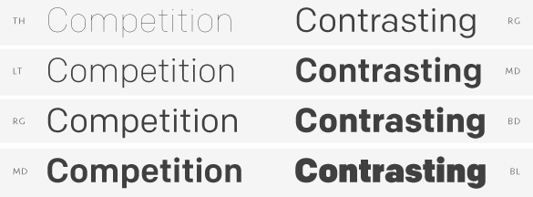
One year on: Webfonts and Capucine
October 6 of 2010 marked the launch of our webfonts program making 2011 our first full year with webfonts on offer. And the report so far? Roughly 38% of fonts purchased on our site were either webfonts or webfont/desktop combinations.

Capucine featured in Codex magazine.

Alice’s typeface Capucine also celebrated its first year post-release. We were delighted to see it featured in the inaugural issue of Codex. Of course, seeing it used for what Alice originally intended – as a typeface for magazine listings – in the November issue of Seattle Met also made our list of wonderful things.

Capucine in Seattle Met magazine.

Henry B. Weimelt
We were surprised to learn this year that Eric’s great grandfather, Henry B. Weimelt, was a passionate letter maker when not working his shift at the local Post Office. For years, relatives told tales of his after-hours letter work but it wasn’t until this year that his collection of hundreds – if not thousands – of handcrafted letters were uncovered and gifted to Eric. After sorting through the collection though, Henry’s intentions remain a mystery. What were the letters used for? Why did he make them? We’ve posted one half of one small box on our Flickr account.

Henry B. Weimelt and his letters.

On Deck for 2012
And last but not least, a good deal of 2011 was spent focusing on releases for 2012. In the New Year Eric will release his 12-font family Chrono followed by the boisterous display companion to Klavika, Klavika Display.

Chrono Typeface

Klavika Display Typeface

2012 also marks our ten-year anniversary. Thank you for ten wonderful years (officially in June) and here’s to ten more. All our best in this new year!

10 Nov 2011

Meet the Stack

The stack

It took me five years to develop Elena. During that time, my constant companion was what we have taken to calling ‘the stack.’ Standing roughly a foot tall, the stack is a chronological collection of laser prints used to test Elena.

Sadly, after a couple of studio moves, the current stack only dates back to 2009. Luckily, 2006, ’07 and ’08 are somewhere. Test documents never get thrown away, only stored absentmindedly awaiting future serendipitous discovery.

The stack - abc's

Long hours were consumed poring over each and every test document to continually refine the typeface. Some tests are set in stone like the archetypal ‘a b c’ run through. Others are created on the fly to test a particular character, language or typographic convention. Sometimes, they’re just gibberish.

The stack - punctuation

The stack - gibberish

Whatever happens to the stack in the end (shoved into a box and stored in the basement?), it’s a tangible testament to the effort and thought process of a typeface.
ND