Posts tagged “Klavika”

Over the years, we’ve been refining our webfonts for better performance but today we’re happy to announce significant improvements to select fonts. Colfax Web, Klavika Web and Klavika Condensed Web are now manually hinted — for ClearType and greyscale — providing a high degree of readability across browsers. In addition to manual hinting, some character shapes were adjusted to render nicely down to 14 pixels.

So what does this look like? Although auto-hinting can do a decent job, it often fails to describe the nuances of certain character shapes across a range of sizes leaving a typeface perfectly readable at some sizes while leaving others muddy. The examples below show where auto-hinting failed the hardest (on the left) with manual hinting to the rescue (on the right).
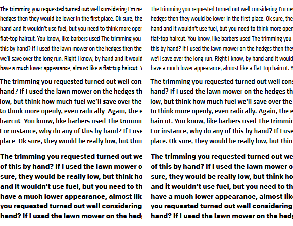

Before hinting, on the left; after, right.
From top to bottom: Klavika Web Condensed Regular, Klavika Web Medium and Colfax Web Bold. All samples are set at 14px and rendered by Firefox 28 on Windows 8.


How can I take advantage of the updates?
Download the new fonts. For previous webfont purchasers, start by logging into your account. The font packages have been updated so simply re-download your order. Or, send us a quick request for the new fonts and we’ll email them to you (be sure to include your order number).

Republish your kit on Typekit. If you’re using Typekit, republish any kits containing the updated fonts to use the latest versions.

Up next
The web versions of Colfax, Klavika and Klavika Condensed were the first in line for the updates, but Elena Web, Stratum 1 & 2 Web and Bryant 2 Web are on deck.
New Release: Klavika Display

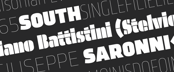
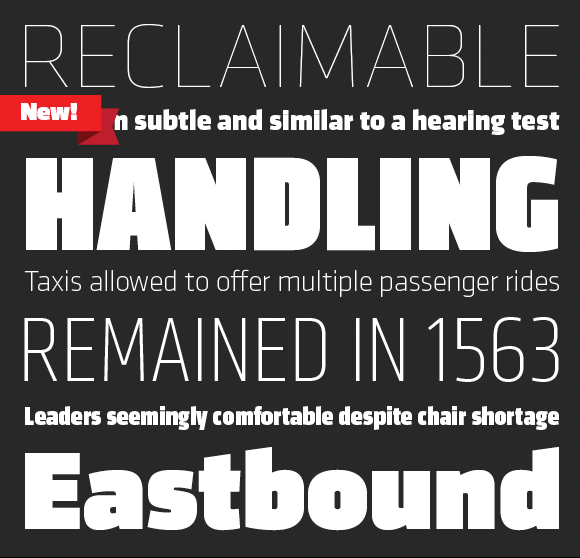
Customers have asked and we’ve always agreed – why doesn’t Klavika have a Black weight? Or an Extra Light? Good questions. Those lead us to wonder, what about an Ultra Black or a Thin as well? Why not fully explore the weight range, expand on the original and add something new? Sounds like the start of a great project!

And with that, Klavika Display was born. Available in four weights – Thin, Extra Light, Black and Ultra Black – and two widths – Standard and Condensed – the family is an addition to the existing Klavika and Klavika Condensed families. Although designed as en extension of the original series, Klavika Display works equally well on its own as a boastful display font. Singles, packs and the complete family are available in both desktop and webfont formats.

Fringe Division

Fringe Division - Detail

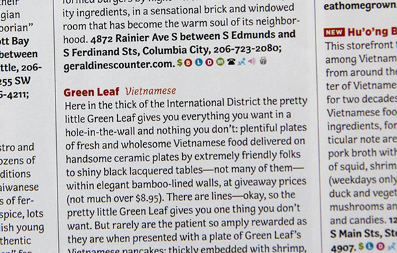
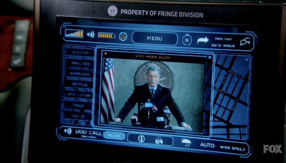
As fans of J.J. Abrams, co-creator of the television show ‘Fringe,’ we were tickled by this tiny use of one of our typefaces in the show. From the episode ‘Everything in Its Right Place,’ the in-car communication and navigation system is branded the property of Fringe Division using Klavika, appropriately and soberly set in all caps.

It’s 2012 already but before we say goodbye to 2011 entirely, there were tidbits from the last 365 we don’t want to forget. And while we’re at it, we’ve included a preview of typefaces slated for release in the New Year.

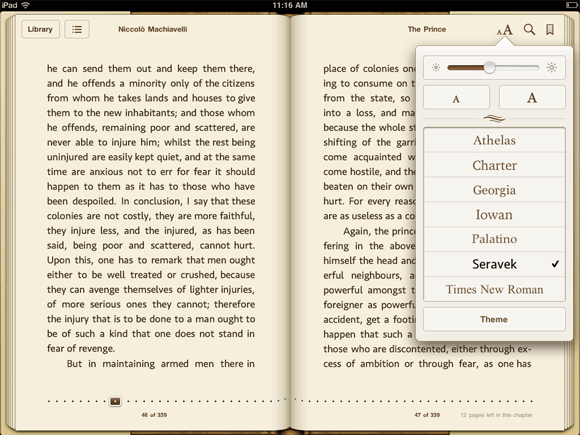
Seravek in Apple's iBooks

Seravek in iBooks
The 1.5 update to Apple’s iBooks app included several new typefaces, our Seravek among them. Of the seven type choices within the app, Seravek is the only sans serif.

Read more about the new fonts in iBooks:
Apple Updates iBooks App with Nighttime Reading Theme, New Fonts, More on MacRumors
Version 1.5 Improves Typography in iBooks on iPad and iPhone on the FontFeed
FontSwap in iBooks on BoingBoing

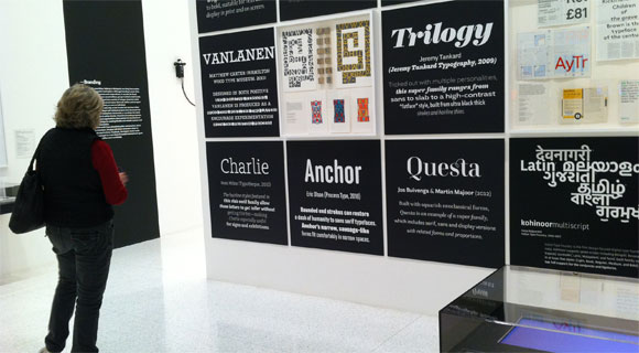
Anchor at Walker Art Center

Anchor at the Walker Art Center
Like MoMA’s acquisition of several typefaces last year, the exhibition Graphic Design: Now in Production currently on view at the Walker Art Center highlights typefaces as significant cultural artifacts in their own right. Anchor was featured among a number of other typefaces as further evidence of the emerging role of designers as producers.

Five Long Years
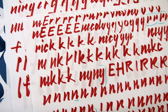
After five years of tweaking, polishing and refining, we finally pressed the launch button on Nicole’s typeface Elena. Up next for Nicole? A display font loosely inspired by the rhythms of the brush marker.

Starter material for Nicole's new typeface.

1% for the Planet
As members of 1% for the Planet, we donate one percent of our yearly sales to non-profit organizations working to improve the environment. This year we lent our support primarily to local organizations like the Will Steger Foundation, the Midtown Greenway Coalition, Friends of the Boundary Waters Wilderness and the Sibley Bike Depot. Our one non-local exception was the Washington-based Sea Shepherd.

One year on: Webfonts and Capucine
October 6 of 2010 marked the launch of our webfonts program making 2011 our first full year with webfonts on offer. And the report so far? Roughly 38% of fonts purchased on our site were either webfonts or webfont/desktop combinations.

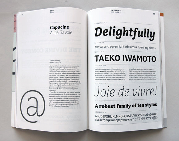
Capucine featured in Codex magazine.

Alice’s typeface Capucine also celebrated its first year post-release. We were delighted to see it featured in the inaugural issue of Codex. Of course, seeing it used for what Alice originally intended – as a typeface for magazine listings – in the November issue of Seattle Met also made our list of wonderful things.

Capucine in Seattle Met magazine.

Henry B. Weimelt
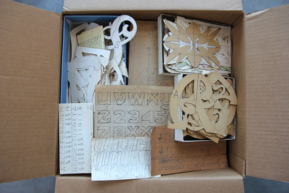
We were surprised to learn this year that Eric’s great grandfather, Henry B. Weimelt, was a passionate letter maker when not working his shift at the local Post Office. For years, relatives told tales of his after-hours letter work but it wasn’t until this year that his collection of hundreds – if not thousands – of handcrafted letters were uncovered and gifted to Eric. After sorting through the collection though, Henry’s intentions remain a mystery. What were the letters used for? Why did he make them? We’ve posted one half of one small box on our Flickr account.

Henry B. Weimelt and his letters.

On Deck for 2012
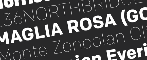
And last but not least, a good deal of 2011 was spent focusing on releases for 2012. In the New Year Eric will release his 12-font family Chrono followed by the boisterous display companion to Klavika, Klavika Display.

Chrono Typeface

Klavika Display Typeface

2012 also marks our ten-year anniversary. Thank you for ten wonderful years (officially in June) and here’s to ten more. All our best in this new year!

Durban stadium seating

Durban, South Africa’s busiest port city, constructed the magnificent Moses Mabhida Stadium which allowed them to be a host stadium for the 2010 FIFA World Cup games. Büro für Gestaltung designed the wayfinding and identity and covered the stadium from the seats to the murals with our Klavika. When the games were over, Jonathan Jackson of WeShouldDoItAll was kind enough to send along images of the stadium with a particular emphasis on the use of Klavika. This booklet was created to showcase his photographs, the stadium and our typeface.

Launch: Klavika at the 2010 FIFA World Cup Booklet

Frustrated with a lack of fonts both versatile and modern, we set out to design Klavika as a full-featured, do-it-all sans serif for the needs of the 21st century. Our result is a design that’s unadorned, modern and infinitely flexible. To achieve this, Klavika follows a decidedly hybrid typographic path – a cross of humanist and geometric influences with allegiances to neither. Crisp and open shapes keep the font legible in small sizes while the straight-sided characters anchor headlines and display work solidly in place. And since part of the goal was flexibility, we’re happy to report that since its introduction in 2004, Klavika has found its way into a wide variety of media from print to pixels.

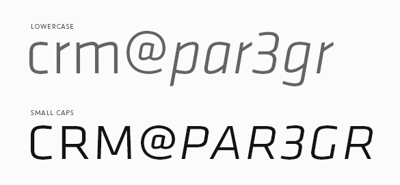
Showing the small caps of Klavika.

To be truly versatile, a font should be reasonably extensive as well. Klavika has a wide range of typographic features and – as is common with our fonts – showers special attention on small caps. They are essential for setting acronyms and initials (amongst other things) and excellent for titling and display work. Special attention has also been paid to the width of the capitals, specifically increasing it, for better legibility at small sizes and added punch in headlines.

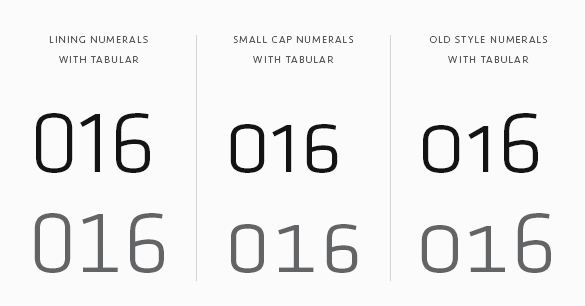
Numerals are another of the typographic features. Because a varied array of numerals is essential to contemporary communication, Klavika contains multiple styles. You’ll find Lining (the default style), Old Style, Small Cap, Tabular, Tabular Old Style and Small Cap Tabular numerals for each weight of Klavika – italics included.

If your requirements don’t call for all those typographic features, Klavika Basic was created with you in mind. It is the same as Klavika but without features like small caps, multiple numeral styles and arrows. If you buy Klavika Basic and later decide to upgrade to the fully-featured Klavika, the purchase price is directly credited towards the complete family.