A couple of Pique things turned up at once so here we are. Check out Nicole Dotin’s typeface in use for an important NYC Health campaign and then watch two videos about its design. While we’re at it, go ahead and take 10% off any license of Pique offered on the site until end-of-day Friday, August 4th (that’s the ‘week’ in Pique Week). Just use the coupon code ‘piqueweek’ at checkout.


In Use: Bare it All
Thanks to Quentin Schmerber for tipping us off to this NYC campaign, after spotting Pique on the subway. “Bare it All” encourages LGBTQ patients to have open discussions with their doctors. And to spread the message, Pique boldly sweeps in across black and white images in print ads and their video.


How was it made?
In the latest Fontribute video, Erin McLaughlin and Thomas Jockin deconstruct and discuss Pique and Lokal Script in some detail.

After watching the video, Nicole picked up her brush marker to (re)construct Pique and show how the marker underpins the design.

To learn more about Pique, visit Pique’s page. #piqueweek
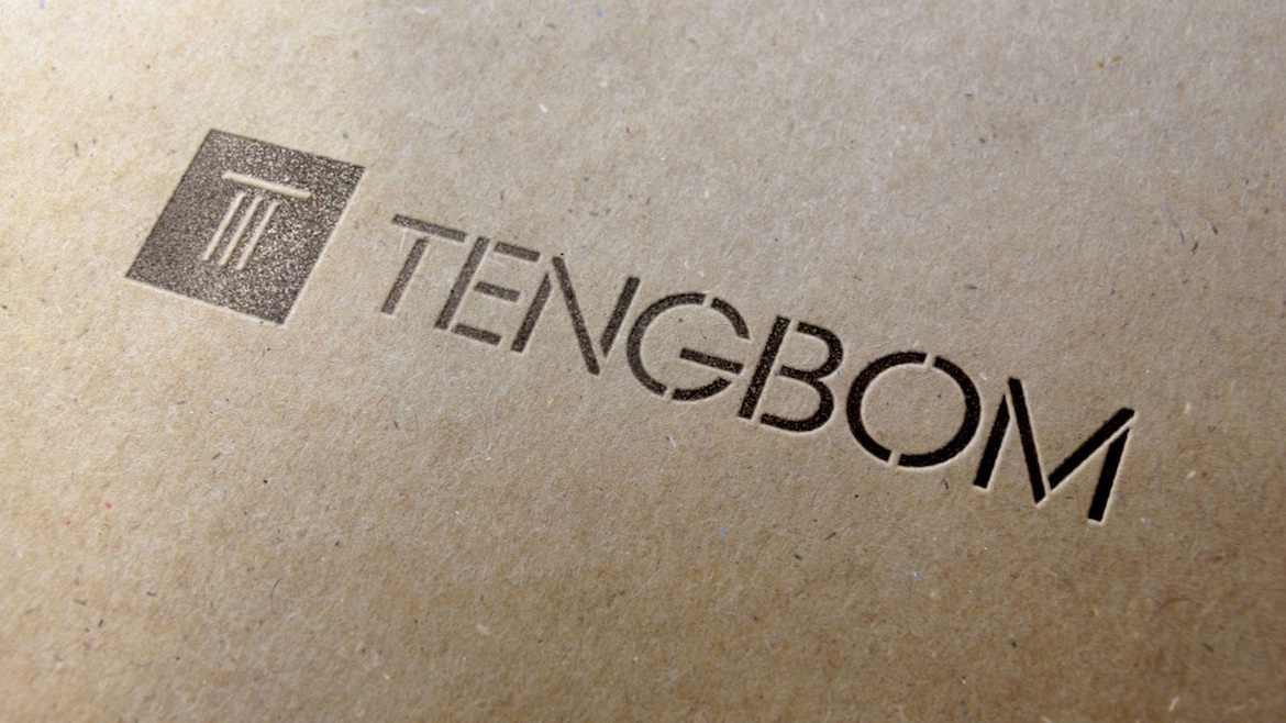
tengbom_id_2016-05-03_page_27_5000

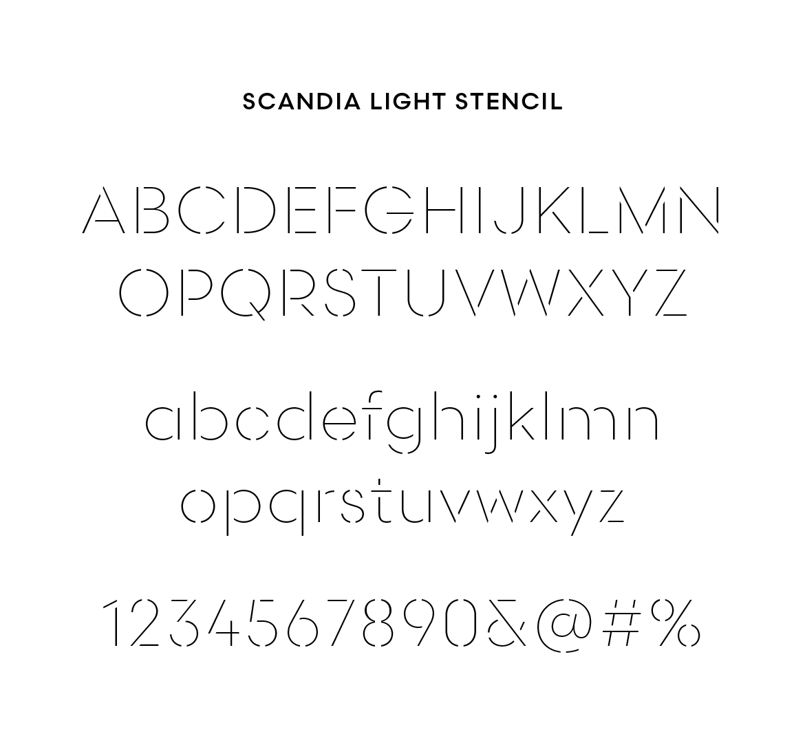
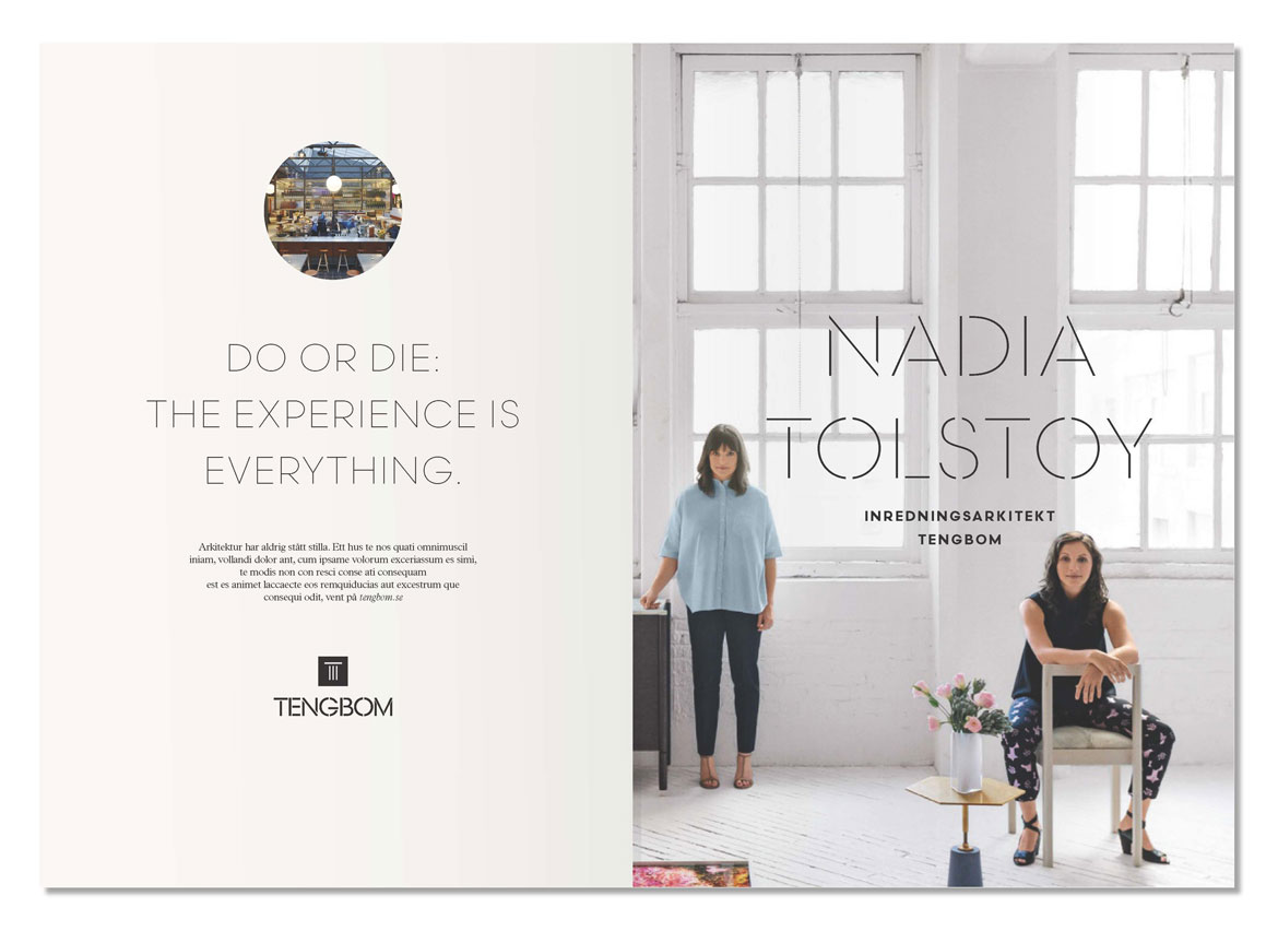
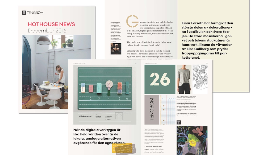
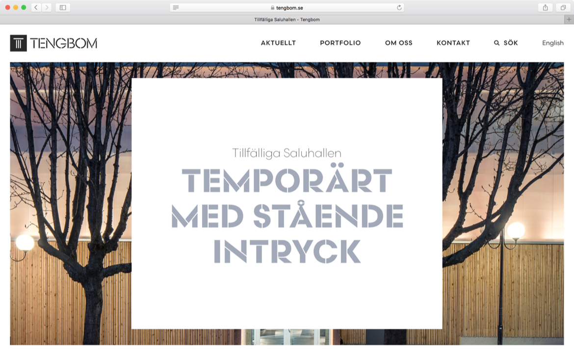
Tengbom, a Scandinavian architectural firm, has a new visual identity and it’s full of Scandia. Developed by Oscar Liedgren Studio, the branding takes full advantage of our latest typeface and also features a new style — Scandia Light Stencil.

Scandia was released with just one stencil font, but Liedgren thought a second, lighter weight would carry them even further. He came to us after creating Tengbom’s new logo, based on Scandia Regular, and worked with Eric Olson to design the custom font. Since there was always potential for more stencil weights, we’re glad they asked.

tengbom-scandia-light-sample

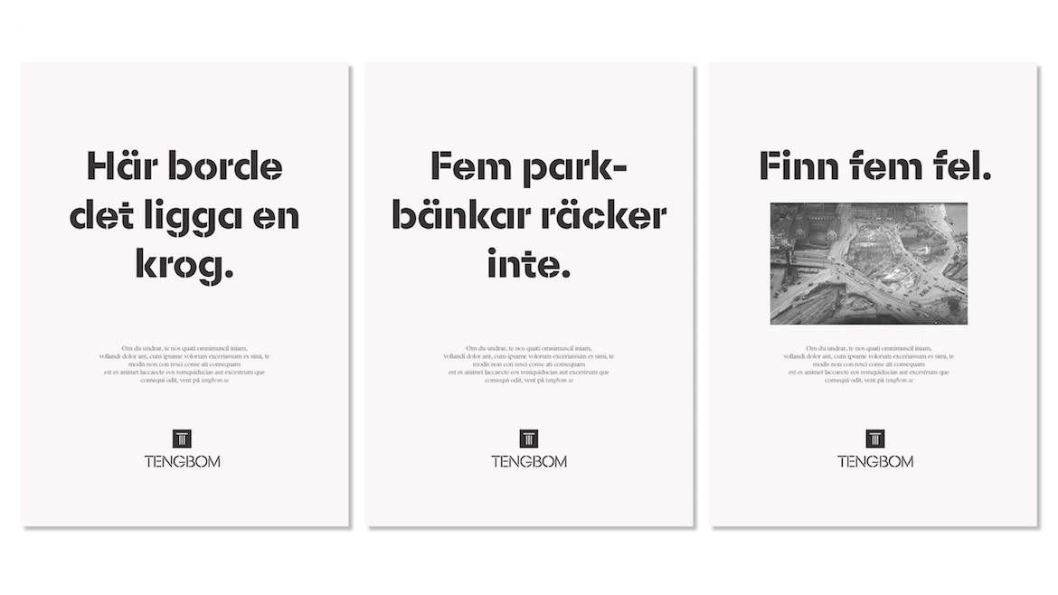
No doubt stencils and architecture have an affinity for each other. Liedgren was keenly aware of the relationship but after surveying the competition, he found it wasn’t as common as he imagined. In the end, their use of stencils accent Tengbom’s own design work, adding a nice level of detail across print and web.

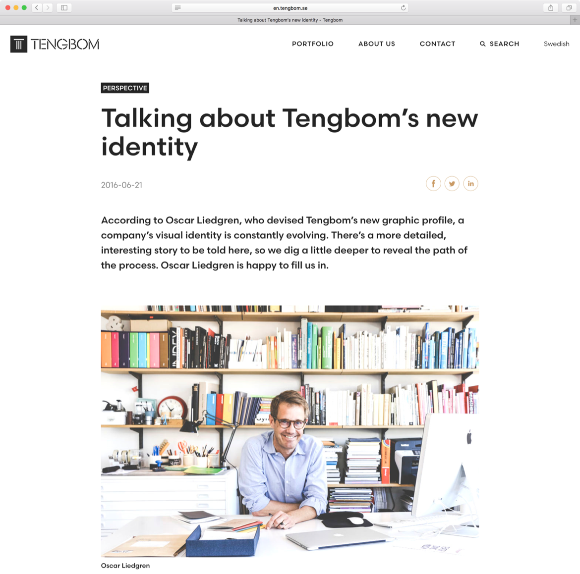
‘I think type in the context of identity can help you either to “belong” to a world (like that of architecture) or “stand apart”,’ Liedgren explained via email. ‘Both are valid strategies and need to be seen in the light of all other graphic elements and imagery at hand. In the end, what makes it work or not, is in the detail, in the craft, and in the way it’s applied.’

tengbom_id_2016-05-03_page_31_5000


Tengbom-portfolio3b

alla-crop

Tengbom-blog2


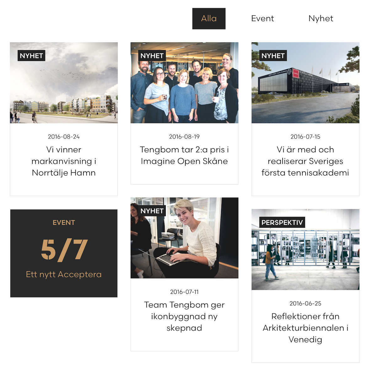
Visit Tengbom.se to see the webfonts served up. And you can see more in-use samples at Oscar Liedgren Studio. Print images courtesy Oscar Liedgren.

FODA Hewn Hopper

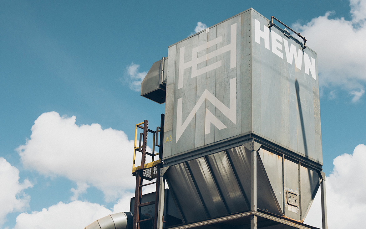
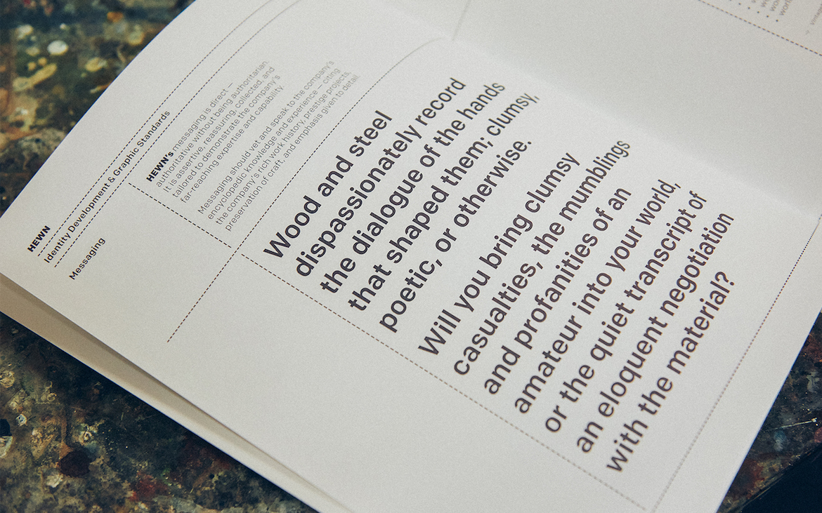
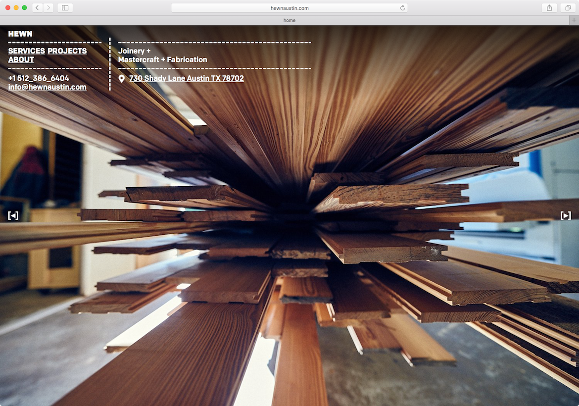
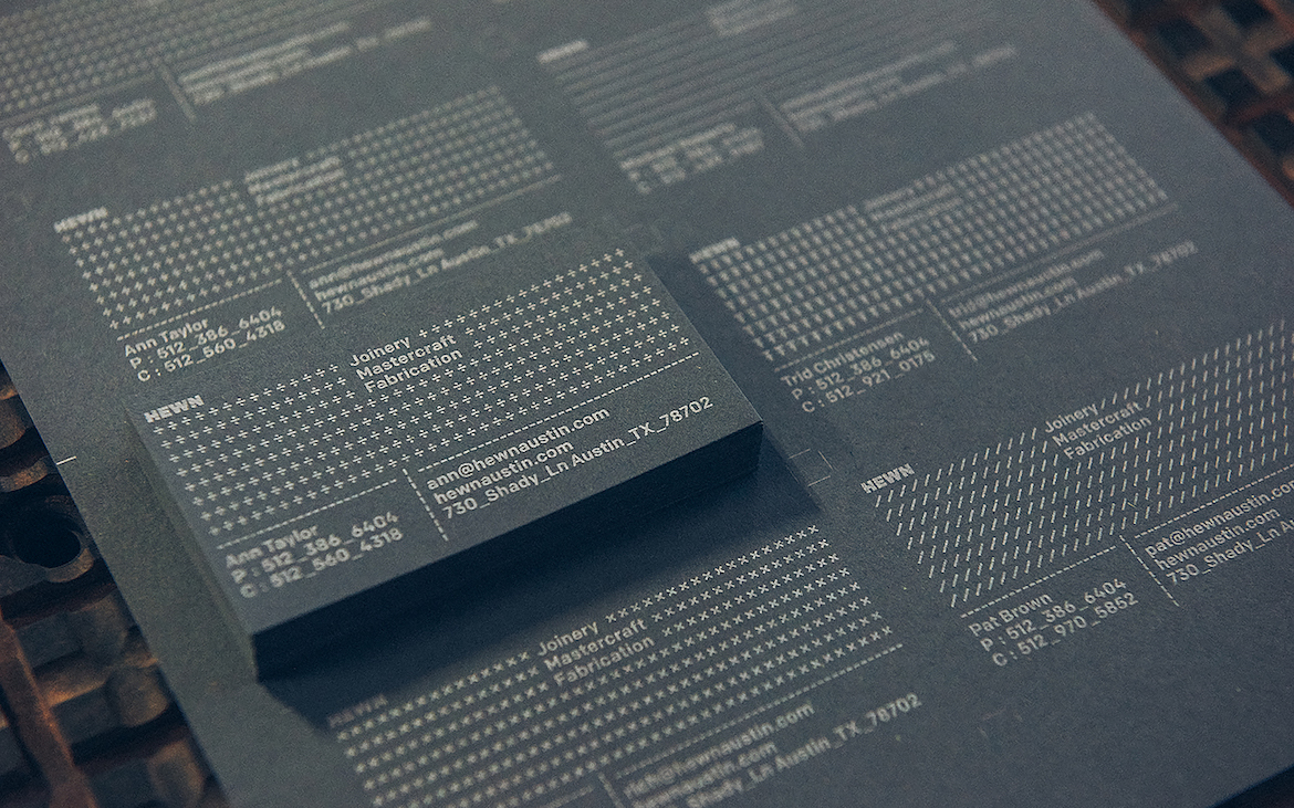
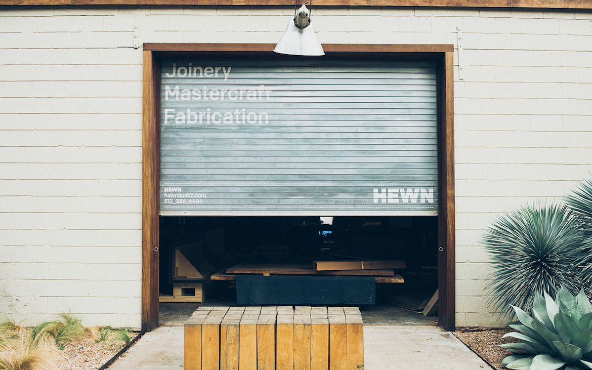
FÖDA, an Austin-based design studio, has renamed and rebranded their neighbor, Hewn, a wood shop, fabricator, and mill. The hefty Colfax Black logo sets the tone – spanning 8' wide on the hopper above! — and Colfax webfonts extend the identity online. Check out their brand guidelines, patterned business cards, and striking sliding door below.

FODA Hewn Brand Guidelines

FODA Hewn Homepage

FODA Hewn Business Cards

FODA Hewn Door

Photographs by Nick Simonite.

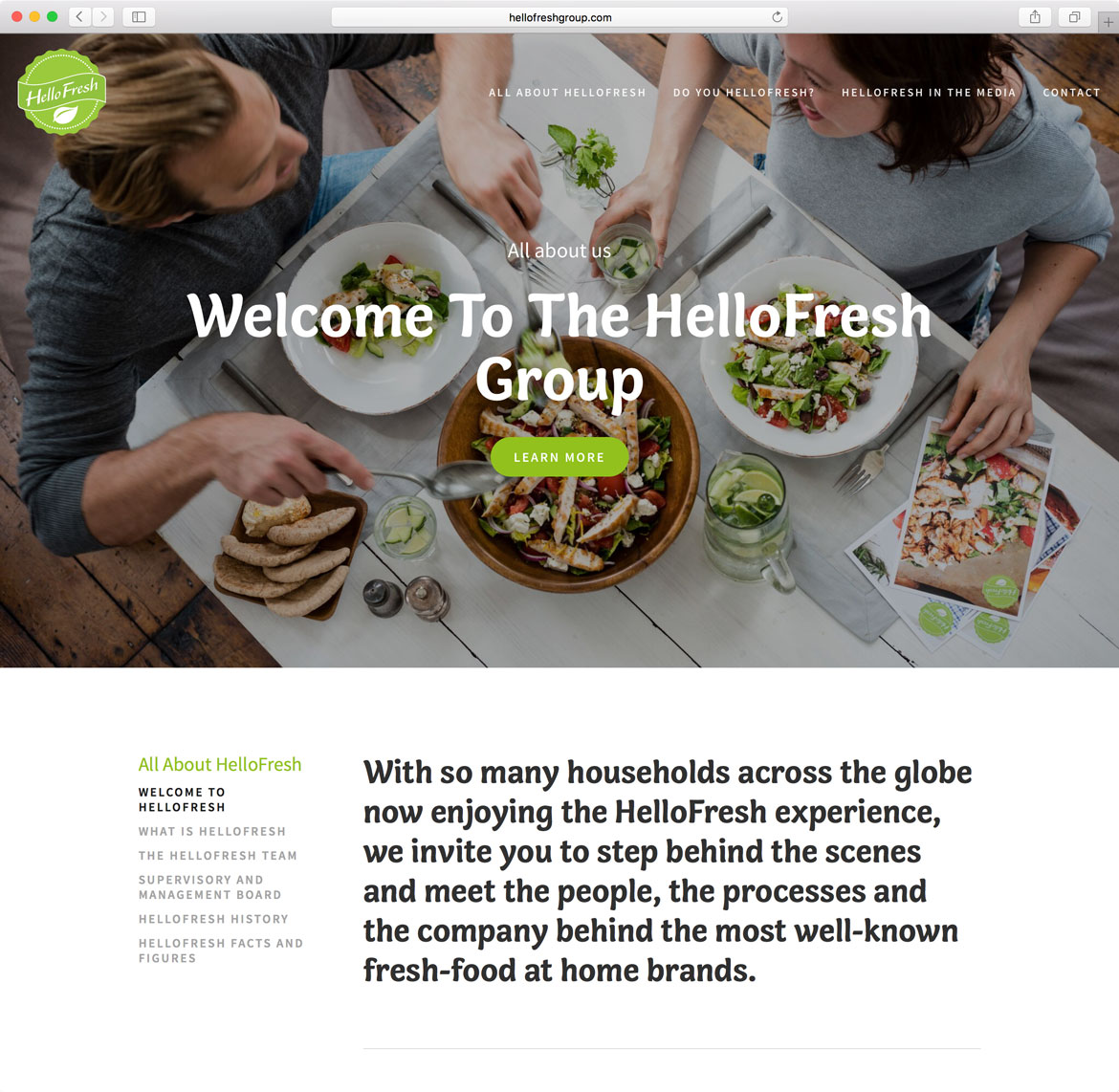
Hello-Fresh-Group-Home

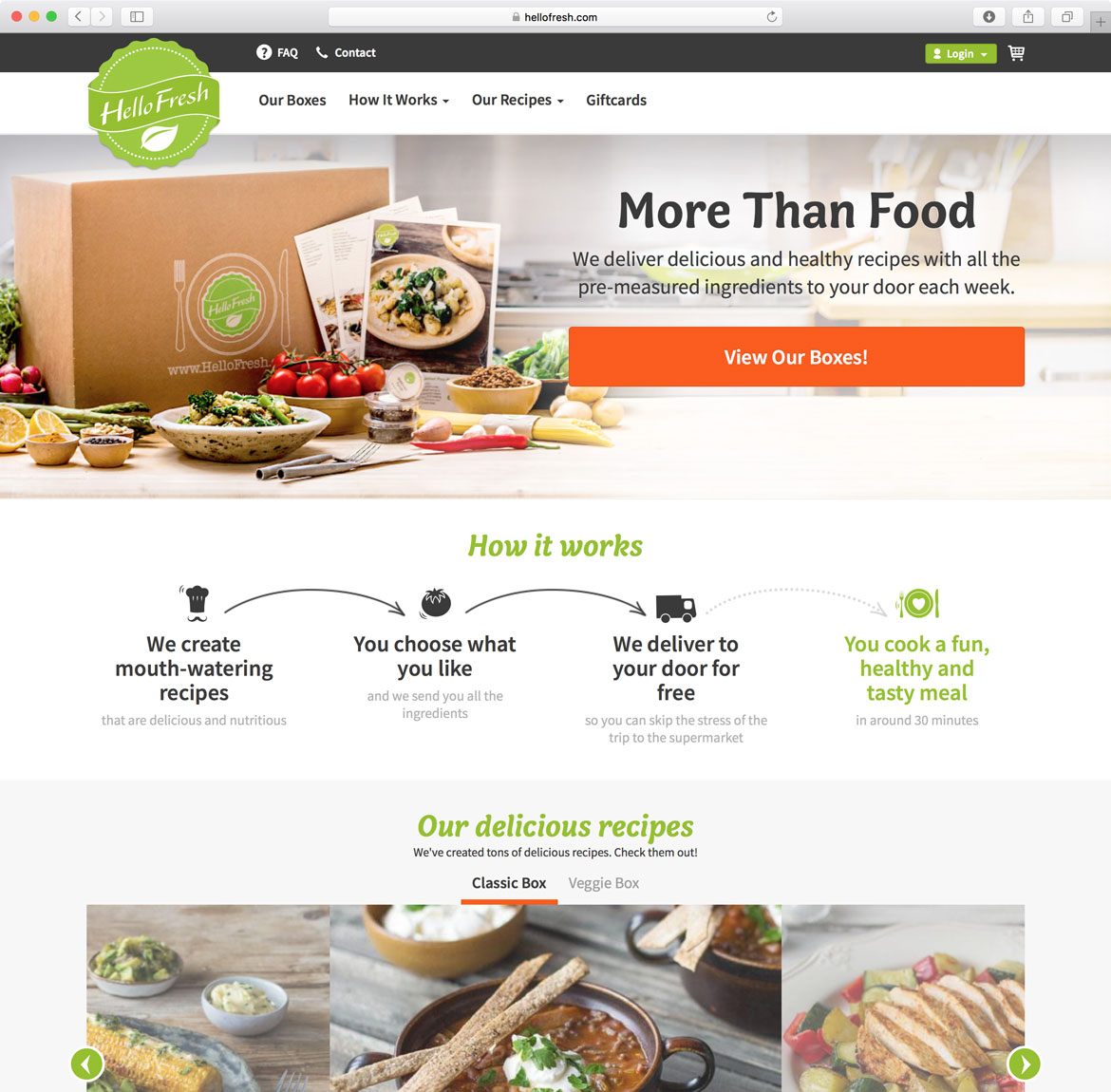
HelloFresh is a delivery service that saves you time on shopping and meal planning – you pick recipes and they send a box full of pre-measured ingredients that you cook at home. It’s one of many such services popping up left and right. In this growing market, where websites replace store aisles, each brand’s take on photography, colors, and type will be key to luring in cooks.

The approach of HelloFresh is a bright orange and green color palette combined with Alice Savoie’s Capucine. Her typeface is used primarily for headings and its rich flavor is balanced by a generous amount of white space. Capucine’s distinct italics are also put to good use, adding a layer of hierarchy and a subtle sense of movement to the page.

Hello-Fresh_Web-Promise

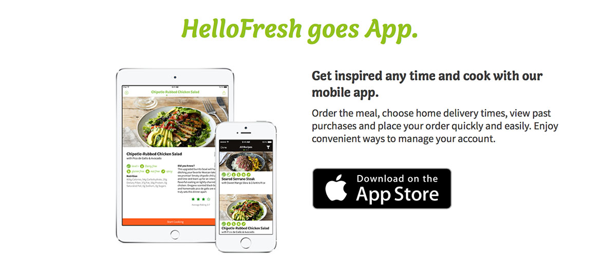
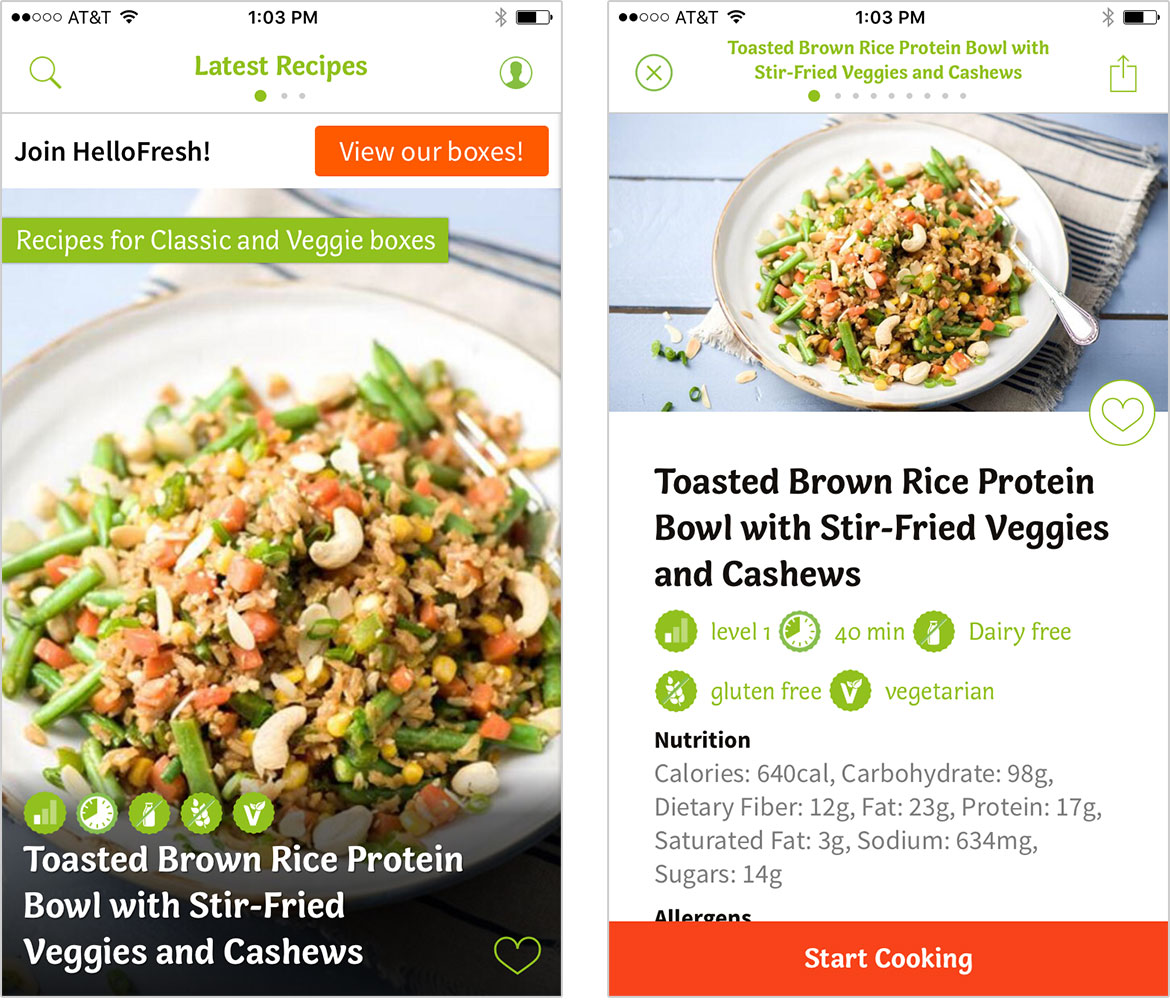
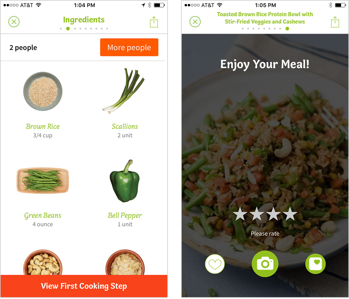
The design carries over to their iOS app, where you can see recipes and rate meals. Paired with Adobe’s Source Sans, Capucine is used more extensively and at a wider range of sizes. The typefaces complement each other, creating a bright vibe and easy-to-follow instructions. Overall, the use of Capucine lends warmth to an experience that could easily feel cold.

Hello-Fresh_App-1

Hello-Fresh_App-2

Capucine is available for desktop and webfont formats, and has extended licensing options.

Fringe Division

Fringe Division - Detail

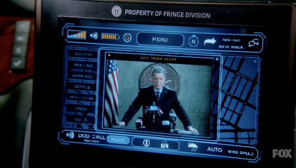
As fans of J.J. Abrams, co-creator of the television show ‘Fringe,’ we were tickled by this tiny use of one of our typefaces in the show. From the episode ‘Everything in Its Right Place,’ the in-car communication and navigation system is branded the property of Fringe Division using Klavika, appropriately and soberly set in all caps.

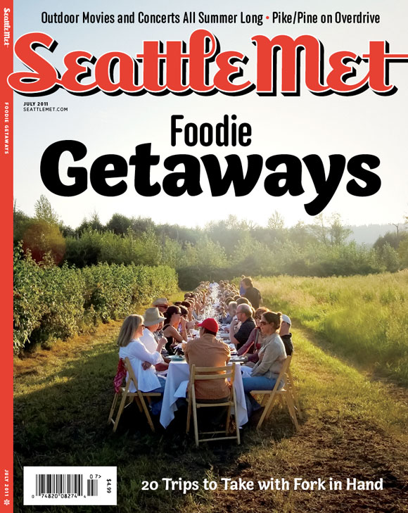
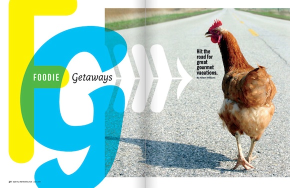
Seattle Met, a magazine covering the local scene in Seattle, WA, has been using Anchor and Bryant Compressed since May, when designer André Mora came on board. But it was for the summery July issue, with its focus on farms, foraging and other foodie adventures that Mora paired Anchor with the agile Capucine, named after the French word for the Nasturtium flower.

As the newest addition to our family of typefaces, it’s great to see Capucine being put to use here in a way that showcases its flexibility, from display headlines to captions.

Seattle Met July 2011