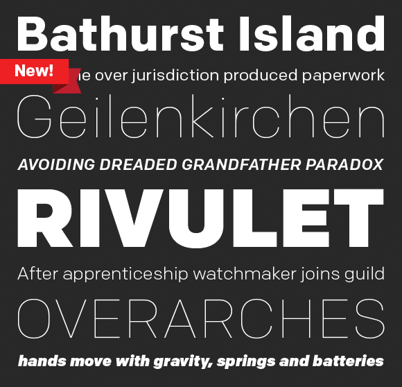
Our Colfax has been finding a home for itself on the web as of late. You won’t find tiny type in this lot of featured sites, but generous sizing that gives the type room to breath and shine. Below are a few websites using Colfax to great effect.


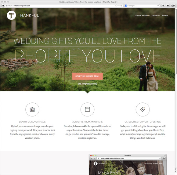
Thankful Site Grab
Thankful, a wedding gift registry site, with headlines set in Colfax Thin and body copy (and some display) set in Elena.


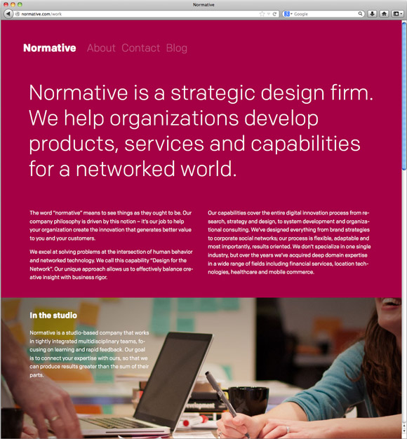
Normative
From Normative, a multidisciplinary design firm based in Toronto, Canada, a website showcasing the firm set exclusively in Colfax.


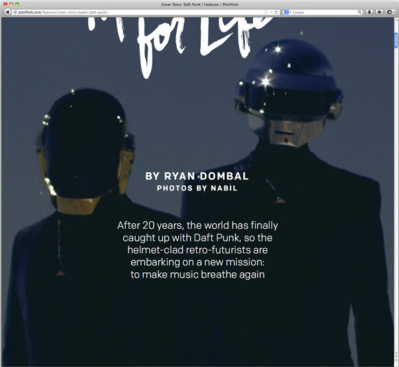
Daft Punk Cover Story
Watch your screen burn in this Pitchfork cover story on Daft Punk, with headlines set in Colfax.

New Release: Klavika Display

Customers have asked and we’ve always agreed – why doesn’t Klavika have a Black weight? Or an Extra Light? Good questions. Those lead us to wonder, what about an Ultra Black or a Thin as well? Why not fully explore the weight range, expand on the original and add something new? Sounds like the start of a great project!

And with that, Klavika Display was born. Available in four weights – Thin, Extra Light, Black and Ultra Black – and two widths – Standard and Condensed – the family is an addition to the existing Klavika and Klavika Condensed families. Although designed as en extension of the original series, Klavika Display works equally well on its own as a boastful display font. Singles, packs and the complete family are available in both desktop and webfont formats.

In the spring of 2012, eight students at North Carolina State University’s College of Design participated in a new course to curate, edit, design and publish The Student Publication, a journal that reports on important issues in the field of design. While they had the support of Dean Marvin Malecha, FAIA and were guided by the expertise of Assistant Professor Tania Allen, the students (Michael Carbaugh, Dwight Davis, Eric Flood, Anna Gonzales, Craig Maxwell, Rebekah Zabarsky, and Leigh Anne Zeitouni) managed every aspect of the project including selecting and inviting contributors, authoring content, designing the publication and managing its promotion. The result, Volume 35: Transformation: New perspectives on design methods and processes, was printed and released this fall.
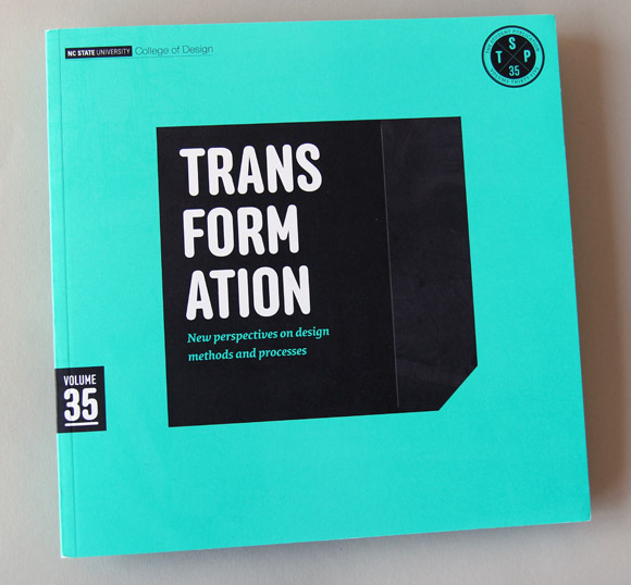
The Student Publication, Volume 35

Volume 35 of The Student Publication was designed by Michael Carbaugh, North Carolina State University Master of Graphic Design ’12.

Assistant Professor Allen was asked how building a course around the well-established publication enhanced the students’ learning experience. She explained that a dedicated course provided time and space for students to sit, think and discuss the strengths and weaknesses of a potential topic and whether it merited an entire issue.

The Student Publication provides a forum for students to develop a comfort with writing and articulating an idea that might be more theoretical in nature,’ said Allen. ‘I have been trying to develop projects that give structure to creating an argument, introduce students to prominent (or not so prominent) thinkers and writers in the field and experiment with the writing process itself.’
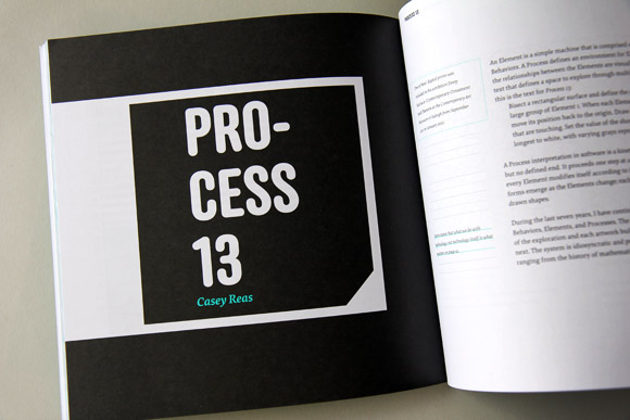
Process 13, Casey Reas

Anchor and Elena are used exclusively throughout the publication.

While the Publication Course was new in 2012, The Student Publication has a sixty-year history. The College of Design published the first volume in 1951. Its purpose then was to act as a collection of voices, focusing on timely and important issues in the design field. Past contributors have included Le Corbusier, Mies Van der Rohe and Buckminster Fuller. Then in 2006, a group of faculty and students in the College, including Denise Gonzales Crisp, Tony Brock and Bob Burns, proposed creating the Publication Course to formalize the project’s learning objectives and student experience. Allen’s Spring 2012 class was inspired by that initial proposal.

Allen commended her students for their ability to create a framework on which future classes can build on and expand. ‘The students really rose to the challenge. They developed a fundamental appreciation for this publication as part of a larger system that not only will, but must, evolve and change in future semesters.’
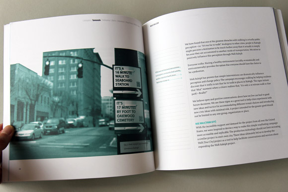
Walk Raleigh, Matt Tomasulo

In addition to providing a more holistic view of editing, designing and publishing a journal, the Publication Course has expanded students’ understanding of writing’s role in design both as content creation and critical practice. Rather than marginalizing writing at the edges of the design process – either as project brief at the start or explanation at the end – Allen wanted students to experience integrating writing into the whole process: to practice writing as a method to talk about how ideas develop through various stages and to enhance those ideas through the course of a project. To further clarify the connection between design and writing, Allen built visualization and making components into the students’ writing assignments. For example, they developed concept maps to find connections among contributed content and designed interactive pieces about the publication’s topic.
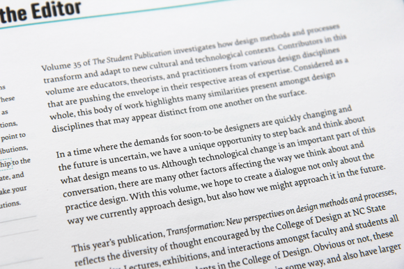
Elena, up close.

A detail – Elena up close.

For Volume 35, the students approached Nicole Dotin for an interview following the public lecture she gave at NC State the previous fall. Nicole presented on type design practice and the development of her typeface Elena (used throughout the publication for text alongside Anchor for headlines). The interview appears among contributions from educators, theorists and practitioners from various design disciplines: Eve Edelstein, Deb Littlejohn, Juhani Pallasmaa, Fernando Magallanes, Casey Reas, Matt Tomasulo and Erin White. Each of the eight contributors offers his or her perspective on how design methods and processes transform and adapt to new cultural and technological contexts. The student editors wrote that they hope The Student Publication creates a dialogue about how the field currently approaches design as well as how it might evolve in the future.

‘Today, I would argue that the incredible shifts in the field have precipitated an increasing need for us as designers to reflect not just on what we are creating, but how and why we are creating and what it is adding to material culture at large,’ Allen advocated. ‘The Student Publication is an opportunity to do that.’

This fall, a new set of students began working on Volume 36: Form + Fiction to be published spring of 2013. Find out more about The Student Publication.

— Guest blogger Erin Hauber is a graphic designer, educator and Master in Graphic Design degree candidate at North Carolina State University.
If you happened by the FontFeed recently, you’ll find an interview with Process Type Foundry partners Eric Olson and Nicole Dotin by Yves Peters. Go ahead, read the words. Sometimes, though, we just want to ogle the pictures. Here are photos from the interview along with extended annotations, outtakes and some extras.

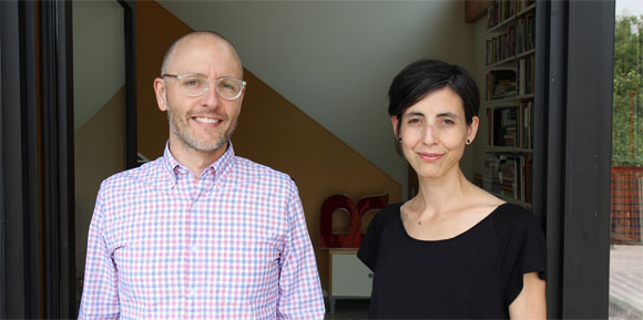
Eric and Nicole
Eric and Nicole standing in the doorway of the Process Type Foundry studio.

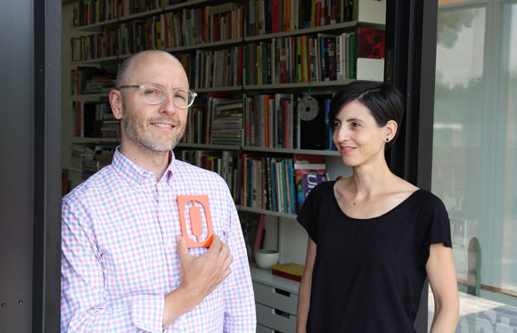
Eric, Nicole and Erik
At some point, our photo shoot started to sour after taking shot after shot. There was nothing left to do but lighten the mood. Obviously, Eric grabbed a house number designed by Erik Spiekermann and placed it where it belonged.


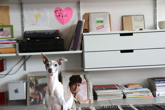
This is Charlie, the silent third partner of Process, in the studio along with Bob Dylan, an old Mac Cube, our record player and various drawings by 3-year-olds.

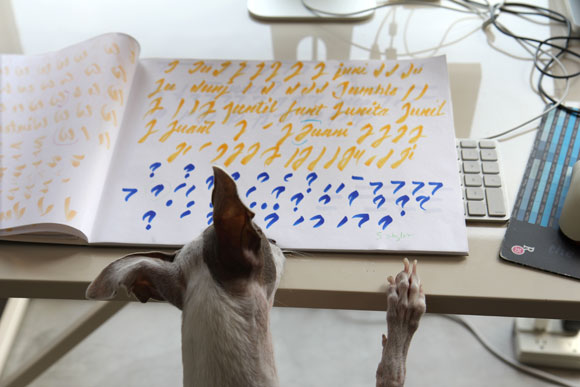
What will he think of the work?
After posing for his photo, Charlie popped by Nicole’s desk to see what she was working on and offer insight. Or, he might have been looking for a treat.

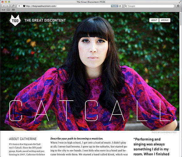
Designed and published by Ryan and Tina Essmaker, The Great Discontent features various weights of Stratum 1 alongside body text set in FontFont’s Meta Serif. More importantly, it features interviews with the makers of today.
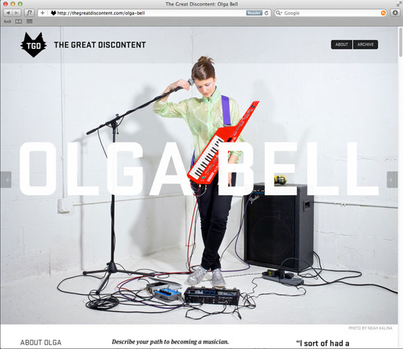
The Great Discontent, Olga Bell.
“Do you guys know that thing that Ira Glass talks about? Where you start out and you know your taste is really good, but your ability needs to catch up to that taste?” An interview with Olga Bell on The Great Discontent.

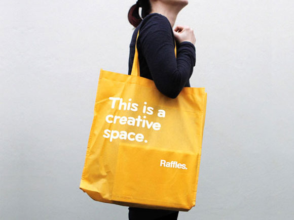
This is a creative space.
Bryant and yellow belong together. This bag was one part of a larger rebrand of Raffles, a design school based in Sydney, Australia. Find more of the identity using Bryant on the Naughtyfish website, the firm that handled the redesign.

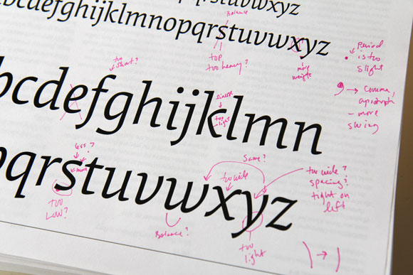
Elena Italic test print.
A test print for Elena Italic. Most of Nicole’s test prints are marked up in colored pen. Red, pink, blue and green are favorite colors for making messy, almost indecipherable notes for later decryption and then correction. The arm of the k needs … finesse.

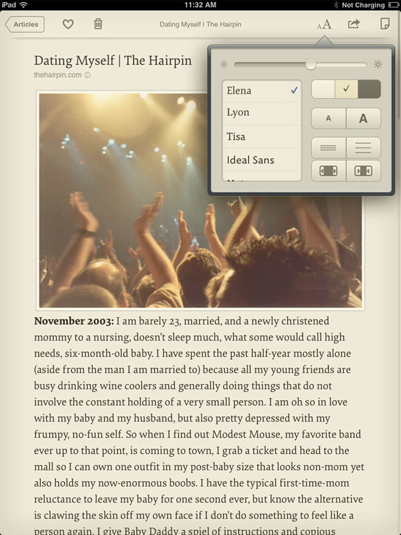
Marco Arment's app Instapaper.
Elena found its way into Instapaper, a popular app by Marco Arment for collecting and saving content to read later. If you happen to click on the link above for Marco, notice his personal site is set in Elena too (at the time of posting).

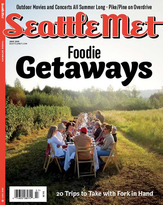
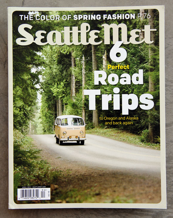
Seattle Met cover featuring both Capucine and Anchor.
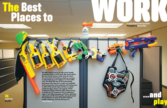
It’s no secret we love seeing our fonts in use and used well. It is a secret however, that we hope to one day see every font in our library used in a single magazine. As far as we know, Seattle Met is the front-runner in our imagined competition. Capucine, Anchor, Bryant, Bryant Compressed and Colfax have all graced the magazine since design director André Mora took the helm. Only 13 more fonts to go, Mr. Mora.

Anchor in Seattle Met.

Colfax on the cover of Seattle Met.

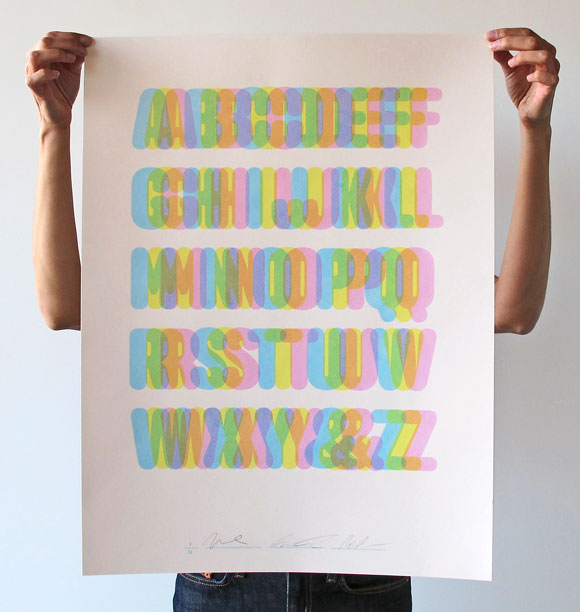
Limited edition poster for Anchor.
During the summer of 2010, we jumped into the seemingly rarefied world of print and made a limited-edition poster celebrating Anchor (long since sold out). Designed by Abi Chase, it was a three-color screenprint featuring an unusually pastel palette when compared to our typical propensity towards CMYK.

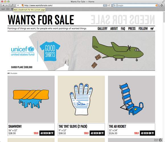
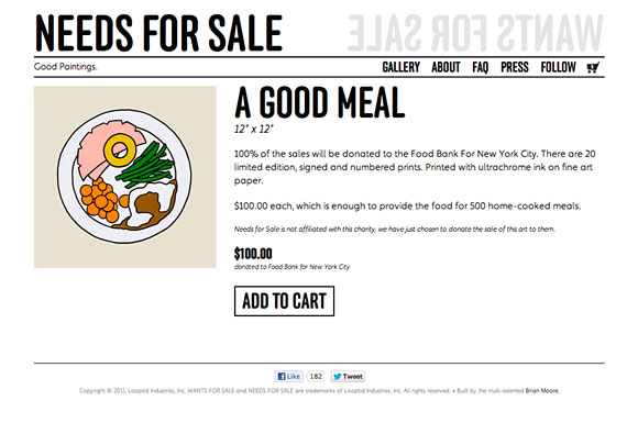
Wants for Sale.
And last but not least, a random bonus. >Wants for Sale was started in July of 2007 by Christine and Justin Gignac. A couple of months later, they took the same basic concept and started Needs for Sale. The concept? The couple paints pictures of needs, anything from basic necessities like food or shelter to research for curing diseases. The paintings are offered for purchase and 100% of the sale is donated to a charity whose mission it is to meet that need.

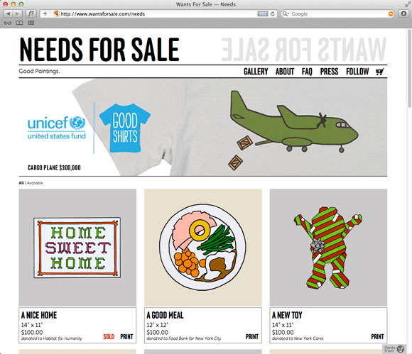
Wants for Sale's companion – Needs for Sale.
Anchor is used for all headlines and titling.

Needed: a good meal.
A nice way to end, right?

10 May 2012

Chrono meet Colfax

In our hearts, Chrono will always be called Chrono. However, we inadvertently crossed paths with another similarly named font and decided the name needed to change. So Chrono, meet Colfax!

Residents of the Twin Cities will recognize the name Colfax as one of our city’s leafy, mostly residential streets. Consequently, it runs directly parallel to Bryant, another street-turned-font-name in our hands.

Already licensed Chrono?
There’s nothing you need to do except note the name change. You’ll still be able to upgrade to larger packages or add additional licenses but under the new name Colfax instead.

Similarly, Typekit users with Chrono already loaded in their library don’t need to make changes either. The fonts will function the same and the name won’t change to Colfax unless you republish your kit. If you’re using the default CSS selector (tk-chrono-web), this will still work after republishing, too.

We’re always on hand to answer questions, just get in touch.

6 Mar 2012

New Release: Colfax

Colfax

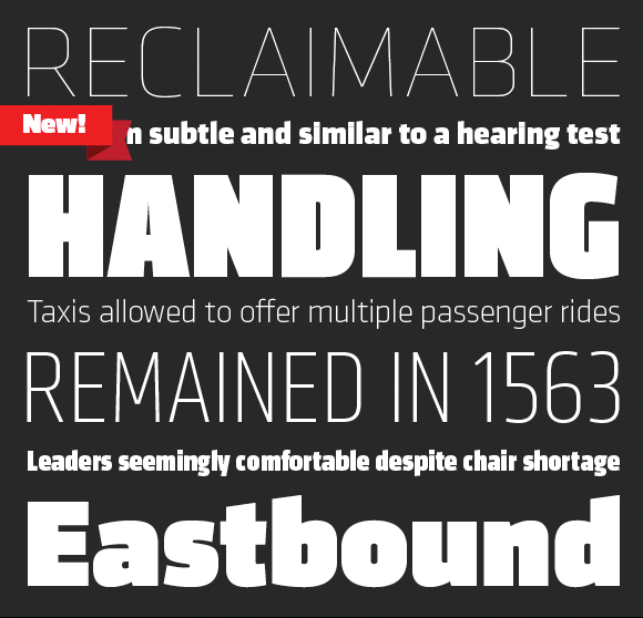
We’re pleased to announce the release of our new typeface Colfax. At home within a range of design environments, Colfax is a refined oval sans serif of twelve styles ranging from Thin to Black with matching italics for each. Singles, packs and the complete family are available in both desktop and webfont formats.

Colfax was formerly named Chrono.